

The browser debugging tools are endlessly useful for helping to build your Ionic applications, and debug any issues you come across. In this article, I am going to discuss a few of the tools and techniques I use to help debug CSS issues in my Ionic application. As well as using these tools to help debug, I also often use the browser debugging tools to help design my application as well, as I can quickly see the effect that changes would have.
This isn’t going to be a super advanced look into how the debugging tools work – this is just going to cover the kinds of techniques I use on a day-to-day basis at a basic level. This article would be most useful to people who are somewhat familiar with using the browser debugging tools but don’t really use anything other than the Console for checking errors during development. Even though a lot of the stuff I am discussing likely won’t be news to the more advanced Ionic developers out there, there may still be a thing or two in this article that you may not know of.
We will be using the Chrome DevTools specifically in this article. Your debugging set up might look slightly different to mine, so for reference throughout this article this is what my set up looks like currently:
We will only be focusing on the debugging tools shown in the screenshot above. You should also keep in mind that the same/similar methods will apply when debugging on a device as well. If you don’t know how to use browser debugging tools when your application is installed on an iOS or Android device, you should check out these videos: Debugging iOS, Debugging Android.
Elements
The elements tab contains the entire structure of your document/application/web page. You can use it to inspect each individual node/element that is being rendered on screen.
It’s great for allowing you to pinpoint exactly the element you are interested in. If you right-click on an element in your application and go to Inspect Element, it will open up the debugger with that element selected. Sometimes it won’t default to the element you actually want, as it could select a parent element instead. However, you will at least be near the element you want, and from there you can just click around through child elements until you find what you want. You can tell what element you have selected because as you hover over it, it will be highlighted in your application.
Once you have selected the element you are interested in there is a lot you can do. As well as having the ability to modify the element completely (you can even delete the entire node if you want), we can also see a lot of information about that specific element at a glance, including:
- The element’s location in the DOM tree
- The classes that are applied to that element and the associated styles
- The computed styles that represent the styles that are actually applied to the element
- The values of the box model for the element
We will be talking more about some of these things throughout the article, but one particularly important concept to understand when debugging CSS is the box model. The box model determines how an element is displayed on the page, and it is represented by this little fellow:
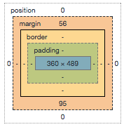
The element itself is the blue rectangle in the center, but there is more that determines the overall size/position of the element. Padding will add additional space inside of the element, a border surrounds the element, and the margin determines the space between this element and other elements around it. For more information about the box model, I would highly recommend this article. It’s a reasonably simple concept once you get your head around it, and understanding it is extremely useful for debugging CSS in your Ionic application.
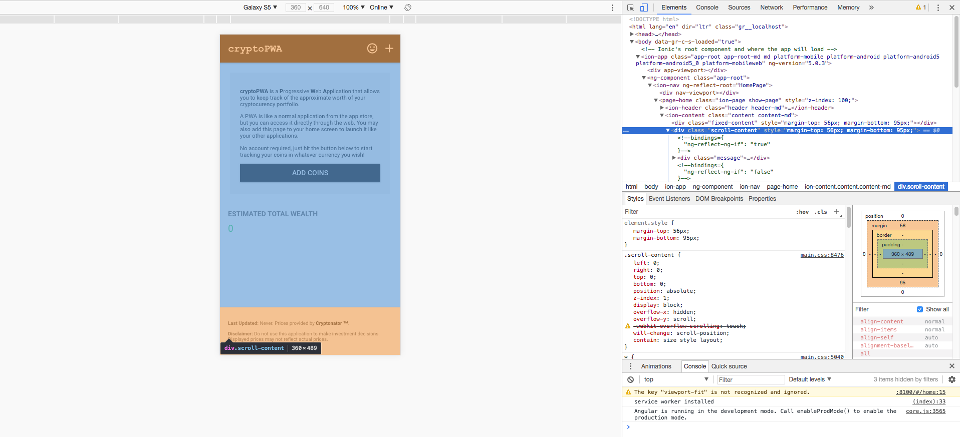
Let’s take a look at an example of how we might use this. The following is a screenshot of me inspecting a particular element in my Ionic application:
In the example above, I can clearly see on the representation of the box model on the right that this element has a margin of 56px on the top and a margin of 95px on the bottom. This is also reflected on the actual application, as the areas where the margin is being applied are highlighted in orange. Although there is no padding in this example, the colours overlayed onto your application reflect the colours in the box model representation – margin is orange, padding is green, the element itself is blue.
This is something I use a lot. It is especially useful for those situations where you are thinking “why in the heck is there a gap at the top of my list?“. You can probably assume that the gap is due to some margin or padding, but it can be difficult to figure out where it is actually coming from. By inspecting the element, you can just keep hovering over different elements in the area until you find the one that has a big green or orange box covering the gap you want to remove. Looking at the box model representation will reveal exactly how much margin or padding is being applied.
Finding and Modifying Styles
The concepts we discussed above can help you find troublesome margins and padding applied to elements, but we can also easily see where those particular styles are coming from and modify them directly through the debugging tools. If you are inspecting an element and look at the Styles tab, you will see that it has two windows (you can see this in the image above).
The window on the right is a representation of the box model that we discussed in the last section. Below this is a list of “computed” styles. You can have multiple different classes applying different styles to an element, sometimes you will even have two classes applying a style for the same property (where one will overwrite the other). The “computed” styles are the styles that have actually been applied to the element. There will be one entry for each property in this list, and you can see the associated style for the property you are interested in.
The window on the left represents every style that is applied to the element, and the class that is responsible for it (or in the case of the first element.style entry, the styles that are added to the style attribute directly on the element). From this window, you can easily deselect certain properties to see the effect that it has, and you can even add your own new styles to a class to see what effect it would have:
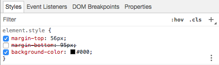
In the example above, I have removed the margin-bottom styling to see what effect it would have, and have also added my own background-color property. As soon as these modifications are made, you will immediately see the effect that it has on your application. This is great for having a quick play around, and you can take note of the classes you are modifying to then go and modify those values in your application’s code (any changes you make in the debugging tools will be lost on refresh).
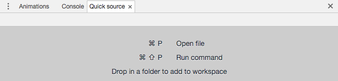
Another option for quickly modifying CSS styles is to use the Quick source tab. You can see this tab in the screenshot I added at the start of this article, but it may not be there by default for you. If it is not, click the three little dots on the left of the toolbar and select Quick source:
In this tab, you can open up any of the source files for your application a modify them. If you open any of your CSS files (just search for .css and open something like main.css), you can start adding CSS code to it and see what effect it would have. It doesn’t really matter what file you add the CSS to, the point is that it gives you a nice work area where you can write some CSS and see the effect immediately. The benefit to this approach is that once you have finished testing your styles, it is much easier to just copy and paste the new CSS classes you added to the file in the proper .scss files for your application.
Understanding and Debugging Specificity
In the previous section, I mentioned the concept of some styles overwriting other styles. You might define the following class:
p {
  color: red;
}
The goal here is to make all paragraph tags have red text. This might work, but there might also be some other class that is attempting to set the colour for paragraph tags. This might be some CSS that is built-in to Ionic, or it might be your own class.
You will often run into a situation where you create a new style to change something, your application refreshes, and then absolutely nothing has changed. This is why it can be helpful to test these styles out through the debugger, as it is going to be much more obvious what is happening. If you were to scroll through the list of styles that are applied to the element, you would eventually find your class/style and see that it is crossed out. If you continued to search through this list of classes, you would find the class that is overwriting your style.
The process that determines which styles are applied over others is referred to as CSS specificity. To put it simply: the most specific rule is the one that will be applied. A style that is applied directly to the element, e.g:
<p style="color: red;">Hello</p>is very specific, and will beat styles that are applied through classes. This generally isn’t the best way to apply styles, though, so you shouldn’t rely on this to make your CSS styles more specific. Similarly, you can also use !important on rules to win the specificity race, but this is also not the best approach and should be avoided wherever possible – if CSS specificity is confusing, wait until you are also contesting with 50 different CSS rules in your application that use !important.
An easy way to increase the specificity of a CSS class is to use nested selectors. When you have an element selected, you will be able to see all of that element’s ancestors:
By nesting selectors using parent elements, we can increase the specificity of a rule. For example, if we added this rule:
div p {
  color: red;
}
or
.my-parent-class p {
  color: red;
}
both of these would beat the original rule we used:
p {
  color: red;
}
So, if we were trying to apply a style to scroll-content like in the image I posted above, we could technically make a rule like this:
html
  > body
  > ion-app
  > ng-component
  > ion-nav
  > page-home
  > ion-content.content.content-md
  > div.scroll-content {
  background-color: #000;
}
This is ultra-specific, and will most certainly work, but it is quite absurd. I definitely wouldn’t recommend doing this. You will usually be able to get your styles to apply the way you want without using !important and without needing to go to the extreme of the example above. Although you should avoid using !important as a hack to avoid specificity issues, it is no great crime to use it from time to time in certain scenarios. Generally, I would take the following approach if I am having trouble with my rules being overwritten:
- Find the class that is setting the style and change that instead of creating my own style to overwrite it
- If that isn’t feasible, increase the specificity of my style to overwrite the other
- If increasing the specificity is too messy/awkward, add
!importantto the rule.
You don’t need to fully understand how specificity works. It is not important to be able to look at two rules and determine which would win, but it is important to realise that this is often the cause of issues you might face. If you do want to understand more about specificity, I would recommend reading this article.
The Device Toolbar
This is a reasonably obvious one, but it can be easily missed. When using Ionic, we do most of our development on a desktop browser, but we are generally designing mobile applications. If you hit the ‘Device Toolbar’ icon in the top left of the debugger (the option highlighted in blue in the image below):
It will allow you to emulate various sized devices to see what your application would look like in those dimensions. You can easily change the device type at the top of the screen. It is important to note that this mostly just sets the device size and user agent, it is not the same as testing on an actual device. It is very useful for quickly seeing what your application looks like on various devices, though.
CSS Animation Performance
Another important aspect of debugging CSS is making sure that you are designing performant CSS animations. CSS animations can perform very well even on lower-end devices, but you could take two different approaches to creating the same animation and one would perform very well and the other terribly (despite the animations doing the same thing). This topic is a bit too in-depth and complex to cover in this article, but if it is something you are interested in I have a short video explaining the basics here: High Performance CSS Animations in Ionic.
This is also a concept I cover in a lot of depth in Elite Ionic.
Summary
The tools and tips I have mentioned in this article does not cover everything you might want to be using, nor is it necessarily the best way to do things. These are just the things I use on a day to day basis that work for me, so hopefully, you might find a thing or two that can help improve your development workflow.