

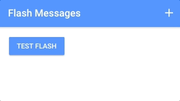
Last week, we built a flash message component with Angular. The purpose of this component was to allow for a way to easily make a one-line call from anywhere in the application to display a flash message like this:
I think it is interesting to then consider what this same component might look like, and how we might use it, if we were to build it with Stencil as a web component rather than as an Angular component. These kinds of direct comparisons help to really distinguish the differences between Ionic/Angular/Stencil as the differences can often be subtle.
The good thing about building this component with Stencil as a generic web component is that we would then be able to reuse the component everywhere (other frameworks, or without a framework) rather than just being able to use it inside of the Angular framework (as is the case for the component we built with Angular last week). The downside is that we won’t have all of the Angular framework stuff to help us build or use it. This means that we are going to need to take a slightly different approach when designing it.
Some things we need to consider immediately when redesigning this component with Stencil instead of Angular are that:
- We can no longer rely on an injectable service to control the component
- We no longer have access to the Angular animations library
- We can no longer use the
ngClassdirective to control the classes that are added to the component - We can no longer use the
*ngIfstructural directive to conditionally remove the component from the DOM
These are all challenges that we can get past, the component is just going to be built a little differently and it is going to function a little differently.
We won’t be adding the <time-bar> component for now (which allowed us to have a shrinking bar indicating how long the message would be displayed for), but if there is enough interest in the comments I will create another tutorial that focuses on building that as a separate web component and then using both together.
What is a Public API method?
In order to have our flash message web component function similarly to the way the Angular component did, we will be making use of the web component’s public API.
A public API method is just a method that belongs to the web component that we can make a call to from outside of the web component. Web components that we build might have 5 or 10 different methods to perform various functions, but not all of those will be “public” in the sense that they are intended to be called from outside of the scope of the web component. Methods like doSomeSpecificCalculation() or makeSomeDOMChange() will typically just be used by the component itself, but if we define methods like show() or reset() on a web component, we might want to make a call to those methods from outside of the component. In short, if a method is public it can be called from anywhere (not just from inside of the web component).
In the case of the flash message web component we will be building, we will want to create a public show() method so that the flash message can be triggered to display (and an appropriate message can also be supplied). As we will discuss in a moment, there is a special decorator in Stencil for the purpose of marking certain methods as part of the public API for that component.
Before We Get Started
This tutorial assumes a basic level of knowledge about Stencil. You should already be reasonably comfortable with what the purpose of Stencil is and the basic syntax. If you are not yet familiar with Stencil, this is a good place to start.
1. Create a New Stencil Project
We are going to build our web component into the Stencil starter project. You should complete the following steps to get the new project set up on your computer.
Run the following commands:
git clone https://github.com/ionic-team/stencil-starter.git flash-messagescd flash-messagesnpm installOnce the install has finished, you can run your project with:
npm startIf you would like to read more about the Stencil starter project, you can find more information here.
2. Generate the Files for the Web Component
The start project has a few components added by default (which we will make use of later to test out our component), but we will be creating a new component for our flash messages.
Create a new folder for the component by running the following command:
mkdir src/components/my-flashCreate the necessary files for the component by running the following commands:
touch src/components/my-flash/my-flash.tsxtouch src/components/my-flash/my-flash.cssWe will not be creating unit tests in this tutorial, so we have not created the my-flash.spec.ts file.
3. Create the Template and Styling
Most of the code we are going to be adding is leeched from the Angular tutorial, but it will require some significant changes to get it working Stencil. We are going to focus just on the template first, and then we will implement the rest of the logic later.
Modify src/components/my-flash/my-flash.tsx to reflect the following:
import { Component, State } from '@stencil/core';

@Component({
  tag: 'my-flash',
  styleUrl: 'my-flash.css',
})
export class MyFlash {
  @State() active: boolean = false;
  @State() message: string;
  @State() activeClass: string = 'primary';

  render() {
    return (
      <div
        onClick={() => this.dismiss()}
        class={
          'flash-container ' +
          (this.active ? 'show ' : 'hide ') +
          this.activeClass
        }
      >
        <div class="message">{this.message}</div>

        <p class="dismiss">tap to dismiss</p>
      </div>
    );
  }
}
We’ve set up some states which will perform the same role that they did in the Angular component. The active state will control whether or not the component should be displayed (this is achieved by either attaching the show class or the hide class). The message simply holds the message to be displayed, and the activeClass determines the style of flash message that should be used (e.g. primary, secondary, danger).
The template is very similar to the template for the component we created in Angular, but we have substituted out the Angular specific stuff. We are making use of the fact that JSX/TSX allows us to run JavaScript code inside of our templates to control which classes are applied instead of using ngClass. We also need to switch out the Angular method of event binding for the generic onClick that JavaScript uses. Right now, the onClick is calling a method that we have not defined yet.
Modify src/components/my-flash/my-flash.css to reflect the following:
.flash-container {
  background-color: #000;
  position: absolute;
  top: 0;
  width: 100%;
  height: 56px;
  color: #fff;
  z-index: 1;
  display: flex;
  align-items: center;
  justify-content: center;
  transition: opacity 0.5s;
}

.show {
  opacity: 1;
}

.hide {
  opacity: 0;
}

.dismiss {
  position: absolute;
  bottom: 0;
  margin: 0 0 5px 0;
  font-size: 0.7em;
  opacity: 0.5;
}

.primary {
  background-color: #488aff;
}

.secondary {
  background-color: #32db64;
}

.danger {
  background-color: #f53d3d;
}

.light {
  background-color: #f4f4f4;
}

.dark {
  background-color: #222;
}
Again, these styles are mostly the same as the Angular version. One of the major differences are that we are using the show and hide classes to toggle the visiblity of the component, so now we are just hiding the component rather than removing it from the DOM completely with *ngIf. Since we are just using standard CSS, not SASS, we have also removed the nesting of our CSS classes.
Instead of using the Angular animations library, we have just set up a transition on the opacity property. This will allow the flash message to fade in and out as the show and hide classes or applied. The transition property is basically just a way to slowly transition from one value to another when making a CSS change, rather than doing it instantly – it’s a very convenient way to create simple animations (it does not work with every property, though).
4. Define the Public API Method
Now we are going to finish implementing the logic for this component and set up our public show method so that we can call it throughout the application.
Modify src/components/my-flash/my-flash.tsx to reflect the following:
import { Component, State, Method } from '@stencil/core';

@Component({
  tag: 'my-flash',
  styleUrl: 'my-flash.css'
})
export class MyFlash {

  @State() active: boolean = false;
  @State() message: string;
  @State() activeClass: string = 'primary';

  private timeout: any;

  @Method() show(message: string, activeClass: string, duration: number): void {

    this.message = message;
    this.activeClass = activeClass;
    this.active = true;

    this.timeout = setTimeout(() => {
      this.active = false;
    }, duration)

  }

  dismiss(){
    this.active = false;
    clearTimeout(this.timeout);
  }

  render() {
    return (
      <div onClick={() => this.dismiss()} class={'flash-container ' + (this.active ? 'show ' : 'hide ') + this.activeClass}>

        <div class="message">
          {this.message}
        </div>

        <p class="dismiss">tap to dismiss</p>

      </div>
    );
  }
}
We’ve added two methods to this class: show and dismiss. It is important to note the use of @Method() on show which is our public method – if you do not do this then calls to the show method will fail when trying to access it from outside of the web component:
Uncaught TypeError: flashComponent.show is not a functionIt is not necessary to add this decorator to the dismiss() method because that is only ever called from inside of the component (although, there would be some utility in exposing the dismiss method publicly if you wanted to). If you would like to read more about the @Method decorator you can do so here
The rest of the logic is just the same as the Angular component we built previously. When show is called the message is set, the appropriate class is applied, and then it is set to active which will cause the message to display. A setTimeout is then used for the given duration that will handle hiding the message after it expires.
5. Using the Flash Message Web Component
The web component is complete, now we just need to use it. We will need to add it somewhere in the DOM – so that it isn’t affected by the styles of other containers in our application, we will add it to the top of the root component.
Modify src/components/my-app/my-app.tsx to reflect the following:
import { Component } from '@stencil/core';

@Component({
  tag: 'my-app',
  styleUrl: 'my-app.css',
})
export class MyApp {
  render() {
    return (
      <div>
        <my-flash></my-flash>

        <header>
          <h1>Stencil App Starter</h1>
        </header>

        <main>
          <stencil-router>
            <stencil-route
              url="/"
              component="app-home"
              exact={true}
            ></stencil-route>

            <stencil-route
              url="/profile/:name"
              component="app-profile"
            ></stencil-route>
          </stencil-router>
        </main>
      </div>
    );
  }
}
Note that we are specifically placing it here because we are using the Stencil starter project which comes with some built in components already. It doesn’t have to be here specifically, you can place it anywhere. Once the <my-flash> component has been added to the DOM somewhere, we just need to grab a reference to it so that we can call the show method.
Modify the src/components/app-home/app-home.tsx file to reflect the following:
import { Component } from '@stencil/core';
@Component({
tag: 'app-home',
styleUrl: 'app-home.css',
})
export class AppHome {
testFlash() {
let flashComponent = document.querySelector('my-flash');
flashComponent.show("Our SCV's are under attack!", 'danger', 2000);
}
render() {
return (
<div class="app-home">
<p>
Welcome to the Stencil App Starter. You can use this starter to build
entire apps all with web components using Stencil! Check out our docs
on <a href="https://stenciljs.com">stenciljs.com</a> to get started.
</p>
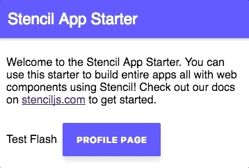
<ion-button onClick={() => this.testFlash()}>Test Flash</ion-button>
<stencil-route-link url="/profile/stencil">
<button>Profile page</button>
</stencil-route-link>
</div>
);
}
}We have just set up a “Test Flash” button that will call the following function when clicked:
testFlash(){
    let flashComponent = document.querySelector('my-flash');
    flashComponent.show('Our SCV's are under attack!', 'danger', 2000);
  }
All we need to do is get a reference to the element, and then we can call the method. In this case, we are using the danger styling and use a time of 2000ms, or 2s. It is important to note that you can not use document.getElementById to grab a reference to the component – if you do, the call to show will fail and it will appear as though the method does not exist. Instead, we can use querySelector. If you would like to know why this happens, this article explains it well.
If you were to run the application now and test out the component, it should look like this:
Summary
Although using the injectable service in Angular was a convenient way to control the flash messages, in some ways this approach with Stencil is better because the component is now completely encapsulated/self-contained. However, the two different approaches are more or less the same – the syntax just looks a little different (and even the syntax is very similar). The main benefit now is that we could use this Stencil web component anywhere, we aren’t limited to just using it within Angular.