

In this tutorial, we are going to improve upon the flash message service that we created in the last tutorial. I offered some suggestions for improving the service at the end of that tutorial which included:
- Allowing for different messages styles (success, danger, warning, etc.)
- Displaying a bar to indicate how long the message will be displayed
- Adding an indicator to communicate that the message can be closed by being tapped
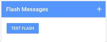
We will be adding all of these features to the flash message service in this tutorial, and this will also include building another custom component to serve as the timing indicator. When we are done, the flash messages will look like this:
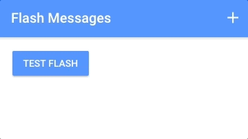
versus what it looked like in the last tutorial:
This certainly looks a lot cooler, but it is important to keep in mind how these UI (User Interface) changes are going to positively affect the UX (User Experience). Styling the messages appropriately allow us to more easily communicate the intent of the message – i.e. is this just a friendly reminder? or should the user be worried about something? By adding the time indicator bar we achieve two things: this suggests to the user that the message will disappear on its own, and it also communicates how long until that happens. Adding some kind of indicator that the message can be closed also communicates that fact to the user, otherwise they may always just wait until it closes on its own.
Once we have finished this tutorial, we will be able to include an optional extra parameter in our flash messages to determine the style of the message, i.e:
this.flashProvider.show('Base is under attack!', 2000, 'danger');Later on in this tutorial, we will also get a chance to look at an interesting feature of @ViewChild called a setter, which will allow us to circumvent an issue that arises due to the nature of our flash message service.
Before We Get Started
Last updated for Ionic 3.9.2
Before you go through this tutorial, you should have at least a basic understanding of Ionic concepts. You must also already have Ionic set up on your machine.
If you’re not familiar with Ionic already, I’d recommend reading my Ionic Beginners Guide first to get up and running and understand the basic concepts. If you want a much more detailed guide for learning Ionic, then take a look at Building Mobile Apps with Ionic.
NOTE: This is a continuation of a previous tutorial, if you want to follow along step-by-step you will need to complete this tutorial first.
Build the Time Bar Component
I struggled with what to actually call this component. It is an established UI pattern – a bar that shrinks to indicate time remaining – but I wasn’t able to find what the accepted term for it is. A few suggestions on Twitter were just “progress bar”, or “release bar”, or “reverse progress bar”… personally, it reminds me of a fuse (like dynamite), but whatever, we are just going to build the thing.
Run the following command to generate the component:
ionic g component TimeBarThe general idea behind this component is quite simple. We have a bar that takes up 100% width, and then we want to animate it down to 0% width over a period of time. The tricky part is that we need to make that animation time customisable, so that it matches the length that the flash message will be displayed.
Let’s start by implementing the template and styling for the template, and then we will get into the logic.
Modify src/components/time-bar/time-bar.html to reflect the following:
<div class="time-bar"></div>Modify src/components/time-bar/time-bar.scss to reflect the following:
time-bar {
  width: 100%;
  height: 8px;

  .time-bar {
    height: 100%;
    width: 100%;
    background-color: #fff;
    opacity: 0.3;
  }
}
Nice and simple. We have the parent container set to 100% width, and inside of that we have the .time-bar which is also 100% width for now but we will be animating that width. Now let’s take a look at the logic.
Modify src/components/time-bar/time-bar.ts to reflect the following:
import { Component, ElementRef, Renderer2 } from '@angular/core';

@Component({
  selector: 'time-bar',
  templateUrl: 'time-bar.html'
})
export class TimeBarComponent {

    constructor(private renderer: Renderer2, private element: ElementRef) {

    }

    startTimer(time){

        this.renderer.setStyle(this.element.nativeElement.children[0], 'transition', 'width ' + time + 'ms linear');

        setTimeout(() => {
            this.renderer.setStyle(this.element.nativeElement.children[0], 'width', '0%');
        }, 0);

    }

}
We just have a single method here that will trigger the timer to start called startTimer and we supply it with the length of time that we want the timer to last. All we need to do is set some styles on the .time-bar element. We first set the transition property with the appropriate amount of time, so that the width change will be animated appropriately. Then we just change the width to 0% and it will animate to that length over the specified time. However, we do put it into a setTimeout so that the code is run asynchronously – if we don’t do this, the transition property won’t take effect properly. Please keep in mind that you generally shouldn’t rely on setTimeout to deal with timing issues, but sometimes it is necessary.
If you are unfamiliar with using Renderer and ElementRef you should check out this tutorial (it is important to use Renderer rather than modifying elements directly).
Integrate Time Bar with the Flash Message Service
Our time bar should now be working as we want. You could even just drop it anywhere you like by adding:
<time-bar></time-bar>But, we are going to integrate it into our existing flash message service. We will start by adding our new component to our flash message component.
Modify src/components/flash/flash.html to reflect the following:
<div (click)="hide()" @messageState *ngIf="active" class="flash-container">
  <time-bar></time-bar>

  <div class="message">{{message}}</div>
</div>
We will also need to add some styling to the time bar for it to display properly, but we will get to that in the next section. For now, let’s focus on the logic for integrating the time bar.
Modify src/components/flash/flash.ts to reflect the following:
import { Component, ViewChild, QueryList } from '@angular/core';
import { FlashProvider } from '../../providers/flash/flash';
import { TimeBarComponent } from '../time-bar/time-bar';
import { trigger, state, style, animate, transition } from '@angular/animations';

@Component({
    selector: 'flash',
    templateUrl: 'flash.html',
    animations: [
        trigger('messageState', [
            transition('void => *', [
                style({transform: 'translateY(-100%)'}),
                animate('200ms ease-out')
            ]),
            transition('* => void', [
                animate('200ms ease-in', style({opacity: '0'}))
            ])
        ])
    ]
})
export class FlashComponent {

    @ViewChild(TimeBarComponent) set tb(timeBar: TimeBarComponent) {

        if(typeof(timeBar) !== 'undefined'){
            timeBar.startTimer(this.duration);
        }

    }

    private active: boolean = false;
    private message: string = '';
    private duration: number;
    private timeout;

    constructor(private flashProvider: FlashProvider) {

        this.flashProvider.show = this.show.bind(this);
        this.flashProvider.hide = this.hide.bind(this);

    }

    show(message, duration){

        this.message = message;
        this.active = true;
        this.duration = duration;

        this.timeout = setTimeout(() => {
            this.active = false;
        }, duration);

    }

    hide(){
        this.active = false;
        clearTimeout(this.timeout);
    }

}
Most of what is here is just stuff we covered in the last tutorial, but we are actually doing something pretty interesting here to get the time bar working. In order to start the timer on the time bar, we need to grab a reference to it and then call the startTimer method. You might think that we would trigger the startTimer method inside of show, but instead, we do this:
@ViewChild(TimeBarComponent) set tb(timeBar: TimeBarComponent) {

        if(typeof(timeBar) !== 'undefined'){
            timeBar.startTimer(this.duration);
        }

    }
If you are familiar with @ViewChild then it probably won’t surprise you that we are using it to grab a reference to the time bar. If you are not familiar with @ViewChild then I would recommend reading this tutorial – in short, @ViewChild allows you to grab a reference to components in the view. The difference here is that we aren’t just using @ViewChild to grab a reference, we are using a “setter function” to trigger the startTimer method.
The issue we are trying to solve is that the entire flash message component, including our time bar, is surrounded in an *ngIf structural directive. This means that when we first attempt to grab a reference to the time bar, it isn’t going to exist in the DOM. This setter function will be triggered when the time bar is added to the DOM, which happens as soon as we trigger the flash message, so we can instead use that to trigger the starting of the timer.
Typically, you would probably use the setter function to set the value of a class member like this.timeBar and then access that elsewhere in the class, but since we just need to trigger the behaviour immediately we can do it from within the setter function.
Add Message Styles
Creating the time bar was the most complicated of the changes we wanted to make, now we will be adding in the different message types as well as a “tap to dismiss” message. We will be setting up styles to reflect the default colour variables that are included in Ionic, e.g: primary, secondary, danger, light, dark. We are also going to add in the styles for our time bar so that it displays more nicely inside of the flash message.
First, let’s modify our flash component so that the show method accepts an optional type parameter – you could supply the type as primary, for example. We will set whatever parameter is passed in on a class member called activeClass.
Modify src/components/flash/flash.ts to reflect the following:
import { Component, ViewChild, QueryList } from '@angular/core';
import { FlashProvider } from '../../providers/flash/flash';
import { TimeBarComponent } from '../time-bar/time-bar';
import { trigger, state, style, animate, transition } from '@angular/animations';

@Component({
    selector: 'flash',
    templateUrl: 'flash.html',
    animations: [
        trigger('messageState', [
            transition('void => *', [
                style({transform: 'translateY(-100%)'}),
                animate('200ms ease-out')
            ]),
            transition('* => void', [
                animate('200ms ease-in', style({opacity: '0'}))
            ])
        ])
    ]
})
export class FlashComponent {

    @ViewChild(TimeBarComponent) set tb(timeBar: TimeBarComponent) {

        if(typeof(timeBar) !== 'undefined'){
            timeBar.startTimer(this.duration);
        }

    }

    private active: boolean = false;
    private message: string = '';
    private duration: number;
    private timeout;
    private activeClass = 'secondary';

    constructor(private flashProvider: FlashProvider) {

        this.flashProvider.show = this.show.bind(this);
        this.flashProvider.hide = this.hide.bind(this);

    }

    show(message, duration, type?){

        this.message = message;
        this.active = true;
        this.duration = duration;

        if(type){
            this.activeClass = type;
        }

        this.timeout = setTimeout(() => {
            this.active = false;
        }, duration);

    }

    hide(){
        this.active = false;
        clearTimeout(this.timeout);
    }

}
Now, the activeClass class member will specify the type of message we want to display. We can then use ngClass in our template to add that class to the flash message component.
Modify src/components/flash/flash.html to reflect the following:
<div
  (click)="hide()"
  @messageState
  *ngIf="active"
  class="flash-container"
  [ngClass]="activeClass"
>
  <time-bar></time-bar>

  <div class="message">{{message}}</div>

  <p class="dismiss">tap to dismiss</p>
</div>
If you are unfamiliar with using ngClass, you might be interested in checking our this video. Now if we have activeClass set to primary then our container for the flash bar component will be given a class of primary. We have also added the “tap to dismiss” message above as well. Now we just need to add the appropriate styles.
Modify src/components/flash/flash.scss to reflect the following:
flash {
  .flash-container {
    position: absolute;
    top: 0;
    width: 100%;
    height: 56px;
    color: #fff;
    z-index: 1;
    display: flex;
    align-items: center;
    justify-content: center;

    time-bar {
      position: absolute;
      top: 0;
    }

    .dismiss {
      position: absolute;
      bottom: 0;
      margin: 0 0 5px 0;
      font-size: 0.7em;
      opacity: 0.5;
    }
  }

  .primary {
    background-color: map-get($colors, primary);
  }

  .secondary {
    background-color: map-get($colors, secondary);
  }

  .danger {
    background-color: map-get($colors, danger);
  }

  .light {
    background-color: map-get($colors, light);
  }

  .dark {
    background-color: map-get($colors, dark);
  }
}
We’ve added a class for each of the colour variables – you could also add more if you wish. We have also styled the dismiss message, and the time bar. Now we can use the updated version of our flash message service.
Modify src/pages/home/home.ts to reflect the following:
import { Component } from '@angular/core';
import { NavController } from 'ionic-angular';
import { FlashProvider } from '../../providers/flash/flash';

@Component({
  selector: 'page-home',
  templateUrl: 'home.html'
})
export class HomePage {

    constructor(public navCtrl: NavController, private flashProvider: FlashProvider) {

    }

    ionViewDidLoad(){

    }

    testFlash(){
        this.flashProvider.show('Base is under attack!', 2000, 'danger');
    }

}
You can supply any of the styles we added to the show method, or if you supply none it will use the default of secondary. If you test it out now, it should look something like this:
Summary
With a few relatively simple changes, we have greatly improved the experience that our flash message service provides to the user. We haven’t just created something that looks cooler, we’ve also put consideration into how those changes are actually going to create a better experience. We also now have a generic time bar component that we can use elsewhere in our applications!