

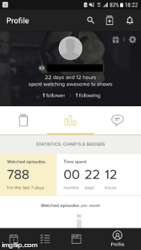
I was browsing the Ionic Forums earlier this week, and came across a post asking if it was possible to create a layout in Ionic where a header would be initially displayed above a segment, that would shrink away as the user scrolled (leaving the segment selections now sitting at the top of the screen). This gif was given as an example.
I’ve already built a component to create similar functionality recently when I wrote Creating a Custom Expandable Header Component for Ionic. That component was to be added to the header area of the application and it would start out expanded initially and display a couple of inputs, as the user scrolled the header area would shrink and the inputs would disappear.
That component will just about already do exactly what we need for this functionality, we will just be making a couple of tweaks to that and applying it in a different context. As such, I won’t spend too much time in this tutorial talking about some of the specifics of the way the component works, I’ll let you read the previous tutorial if you are interested in that, we will just focus on building out the solution.
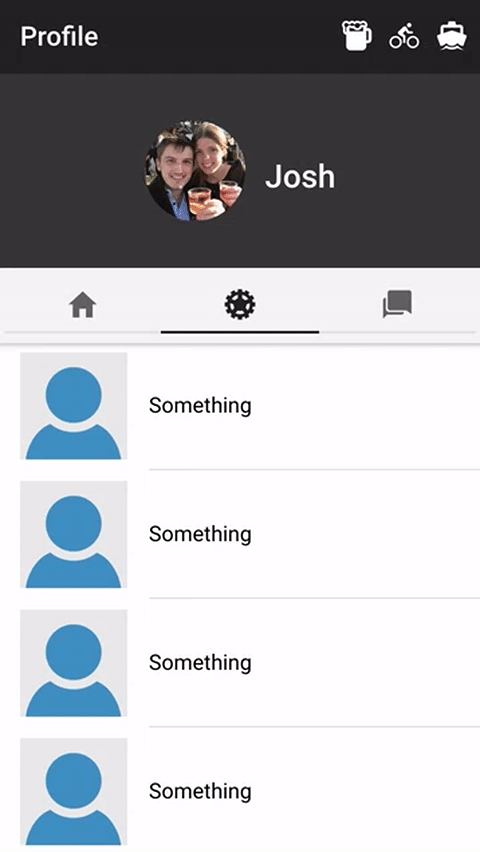
Here’s what it will look like when we are done:
Before We Get Started
Last updated for Ionic 3.9.2
Before you go through this tutorial, you should have at least a basic understanding of Ionic concepts. You must also already have Ionic set up on your machine.
If you’re not familiar with Ionic already, I’d recommend reading my Ionic Beginners Guide or watching my beginners series first to get up and running and understand the basic concepts. If you want a much more detailed guide for learning Ionic, then take a look at Building Mobile Apps with Ionic.
1. Generate a New Ionic Application
We’re going to start by generating a new blank Ionic application, to do that just run the following command:
ionic start ionic-shrinking-segment-header blankOnce that has finished generating, you should make it your working directory by running the following command:
cd ionic-shrinking-segment-header blankWe will just need to generate a single component for this application, so let’s do that now by running the following command:
ionic g component ShrinkingSegmentHeaderIn order to be able to use that component throughout our application, we will need to add it to our app.module.ts file.
Modify src/app/app.module.ts to reflect the following:
import { BrowserModule } from '@angular/platform-browser';
import { ErrorHandler, NgModule } from '@angular/core';
import { IonicApp, IonicErrorHandler, IonicModule } from 'ionic-angular';
import { SplashScreen } from '@ionic-native/splash-screen';
import { StatusBar } from '@ionic-native/status-bar';

import { MyApp } from './app.component';
import { HomePage } from '../pages/home/home';

import { ShrinkingSegmentHeader } from '../components/shrinking-segment-header/shrinking-segment-header';

@NgModule({
  declarations: [MyApp, HomePage, ShrinkingSegmentHeader],
  imports: [BrowserModule, IonicModule.forRoot(MyApp)],
  bootstrap: [IonicApp],
  entryComponents: [MyApp, HomePage],
  providers: [
    StatusBar,
    SplashScreen,
    { provide: ErrorHandler, useClass: IonicErrorHandler },
  ],
})
export class AppModule {}
2. Implement the Shrinking Header Component
This component is actually really quite simple, and it’s even simpler than the component we used in the previous tutorial because we don’t need logic to handle hiding inputs at certain thresholds.
We will start off with the template, which will just contain a simple content projection.
Modify src/components/shrinking-segment-header/shrinking-segment-header.html to reflect the following:
<ng-content></ng-content>All this will do is project whatever we add inside of the component into the component’s template. Again, if you’re interested in learning more about the details of this, I’d recommend reading the previous tutorial.
In order for the header to display properly, we will just need to add a block display style to the .scss file for the component.
Modify src/components/shrinking-segment-header/shrinking-segment-header.scss to reflect the following:
shrinking-segment-header {
  display: block;
}
Now let’s move on to the main part of the component.
Modify src/components/shrinking-segment-header/shrinking-segment-header.ts to reflect the following:
import { Component, Input, ElementRef, Renderer } from '@angular/core';

@Component({
  selector: 'shrinking-segment-header',
  templateUrl: 'shrinking-segment-header.html'
})
export class ShrinkingSegmentHeader {

  @Input('scrollArea') scrollArea: any;
  @Input('headerHeight') headerHeight: number;

  newHeaderHeight: any;

  constructor(public element: ElementRef, public renderer: Renderer) {

  }

  ngAfterViewInit(){

    this.renderer.setElementStyle(this.element.nativeElement, 'height', this.headerHeight + 'px');

    this.scrollArea.ionScroll.subscribe((ev) => {
      this.resizeHeader(ev);
    });

  }

  resizeHeader(ev){

    ev.domWrite(() => {

      this.newHeaderHeight = this.headerHeight - ev.scrollTop;

      if(this.newHeaderHeight < 0){
        this.newHeaderHeight = 0;
      }

      this.renderer.setElementStyle(this.element.nativeElement, 'height', this.newHeaderHeight + 'px');

    });

  }

}
Although this uses the same logic as the previous tutorial, I will recap quickly. This component accepts two inputs: a headerHeight that will define how big the header area should be, and a scrollArea that the component will listen to for scroll events and resize accordingly.
In the ngAfterViewInit function we set up the component by setting the initial height, as supplied by the input, and we set up a listener for the scroll events that will call resizeHeader every time a scroll event occurs. That’s all there is to it!
3. Use the Shrinking Header Component
Now that we have the component defined, we just need to use it in conjunction with a segment. We will also add a bit of styling to make things look a little nicer.
Modify src/pages/home/home.html to reflect the following:
<ion-header>
  <ion-navbar color="dark">
    <ion-title> Profile </ion-title>
    <ion-buttons right>
      <button ion-button icon-only><ion-icon name="beer"></ion-icon></button>
      <button ion-button icon-only><ion-icon name="bicycle"></ion-icon></button>
      <button ion-button icon-only><ion-icon name="boat"></ion-icon></button>
    </ion-buttons>
  </ion-navbar>

  <shrinking-segment-header [scrollArea]="myContent" headerHeight="150">
    <img src="https://avatars.io/instagram/pathmoretravelled" />
    <h2>Josh</h2>
  </shrinking-segment-header>

  <ion-toolbar color="light" mode="md">
    <ion-segment color="dark" mode="md" [(ngModel)]="section">
      <ion-segment-button value="one">
        <ion-icon name="home"></ion-icon>
      </ion-segment-button>
      <ion-segment-button value="two">
        <ion-icon name="cog"></ion-icon>
      </ion-segment-button>
      <ion-segment-button value="three">
        <ion-icon name="chatbubbles"></ion-icon>
      </ion-segment-button>
    </ion-segment>
  </ion-toolbar>
</ion-header>

<ion-content fullscreen #myContent>
  <div [ngSwitch]="section">
    <ion-list *ngSwitchCase="'one'">
      <ion-item *ngFor="let something of somethings">
        <ion-thumbnail item-left>
          <img src="https://avatars.io/instagram/unknown" />
        </ion-thumbnail>
        <h2>Something</h2>
      </ion-item>
    </ion-list>

    <ion-list *ngSwitchCase="'two'">
      <ion-item *ngFor="let something of somethings">
        <ion-thumbnail item-left>
          <img src="https://avatars.io/instagram/unknown" />
        </ion-thumbnail>
        <h2>Something</h2>
      </ion-item>
    </ion-list>

    <ion-list *ngSwitchCase="'three'">
      <ion-item *ngFor="let something of somethings">
        <ion-thumbnail item-left>
          <img src="https://avatars.io/instagram/unknown" />
        </ion-thumbnail>
        <h2>Something</h2>
      </ion-item>
    </ion-list>
  </div>
</ion-content>
For the most part, this template is just a normal segment with three different cases and a bunch of dummy content. However, we have added the <shrinking-segment-header> component above the segment in the header, and we have supplied that with an input of the headerHeight we want to use and the element that it should listen to for scroll events (which is the <ion-content> area that we added the #myContent template variable to).
We will need to add a couple of styles to this to get it looking how we want.
Modify src/pages/home/home.scss to reflect the following:
page-home {
  shrinking-segment-header {
    background-color: #363636;
    color: #fff;
    display: flex;
    align-items: center;
    justify-content: center;

    img {
      border-radius: 50%;
      width: 75px;
      height: auto;
      margin-right: 15px;
    }
  }
}
Finally, we just need to implement the TypeScript file for the Home Page.
Modify src/pages/home/home.ts to reflect the following:
import { Component } from '@angular/core';
import { NavController } from 'ionic-angular';

@Component({
  selector: 'page-home',
  templateUrl: 'home.html'
})
export class HomePage {

    section: string = 'two';
    somethings: any = new Array(20);

    constructor(public navCtrl: NavController) {

    }

}
This file is quite simple as well. We just set up the variable being used to switch between our various segments and a somethings array that we are just using to create a bunch of dummy data inside an *ngFor loop in the template.
If you run the code in your browser now, you should have a fully functional shrinking header component above your segments.
Summary
If you’ve read both of the tutorials related to this component, then you would likely notice that there are very few differences between the two implementations. That’s the benefit of a well-designed component, it can just about be dragged and dropped into any application and used in a variety of different circumstances.