

One of my favourite pastimes is trying to implement cool looking user interfaces that people send me in Ionic 2. A little while ago, somebody sent through this example from AirBnB.
I set out to build a simple implementation of this, and ended up with a custom component that looks like this:
The header height can be configured, and then as the header scrolls, any elements that start getting cut off by the expandable header shrinking will fade away (and fade back in where there is room again).
I’ve actually recorded myself building this “live” on a screencast, so if you would like to follow along with how I built it rather than seeing the end result right away, you can take a look at these two videos:
Those videos cover building most of the functionality in an ad-hoc manner, but this blog post will be a more structured tutorial that will step through building the end result. I’ve taken some time to polish up the work I did in the videos, and also added some styling to make it all look a little nicer.
Before We Get Started
Last updated for Ionic 3.9.2
Before you go through this tutorial, you should have at least a basic understanding of Ionic 2 concepts. You must also already have Ionic 2 installed on your machine.
If you’re not familiar with Ionic 2 already, I’d recommend reading my Ionic 2 Beginners Guide first to get up and running and understand the basic concepts. If you want a much more detailed guide for learning Ionic 2, then take a look at Building Mobile Apps with Ionic 2.
You should also have a basic understanding of how custom components work in Ionic 2, if you are not also familiar with this then I would recommend taking a look at this video first.
1. Generate a New Ionic 2 Application
Let’s start by creating a new Ionic 2 application with the following command:
ionic start ionic2-expandable-header blankOnce that has finished generating, you should make it your current working directory by running the following command:
cd ionic2-expandable-headerWe are also going to generate the custom component that we will be implementing in this tutorial, so you should also run the following command:
ionic g component ExpandableHeaderAnd so that we are able to use that component, we also need to add it to the app.module.ts file.
Modify app.module.ts to reflect the following:
import { BrowserModule } from '@angular/platform-browser';
import { NgModule, ErrorHandler } from '@angular/core';
import { IonicApp, IonicModule, IonicErrorHandler } from 'ionic-angular';
import { SplashScreen } from '@ionic-native/splash-screen';
import { StatusBar } from '@ionic-native/status-bar';

import { MyApp } from './app.component';
import { HomePage } from '../pages/home/home';
import { ExpandableHeader } from '../components/expandable-header/expandable-header';

@NgModule({
  declarations: [MyApp, HomePage, ExpandableHeader],
  imports: [BrowserModule, IonicModule.forRoot(MyApp)],
  bootstrap: [IonicApp],
  entryComponents: [MyApp, HomePage],
  providers: [
    StatusBar,
    SplashScreen,
    { provide: ErrorHandler, useClass: IonicErrorHandler },
  ],
})
export class AppModule {}
IMPORTANT: If you plan on using this component on iOS, you should also install the WKWebView plugin.
2. Implement the Expandable Header Component
We’re going to jump straight into implementing the component now. The code is reasonably small for this component, but there are a few things that we will need to talk through.
Modify src/components/expandable-header/expandable-header.ts to reflect the following:
import { Component, Input, ElementRef, Renderer } from '@angular/core';

@Component({
  selector: 'expandable-header',
  templateUrl: 'expandable-header.html'
})
export class ExpandableHeader {

  @Input('scrollArea') scrollArea: any;
  @Input('headerHeight') headerHeight: number;

  newHeaderHeight: any;

  constructor(public element: ElementRef, public renderer: Renderer) {

  }

  ngOnInit(){

    this.renderer.setElementStyle(this.element.nativeElement, 'height', this.headerHeight + 'px');

    this.scrollArea.ionScroll.subscribe((ev) => {
      this.resizeHeader(ev);
    });

  }

  resizeHeader(ev){

    ev.domWrite(() => {

      this.newHeaderHeight = this.headerHeight - ev.scrollTop;

      if(this.newHeaderHeight < 0){
        this.newHeaderHeight = 0;
      }

      this.renderer.setElementStyle(this.element.nativeElement, 'height', this.newHeaderHeight + 'px');

      for(let headerElement of this.element.nativeElement.children){

        let totalHeight = headerElement.offsetTop + headerElement.clientHeight;

        if(totalHeight > this.newHeaderHeight && !headerElement.isHidden){
          headerElement.isHidden = true;
          this.renderer.setElementStyle(headerElement, 'opacity', '0');
        } else if (totalHeight <= this.newHeaderHeight && headerElement.isHidden) {
          headerElement.isHidden = false;
          this.renderer.setElementStyle(headerElement, 'opacity', '0.7');
        }

      }

    });

  }

}
We set up two @Input’s for this component, the scrollArea and headerHeight. The scrollArea is the area we are listening to for scroll events to determine when the header should expand and shrink (which will just be the <ion-content> area), and the headerHeight is simply a number that determines how tall the expandable header should be.
In the ngOnInit hook, we set up the initial state of the component. We want to set the height of the expandable header element to whatever value was provided, and we also start listening for scroll events on the scrollArea here and pass them to the resizeHeader function.
The resizeHeader function is what controls expanding and shrinking the header. Setting the height of the header is simple enough, we just subtract whatever the scrollTop is (that’s the distance the user has scrolled from the top of the content area) from the initial header height. Once the user has scrolled more than the height of the header, it will disappear completely.
The harder bit is calculating when to hide the elements that are contained inside of the header. To do this, we loop through all of the children of the expandable header element and check to see if the bottom of the element has been cut off by the header yet. By combining the offsetTop with the clientHeight of each element, we are able to work out where the bottom of the element actually is in relation to the header. This diagram may illustrate that concept a little better: [IMAGE]
When we detect that the bottom of a headerElement has collided with the bottom of the expandable header, we hide it. When we detect that there is room again to show the element, we display it again. So that we aren’t unnecessarily setting the opacity of the elements (i.e. hiding the element when it is already hidden) we keep track of whether the headerElement is currently being displayed or not by adding an isHidden property. For performance reasons, we want to avoid DOM updates wherever possible.
We also wrap this whole process inside of a domWrite, which will allow Ionic to schedule the DOM updates efficiently. Let’s add the template for the component now.
Modify src/components/expandable-header/expandable-header.html to reflect the following:
<ng-content></ng-content>The template for this component is super simple. All we do is set up content projection with <ng-content> so that anything we place inside of the <expandable-header> tags wherever we want to use the component will be projected into here. This is what will allow us to add whatever elements we want to the component.
Now we just need to add a few styles for this component.
Modify src/components/expandable-header/expandable-header.scss to reflect the following:
expandable-header {
  display: block;
  background-color: map-get($colors, primary);
  overflow: hidden;
}
It’s important that the overflow property is set here, otherwise, the content in the header will spill over into the content area when the expandable header is no longer visible.
3. Add the Component to a Template
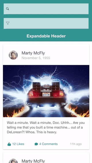
The component is completed now, so now we just need to use it in a template. We are going to add an example to the HomePage.
Modify src/pages/home/home.html to reflect the following:
<ion-header>
  <expandable-header [scrollArea]="mycontent" headerHeight="125">
    <ion-item>
      <ion-label><ion-icon name="search"></ion-icon></ion-label>
      <ion-input type="text"></ion-input>
    </ion-item>

    <ion-item>
      <ion-label><ion-icon name="funnel-outline"></ion-icon></ion-label>
      <ion-input type="text"></ion-input>
    </ion-item>
  </expandable-header>

  <ion-navbar color="primary">
    <ion-title> Expandable Header </ion-title>
  </ion-navbar>
</ion-header>

<ion-content fullscreen #mycontent>
  <ion-card *ngFor="let test of testData">
    <ion-item>
      <ion-avatar item-left>
        <img
          src="https://ionicframework.com/dist/preview-app/www/assets/img/marty-avatar.png"
        />
      </ion-avatar>
      <h2>Marty McFly</h2>
      <p>November 5, 1955</p>
    </ion-item>

    <img
      src="https://ionicframework.com/dist/preview-app/www/assets/img/advance-card-bttf.png"
    />

    <ion-card-content>
      <p>
        Wait a minute. Wait a minute, Doc. Uhhh... Are you telling me that you
        built a time machine... out of a DeLorean?! Whoa. This is heavy.
      </p>
    </ion-card-content>

    <ion-row>
      <ion-col>
        <button ion-button icon-left clear small>
          <ion-icon name="thumbs-up"></ion-icon>
          <div>12 Likes</div>
        </button>
      </ion-col>
      <ion-col>
        <button ion-button icon-left clear small>
          <ion-icon name="text"></ion-icon>
          <div>4 Comments</div>
        </button>
      </ion-col>
      <ion-col center text-center>
        <ion-note> 11h ago </ion-note>
      </ion-col>
    </ion-row>
  </ion-card>
</ion-content>
Most of this is just example content to make the example look a little nicer. The important parts are that we add some inputs inside of <expandable-header> and we also set up a local variable called #mycontent on the <ion-content> area, and pass that into the component using the scrollArea input. It’s also important that the fullscreen attribute is added to the <ion-content> area so that the header displays correctly.
Now we just need to add a little more styling for the HomePage.
Modify src/pages/home/home.scss to reflect the following:
.ios,
.md {
  page-home {
    ion-item {
      width: 92%;
      margin: 4%;
      padding-left: 10px !important;
      margin-bottom: 10px;
      background-color: #fff;
      opacity: 0.7;
      font-size: 0.9em;
      transition: 0.2s linear;
    }
  }
}
This is mostly just general styling for the input elements, but I have also added the transition property here so that the elements animate in and out when they are hidden or shown. If you do not add this property, the elements will just pop in and out instantly.
Summary
There are still likely a few improvements that could be made to this component, but the end result is quite good. It will perform well on devices since we are making efficient writes to the DOM, and it is also easy to configure and reuse anywhere in an application.