

In recent tutorials, I have been walking through how to build a custom Flash Card component in Ionic 2, including a video which goes a little more in-depth.
I didn’t want to stop there, the flash card is a super cool looking component and has a lot of practical purposes, so I wanted to put it to use in more of a real-world scenario. This is what I created:
It’s a quiz application for kids, which makes use of the flash card component to display the correct answer for the questions. In this tutorial, we are going to walk through how to build it. Here’s what we will cover:
- How to use @Input to provide configuration to a custom component
- How to create a quiz style interface
- How to import data from a JSON file to use in the application
Before We Get Started
Last updated for Ionic 3.2.1
Before you go through this tutorial, you should have at least a basic understanding of Ionic 2 concepts. You must also already have Ionic 2 set up on your machine.
If you’re not familiar with Ionic 2 already, I’d recommend reading my Ionic 2 Beginners Guide first to get up and running and understand the basic concepts. If you want a much more detailed guide for learning Ionic 2, then take a look at Building Mobile Apps with Ionic 2.
1. Generate a new Ionic 2 Project
Let’s start by creating a new Ionic 2 project. You can do that by running the following command:
ionic start ionic2-kids-quiz blank --v2Once that has finished generating, you should make it your working directory by running the following command:
cd ionic2-kids-quizNow we are going to generate a few things that our application will need. We are going to need to generate the component for the flash card, as well as a provider for the data that we want to pull into the application.
Run the following commands:
ionic g component FlashCardionic g provider DataAfter generating those, we will also need to set them up in our module file.
Modify src/app/app.module.ts to reflect the following:
import { BrowserModule } from '@angular/platform-browser';
import { NgModule, ErrorHandler } from '@angular/core';
import { HttpModule } from '@angular/http';
import { IonicApp, IonicModule, IonicErrorHandler } from 'ionic-angular';
import { SplashScreen } from '@ionic-native/splash-screen';
import { StatusBar } from '@ionic-native/status-bar';

import { MyApp } from './app.component';
import { HomePage } from '../pages/home/home';
import { FlashCardComponent } from '../components/flash-card/flash-card';
import { Data } from '../providers/data';

@NgModule({
  declarations: [MyApp, HomePage, FlashCardComponent],
  imports: [BrowserModule, HttpModule, IonicModule.forRoot(MyApp)],
  bootstrap: [IonicApp],
  entryComponents: [MyApp, HomePage],
  providers: [
    StatusBar,
    SplashScreen,
    { provide: ErrorHandler, useClass: IonicErrorHandler },
    Data,
  ],
})
export class AppModule {}
We are also going to be making use of some images for the flash cards in this tutorial. If you would like to use the same ones as me you can just grab the source code for this tutorial by signing up below. If you prefer, you can just as easily use your own images, use a simple http://placehold.it/200 placeholder image, or even just use text instead of an image.
If you are using images, make sure they are placed in the assets/images folder. You will need to manually create the images folder.
2. Create the Flash Card Component
If you’ve read or watched the Flash Card component tutorial, then you would already have some idea of how this component works.
The component that we use in this tutorial will be mostly the same, but, there will be some minor changes. In the tutorials above, the flash card component flips based on when the user clicks the component. We don’t want that to happen in this case, we want to be able to programatically control when the card flips (i.e. when the user selects an answer).
We’re going to need to make some minor changes to achieve this. I’m going to post the code for the component first, and then we will discuss what is different. I’m going to skip over most of the technical details because I already covered those in the previous tutorials.
NOTE: I mentioned this in the other tutorial, but I want to make sure you know that the CSS animation for this component was created by David Walsh. You should definitely go check his blog out.
Modify src/components/flash-card.scss to reflect the following:
.ios,
.md {
  flash-card {
    /*
         *  Flip animation by David Walsh: https://davidwalsh.name/css-flip
         */

    /* entire container, keeps perspective */
    .flip-container {
      perspective: 1000px;
    }

    /* flip the pane when hovered */
    .flip-container.flipped .flipper {
      transform: rotateY(180deg);
    }

    .flip-container,
    .front,
    .back {
      width: 90vw;
      height: 40vh;
      margin: 20px auto;
    }

    /* flip speed goes here */
    .flipper {
      transition: 0.6s;
      transform-style: preserve-3d;

      position: relative;
    }

    /* hide back of pane during swap */
    .front,
    .back {
      display: flex;
      align-items: center;
      justify-content: center;
      background-color: #ecf0f1;
      backface-visibility: hidden;
      -webkit-box-shadow: 0px 8px 4px -4px rgba(163, 163, 163, 0.25);
      -moz-box-shadow: 0px 8px 4px -4px rgba(163, 163, 163, 0.25);
      box-shadow: 0px 8px 4px -4px rgba(163, 163, 163, 0.25);
      border: 1px solid #dee2e3;
      margin: 0;
      position: absolute;
      top: 0;
      left: 0;
    }

    /* front pane, placed above back */
    .front {
      z-index: 2;
      /* for firefox 31 */
      transform: rotateY(0deg);
    }

    /* back, initially hidden pane */
    .back {
      transform: rotateY(180deg);
    }
  }
}
Modify src/components/flash-card/flash-card.html to reflect the following:
<div class="flip-container" [class.flipped]="flipCard">
  <div class="flipper">
    <div class="front">
      <ng-content select=".flash-card-front"></ng-content>
    </div>

    <div class="back">
      <ng-content select=".flash-card-back"></ng-content>
    </div>
  </div>
</div>
Modify src/components/flash-card/flash-card.ts to reflect the following:
import { Component, Input } from '@angular/core';

@Component({
  selector: 'flash-card',
  templateUrl: 'flash-card.html',
})
export class FlashCardComponent {
  @Input('isFlipped') flipCard: boolean;

  constructor() {}
}
The difference in the component now is that we have removed the flip() function which we triggered when the card was clicked. Instead, we have added a conditional class called flipped which we apply only when the flipCard expression is true.
That flipCard value is determined with this:
@Input('isFlipped') flipCard: boolean;This @Input decorator is used to define input for the component. This will allow us to supply a value to the component by using the isFlipped property, and whatever value is being passed in is what will be assigned to the flipCard variable.
We’re going to implement this properly soon, but this is how the above would allow us to pass in the value from whatever page is using the component:
<flash-card [isFlipped]="someVariableWeToggle"></flash-card>Now rather than defining whether the card is flipped or not in the component itself, based on an interaction, we can now define that from wherever we are using the component. All we have to do is change that someVariableWeToggle value from true to false to flip the card.
3. Create the Quiz Page
Eventually we are going to pull in some data so that we can automatically display a bunch of different questions, but for now we are just going to set up one example question with the flash card.
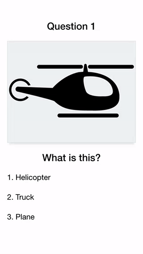
Modify src/pages/home/home.html to reflect the following
<ion-content>
  <ion-slides #slides>
    <ion-slide>
      <h3>Question 1</h3>

      <flash-card [isFlipped]="flashCardFlipped">
        <div class="flash-card-front">
          <img src="assets/images/helicopter.png" />
        </div>
        <div class="flash-card-back">Helicopter</div>
      </flash-card>

      <h3>What is this?</h3>

      <ion-list no-lines radio-group>
        <ion-item>
          <ion-label>1. Helicopter</ion-label>
          <ion-radio (click)="selectAnswer()"></ion-radio>
        </ion-item>

        <ion-item>
          <ion-label>2. Truck</ion-label>
          <ion-radio (click)="selectAnswer()"></ion-radio>
        </ion-item>

        <ion-item>
          <ion-label>3. Plane</ion-label>
          <ion-radio (click)="selectAnswer()"></ion-radio>
        </ion-item>
      </ion-list>
    </ion-slide>
  </ion-slides>
</ion-content>
We’ve set up a single slide now that has a question with some answer options, and a flash card. Right now we are just hard coding the values in, but in the next part we will generate these questions and answers dynamically.
The isFlipped property on the flash card component is set to flashCardFlipped so we are going to define a member variable in our TypeScript file to define that in just a moment. We also have each of the <ion-radio> elements triggering a selectAnswer function, which will handle changing the value of this flashCardFlipped variable. Once we set up the dynamic data we will be changing how this works, but for now we just want to see the flash card flipping when the user selects an answer.
You should also notice that we are supplying some options to the <ion-slides> component, which we will be using to do something a little tricky with our slides. The way in which we supply options to the <ion-slides> component (which is provided by Ionic) is the same concept as the way we are supplying configuration to our own custom flash card component.
Now we are going to set up the TypeScript file.
Modify src/pages/home/home.ts to reflect the following:
import { Component, ViewChild } from '@angular/core';
import { NavController } from 'ionic-angular';
import { Data } from '../../providers/data';

@Component({
  selector: 'page-home',
  templateUrl: 'home.html'
})
export class HomePage {

    @ViewChild('slides') slides: any;

    slideOptions: any;
    flashCardFlipped: boolean = false;

    constructor(public navCtrl: NavController, public dataService: Data) {

    }

    ionViewDidLoad() {

    }

    selectAnswer(){
        this.flashCardFlipped = true;
    }

}
This is mostly just a skeleton of what we will be building, we are going to add quite a bit to this in the next part of this tutorial series. We grab a reference to our slides component using the @ViewChild decorator, but we won’t be making use of that until the next tutorial (where we will use that reference to control navigation between slides).
We create the slideOptions object that we were supplying to the <ion-slides> component, and we set the onlyExternal option to true. You may have never seen this option before – what it does is prevent the user from navigating between slides with swiping gestures. Instead, we will have to manually trigger slide changes within our code. This is exactly the behaviour we want, because we don’t want the user to be able to skip over questions without providing an answer by swiping.
We also define the selectAnswer function which will switch the value of flashCardFlipped. Again, we will be modifying this function to work with some real data later, but for now we just want to see the flash card flip.
Summary
If you take a look at the application now it should look something like this:
We will have quite a way to go, but it’s starting to come together. In the next part, we will focus on loading in some real data, using multiple questions for the quiz, randomizing answers, adding scoring, making it look prettier and more.