

Flash cards are a useful little tool for remembering information, and they’ve been used as far back as the 19th century.
In recent tutorials, we have walked through how to build some custom Directives to modify the behaviour of Components in our applications. You can check them out below:
- Create a Sliding Item Animation with a Directive in Ionic 2
- How to Create a Directive in Ionic 2 – Parallax Header
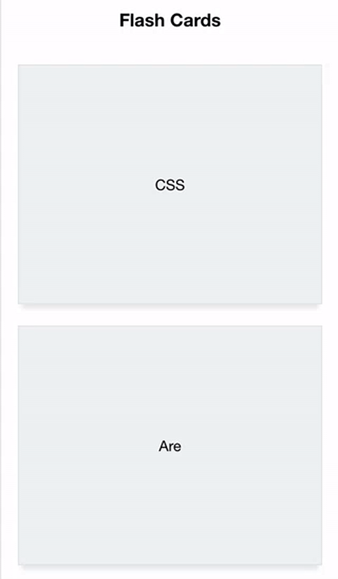
Both of those tutorials create some cool looking animations, and we will be creating a cool animation in just a moment as well, but we won’t be using a directive this time. In this tutorial, we will be building our own entirely new custom component in Ionic 2. In the end, it will look something like this:
As you’re probably aware, Ionic 2 provides a bunch of components by default, like these:
Cards
<ion-card></ion-card>Lists
<ion-list>
  <ion-item></ion-item>
</ion-list>
Grids
<ion-row>
  <ion-col></ion-col>
</ion-row>
but you aren’t limited to just using these, you can also create your very own reusable components, and we will be making a flash card component so that we can do this:
<flash-card>
  <div class="flash-card-front">FLASH CARDS</div>

  <div class="flash-card-back">ARE COOL</div>
</flash-card>
to create this:
Anywhere in our application, or any other application that we drop this component into!
NOTE: The CSS animation used for this component was created by David Walsh, so a big thanks to him for that since it adds about 99% of the cool factor to this component.
Before We Get Started
Last updated for Ionic 3.3.0
Before you go through this tutorial, you should have at least a basic understanding of Ionic 2 concepts. You must also already have Ionic 2 set up on your machine.
If you’re not familiar with Ionic 2 already, I’d recommend reading my Ionic 2 Beginners Guide first to get up and running and understand the basic concepts. If you want a much more detailed guide for learning Ionic 2, then take a look at Building Mobile Apps with Ionic 2.
1. Generate a New Ionic 2 Application
Let’s first create a new Ionic 2 application by running the following command:
ionic start ionic2-flash-card blankonce that has finished generating, you should make it your working directory:
cd ionic2-flash-cardand then we are going to create our component using the generate command:
ionic g component FlashCardthis will automatically generate the files we require for our component and put it into the components folder. Finally, we also need to set this new component up in our app.module.ts file.
Modify src/app/app.module.ts to reflect the following:
import { BrowserModule } from '@angular/platform-browser';
import { NgModule, ErrorHandler } from '@angular/core';
import { IonicApp, IonicModule, IonicErrorHandler } from 'ionic-angular';
import { SplashScreen } from '@ionic-native/splash-screen';
import { StatusBar } from '@ionic-native/status-bar';

import { MyApp } from './app.component';
import { HomePage } from '../pages/home/home';
import { FlashCardComponent } from '../components/flash-card/flash-card';

@NgModule({
  declarations: [MyApp, HomePage, FlashCardComponent],
  imports: [BrowserModule, IonicModule.forRoot(MyApp)],
  bootstrap: [IonicApp],
  entryComponents: [MyApp, HomePage],
  providers: [
    StatusBar,
    SplashScreen,
    { provide: ErrorHandler, useClass: IonicErrorHandler },
  ],
})
export class AppModule {}
2. What is a Component?
We’re going to move straight into the most interesting part of the tutorial, and that’s creating the Flash Card component. I’m not going to dive too deep into the theory of components, but essentially your Ionic 2 application is made up of a bunch of different components.
In short, a component is a way to wrap up a bunch of functionality into a custom HTML element. If you were to take a look at your index.html file you would see this:
<body>
  <!-- Ionic's root component and where the app will load -->
  <ion-app></ion-app>

  <!-- The polyfills js is generated during the build process -->
  <script src="build/polyfills.js"></script>

  <!-- The bundle js is generated during the build process -->
  <script src="build/main.js"></script>
</body>
In the code above, <ion-app> is a component. When you run your application, that’s not what you’ll see in the DOM, instead, the template for whatever the <ion-app> component is will be inserted there. In this case, that happens to be the root component of the application, which you will find in the app folder of the project. If we take a look at the template for the root component (in app.component.ts) you will see:
<ion-nav [root]="rootPage"></ion-nav>So, that <ion-nav> component will be injected into our application. But that is also a component, which is setting up whatever the rootPage component is. If we take a look at that:
<ion-header>
  <ion-navbar>
    <ion-title> Ionic Blank </ion-title>
  </ion-navbar>
</ion-header>

<ion-content padding>
  The world is your oyster.
  <p>
    If you get lost, the
    <a href="http://ionicframework.com/docs/v2">docs</a> will be your guide.
  </p>
</ion-content>
More components! All of these HTML elements will also each have their respective functionality injected into the application, but I’m going to stop it there because I think you get the point. An Ionic 2 application (any Angular 2 application for that matter) is components inside of components inside of components.
Like <ion-header>, <ion-navbar>, and <ion-content> above, our flash card component is going to allow us to use our own <flash-card> HTML element. Let’s get started.
3. Create the Component Template
First, we are going to create the template for our component.
Modify src/components/flash-card/flash-card.html to reflect the following:
<div class="flip-container" (click)="flip()" [class.flipped]="flipped">
  <div class="flipper">
    <div class="front">
      <ng-content select=".flash-card-front"></ng-content>
    </div>

    <div class="back">
      <ng-content select=".flash-card-back"></ng-content>
    </div>
  </div>
</div>
This is the HTML that is going to be injected into our application wherever our <flash-card> element is placed, but there’s a little bit more to it than that.
We’ve set up some CSS classes so that we can attach David’s CSS animation to our cards appropriately, which is why we also have a conditional class of flipped being applied based on whether or now flipped is set to true. This will allow us to toggle the animation on and off. Each time the flip function is triggered (which we will define in just a moment) the flipped value will toggle between true and false.
The tricky part here is the use of the <ng-content> tag, this allows us to perform what is called “content projection”. We don’t want all of the flash cards to be exactly the same, we need a way to pass in the information for the front and back of the cards. What the <ng-content> tag does is look for a tag that matches the CSS selector of the select property inside of our custom component and injects (or “projects”) that content in place of the <ng-content> tag.
That means that we can do this when adding our component somewhere:
<flash-card>
  <div class="flash-card-front">Front Content</div>

  <div class="flash-card-back">Back Content</div>
</flash-card>
and then the template for our component would become:
<div class="flip-container" (click)="flip()" [class.flipped]="flipped">
  <div class="flipper">
    <div class="front">Front Content</div>

    <div class="back">Back Content</div>
  </div>
</div>
4. Create the Component Class
For the logic behind this component, we need to create a very simple class. All we need to do is toggle that flipped value so this is going to be quite simple.
Modify src/components/flash-card/flash-card.ts to reflect the following:
import { Component } from '@angular/core';

@Component({
  selector: 'flash-card',
  templateUrl: 'flash-card.html',
})
export class FlashCardComponent {
  flipped: boolean = false;

  constructor() {}

  flip() {
    this.flipped = !this.flipped;
  }
}
The only thing worth pointing out here is that we set the selector to flash-card which is what determines what the custom HTML element is called.
5. Create the CSS Animation
Now we just need to create the animation effect for when the card is flipped. As I mentioned before, David Walsh has done the majority of the work here, so if you want a good explanation of how it works, check out his tutorial. I’ve only made very minor changes.
Modify src/components/flash-card/flash-card.scss to reflect the following:
.ios,
.md {
  flash-card {
    /*
         *  Flip animation by David Walsh: https://davidwalsh.name/css-flip
         */

    /* entire container, keeps perspective */
    .flip-container {
      perspective: 1000px;
    }

    /* flip the pane when hovered */
    .flip-container.flipped .flipper {
      transform: rotateY(180deg);
    }

    .flip-container,
    .front,
    .back {
      width: 90vw;
      height: 40vh;
      margin: 20px auto;
    }

    /* flip speed goes here */
    .flipper {
      transition: 0.6s;
      transform-style: preserve-3d;

      position: relative;
    }

    /* hide back of pane during swap */
    .front,
    .back {
      display: flex;
      align-items: center;
      justify-content: center;
      background-color: #ecf0f1;
      backface-visibility: hidden;
      -webkit-box-shadow: 0px 8px 4px -4px rgba(163, 163, 163, 0.25);
      -moz-box-shadow: 0px 8px 4px -4px rgba(163, 163, 163, 0.25);
      box-shadow: 0px 8px 4px -4px rgba(163, 163, 163, 0.25);
      border: 1px solid #dee2e3;
      margin: 0;
      position: absolute;
      top: 0;
      left: 0;
    }

    /* front pane, placed above back */
    .front {
      z-index: 2;
      /* for firefox 31 */
      transform: rotateY(0deg);
    }

    /* back, initially hidden pane */
    .back {
      transform: rotateY(180deg);
    }
  }
}
6. Add the Component to a Template
The component is completely finished now, so all we need to do is use it!
Modify src/pages/home/home.html to reflect the following:
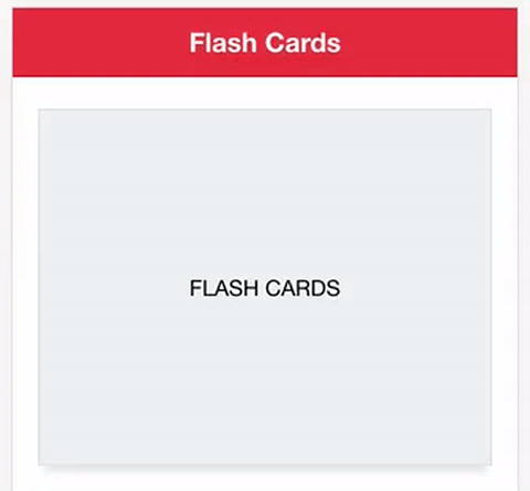
<ion-header>
  <ion-navbar color="danger">
    <ion-title> Flash Cards </ion-title>
  </ion-navbar>
</ion-header>

<ion-content>
  <flash-card>
    <div class="flash-card-front">FLASH CARDS</div>

    <div class="flash-card-back">ARE COOL!</div>
  </flash-card>
</ion-content>
Summary
With a little bit of work upfront, we can now create a super cool component in any application with just a few lines of code. The power of components here should be obvious, without components we would have to manually paste in all of the HTML, CSS, and JavaScript logic every time we wanted to use it somewhere. Now all of the complicated stuff is abstracted away.