

An important concept when designing a user interface with user experience in mind is Cognitive Dimensions. These cognitive dimensions, which were defined in the context of academic papers in 1996, provide a set of concerns to be measured that have an impact on usability.
These dimensions, when applied to interface design, include things like making sure a user has enough information before asking them for a commitment, the ability for a user to locate relevant elements required to complete actions, and how an interface responds to user input.
Poor execution on these cognitive dimensions can contribute to a feeling of unease, frustration, and confusion which could be referred to as cognitive dissonance.
The concept is clearly broader than just user interfaces and user experience, but the last section of that quote (to which I have added emphasis) is particularly pertinent. When dealing with a user interface you expect it to work in a certain way, if you are confronted with a user interface that is confusing and does not work the way you would expect it to it can contribute to this feeling of mental stress or discomfort.
I like to visualise this concept by imaging a user with a little bar floating over their head:
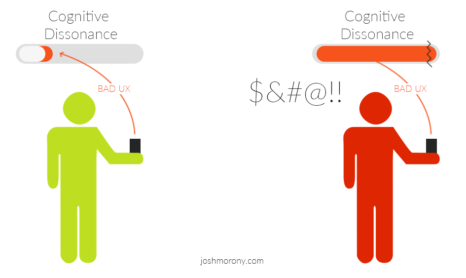
Each time the user interacts with an interface that leads to a bad user experience, their cognitive dissonance bar fills a little. The worse the experience, the more the bar fills up. All of these experiences add up, and when the bar fills up to the breaking point, the user becomes so frustrated that they abandon your application.
The goal isn’t just to stay under that breaking point threshold, it is to keep cognitive dissonance to an absolute minimum. Even if a user doesn’t get to the point where they are so frustrated that they abandon your application, they may still be left with negative feelings about the application which could affect their likelihood to use it again or recommend it to others.
I’d recommend familiarising yourself with all of the cognitive dimensions listed in A Usable Guide to Cognitive Dimensions. We are going to take a look at a specific example, though.
When considering cognitive dimensions in the context of input fields, the following dimensions are especially relevant
- Error-Proneness – refers to the symbols, buttons, labels, and language that we use to communicate instructions to users. An application that provides unclear instructions and feedback will be more error prone.
- Secondary Notation – refers to elements on the interface that are not strictly required, but help to add clarification to a task the user may be performing.
We want it to be clear to the user what the intent of the input field is and what is required of them, and we want to make it easy for them to fill out the form correctly with no errors.
You might try using placeholder text to provide the user with an example to help address these issues, for example:
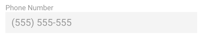
however, this is not considered a good practice. There are two main issues with this approach:
- Once the user starts typing the placeholder will disappear. This forces the user to use their memory to recall what the placeholder text was and what they need to type. It introduces an element of uncertainty that increases cognitive dissonance – in the worst case scenario, the user may have to delete what they have written so that they can view the placeholder text again. It may seem silly to think Oh no, we’re making users use their brain! How awful! but it is these small, sometimes imperceptible, annoyances that add up and lead to a bad user experience.
- It may appear as though the input field is already filled in. Studies have shown that “fields with stuff in them are less noticeable”. As a user scans a page, they are more likely to take notice of an empty field, than one that is filled with placeholder text.
An approach that addresses the issues of error proneness and secondary notation, one that provides a better user experience and will help reduce cognitive dissonance, is input masking.
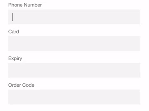
In this tutorial, we are going to go through an example of how we can use input masking in Ionic 2 to provide a better user experience. We will cover a few common use cases including a phone number input with specific country style formatting, and credit card input. Here’s what it will look like when we are done:
Javascript based validation is never a substitution for validating user input, it is entirely to improve usability. If you are ever sending user data to a server you should do your own server side validation because Javascript based validation can easily be circumvented.
Before We Get Started
Before you go through this tutorial, you should have at least a basic understanding of Ionic 2 concepts and the differences to Ionic 1. You must also already have Ionic 2 installed on your machine.
If you’re not familiar with Ionic 2 already, I’d recommend reading my Ionic 2 Beginners Guide first to get up and running and understand the basic concepts. If you want a much more detailed guide for learning Ionic 2, then take a look at Building Mobile Apps with Ionic 2.
1. Generate a New Ionic 2 Application
We are going to start off by generating a new Ionic 2 application with the following command:
ionic start ionic2-input-mask blank --v2Once that has finished generating, you should make it your current working directory by running the following command:
cd ionic2-input-mask2. Install Angular 2 Text Mask
We are going to be using Angular 2 Text Mask which provides a directive we can use to add input masks to inputs in the application.
There are a few minor issues with this directive, but the developers have done an amazing job on this. It’s super easy to set up, and even though it involves using regex, it’s still quite straightforward to use.
Before we can use the directive that Angular 2 Text Mask provides, we will need to install it and set it up in our application.
Run the following command to install Angular 2 Text Mask
npm install angular2-text-mask --saveThe set-up for this is a little different than most third party libraries, in that it requires we import a new module for it in addition to the normal IonicModule that we use.
Modify src/app/app.module.ts to reflect the following:
import { NgModule, ErrorHandler } from '@angular/core';
import { IonicApp, IonicModule, IonicErrorHandler } from 'ionic-angular';
import { MyApp } from './app.component';
import { HomePage } from '../pages/home/home';
import { TextMaskModule } from 'angular2-text-mask';

@NgModule({
  declarations: [MyApp, HomePage],
  imports: [IonicModule.forRoot(MyApp), TextMaskModule],
  bootstrap: [IonicApp],
  entryComponents: [MyApp, HomePage],
  providers: [{ provide: ErrorHandler, useClass: IonicErrorHandler }],
})
export class AppModule {}
With that set up, we will be able to use the textMask directive anywhere in the application. This directive works with both normal <input> as well as the Ionic specific <ion-input>.
NOTE: There may be an issue with using this directive with ion-input in the RC.5 release.
3. Create a Form
Before we set up the input mask, we are just going to set up a basic form and style it a little bit.
Modify src/pages/home/home.html to reflect the following:
<ion-header>
  <ion-navbar color="primary">
    <ion-title> Input Masking </ion-title>
  </ion-navbar>
</ion-header>

<ion-content padding>
  <ion-list no-lines>
    <ion-item>
      <ion-label stacked>Phone Number</ion-label>
      <ion-input type="tel" [(ngModel)]="phoneNumber"></ion-input>
    </ion-item>

    <ion-item>
      <ion-label stacked>Card</ion-label>
      <ion-input type="tel" [(ngModel)]="cardNumber"></ion-input>
    </ion-item>

    <ion-item>
      <ion-label stacked>Expiry</ion-label>
      <ion-input type="tel" [(ngModel)]="cardExpiry"></ion-input>
    </ion-item>

    <ion-item>
      <ion-label stacked>Order Code</ion-label>
      <ion-input type="text" [(ngModel)]="orderCode"></ion-input>
    </ion-item>
  </ion-list>

  <button ion-button outline (click)="save()">Save</button>
</ion-content>
Also note that we are using type="tel" here, which also contributes to a better user experience. The fields that we are using the tel type on are for numeric input only, so it makes more sense to display the number keypad instead of the entire keyboard.
Modify src/pages/home/home.scss to reflect the following
.ios,
.md {
  page-home {
    ion-input {
      background-color: map-get($colors, light);
      padding-left: 10px;
      color: #6c6c6c;
    }

    ion-label {
      color: #6c6c6c;
    }

    [floating] {
      margin-left: 10px;
    }

    button {
      float: right;
      margin-right: 20px;
    }
  }
}
Modify src/pages/home/home.ts to reflect the following:
import { Component } from '@angular/core';
import { NavController } from 'ionic-angular';

@Component({
  selector: 'page-home',
  templateUrl: 'home.html'
})
export class HomePage {

    masks: any;

    phoneNumber: any = "";
    cardNumber: any = "";
    cardExpiry: any = "";
    orderCode: any = "";

    constructor(public navCtrl: NavController) {

    }

    save(){

    }

}
4. Implement Input Masking
Now we can get into the interesting stuff. To get input masking working, we need to create the mask in our TypeScript file, and then we need to supply that mask to the input field through the use of the [textMask] directive. Let’s start off by defining the masks.
Modify src/pages/home/home.ts to reflect the following:
import { Component } from '@angular/core';

import { NavController } from 'ionic-angular';

@Component({
  selector: 'page-home',
  templateUrl: 'home.html'
})
export class HomePage {

    masks: any;

    phoneNumber: any = "";
    cardNumber: any = "";
    cardExpiry: any = "";
    orderCode: any = "";

    constructor(public navCtrl: NavController) {

        this.masks = {
            phoneNumber: ['(', /[1-9]/, /d/, /d/, ')', ' ', /d/, /d/, /d/, '-', /d/, /d/, /d/, /d/],
            cardNumber: [/d/, /d/, /d/, /d/, '-', /d/, /d/, /d/, /d/, '-', /d/, /d/, /d/, /d/, '-', /d/, /d/, /d/, /d/],
            cardExpiry: [/[0-1]/, /d/, '/', /[1-2]/, /d/],
            orderCode: [/[a-zA-z]/, ':', /d/, /d/, /d/, /d/]
        };

    }

    save(){

        let unmaskedData = {
            phoneNumber: this.phoneNumber.replace(/D+/g, ''),
            cardNumber: this.cardNumber.replace(/D+/g, ''),
            cardExpiry: this.cardExpiry.replace(/D+/g, ''),
            orderCode: this.orderCode.replace(/[^a-zA-Z0-9 -]/g, '')
        };

        console.log(unmaskedData);

    }

}
We have added an object to masks which contains all of the masks for each input we have. A mask is just an array, where each element contains a regex pattern to match the input at that location. If you use a simple string instead of a regex pattern like ( or - or “ then it will treat that position in the input as a separator rather than accepting user input (this allows you to add hyphens between a credit card number, for example).
If we take the phoneNumber mask as an example, in this case, we want input entered in the following format: (555) 555-5555. We have the two parenthesis as strings in the array, as well as the hyphen. All the other positions have a regex pattern that will only match numbers. Now all the user has to do (and all they are able to do) is to enter numbers, and they don’t have to worry about entering the parenthesis and the hyphen. This obviously makes the number easier to enter, but it also removes doubt in the users mind around whether or not they are supposed to enter in that specific format or if they can just enter numbers like this: 5555555555.
The cardNumber and cardExpiry masks are basically the same, and the orderCode forces the first character to be a letter, followed by a colon, and then four numbers.
When we want to access that data for saving, it will contain the entire mask rather than just the values the user entered. If that is not the way you want to store the data, then you will need to unmask the data manually. This is what the save function does, it just uses another regex pattern to remove the characters we don’t want.
Now we just need to supply these masks to our inputs.
Modify src/pages/home/home.html to reflect the following:
<ion-header>
  <ion-navbar color="primary">
    <ion-title> Input Masking </ion-title>
  </ion-navbar>
</ion-header>

<ion-content padding>
  <ion-list no-lines>
    <ion-item>
      <ion-label stacked>Phone Number</ion-label>
      <ion-input
        type="tel"
        [(ngModel)]="phoneNumber"
        [textMask]="{mask: masks.phoneNumber}"
      ></ion-input>
    </ion-item>

    <ion-item>
      <ion-label stacked>Card</ion-label>
      <ion-input
        type="tel"
        [(ngModel)]="cardNumber"
        [textMask]="{mask: masks.cardNumber}"
      ></ion-input>
    </ion-item>

    <ion-item>
      <ion-label stacked>Expiry</ion-label>
      <ion-input
        type="tel"
        [(ngModel)]="cardExpiry"
        [textMask]="{mask: masks.cardExpiry}"
      ></ion-input>
    </ion-item>

    <ion-item>
      <ion-label stacked>Order Code</ion-label>
      <ion-input
        type="text"
        [(ngModel)]="orderCode"
        [textMask]="{mask: masks.orderCode}"
      ></ion-input>
    </ion-item>
  </ion-list>

  <button ion-button outline (click)="save()">Save</button>
</ion-content>
All we are doing is passing an object with a mask property reflecting the mask we want to use to the [textMask] directive. You can also provide further configuration in the object if you like. By default, the placeholderChar which will be displayed until the user enters input is an underscore, but this can be changed by supplying a placeholderChar property in the object. You can also control whether or not to display the mask (rather than just enforcing the input) by supplying a guide property and setting that to true or false (although, in my opinion you should always use the guide).
For a full list of the options available, take a look at the documentation.
Summary
The example we have created goes a long way to improve user experience, but there is more we could do. Currently, the input mask only displays when the user starts typing, but it would be useful if the input mask displayed as soon as the input received focus. It would also improve the user experience if, once the mask has been activated, placeholder characters would be displayed to indicate the format, e.g: dd/mm/yyyy.
Angular 2 Text Mask does not support these features right now, so if you think you’re up to the task you might want to go check out the GitHub repository.