

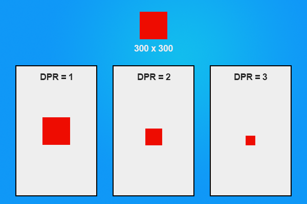
If you don’t have one, you’ve probably heard of Apple’s “Retina” devices. Retina is just marketing spiel that refers to the device pixel ratio of the device. If we take a look at the iPhone 5 as an example, it has a resolution of:
640 x 1136
this is how many pixels we have to work with, but the actual device-width of the iPhone 5 is:
320 x 568
So we have a device that is 320 pixels wide, but we can actually fit 640 pixels across it. This is because the iPhone 5 has a device pixel ratio of 2, i.e. the iPhone5 is 320 pixels wide but it can fit twice that number of pixels in that space. This means that we can display images that are of much higher quality on the screen, but it is a very frustrating issue to cater for.
Apple devices aren’t the only ones that have a device pixel ratio above 1, many modern devices do. A great website to check the device pixel ratio of a range of popular devices is mydevice.io. If you take a look at that website you’ll see many devices with a DPR (Device Pixel Ratio) of 2, but also some with 3 and even 4. It’s not always whole numbers either, some devices have a DPR of 1.5, 2.4, 1.8 and so on. Given these large variations in values, I’m sure you can see how it could be a tricky problem to deal with.
Let’s see DPR in action
I’m going to use the example game I’ve included in Mobile Development for Web Developers to show you the device pixel ratio in effect.
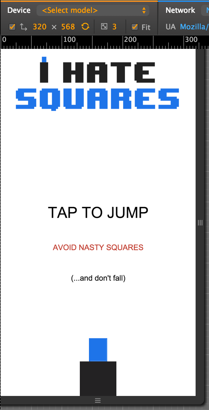
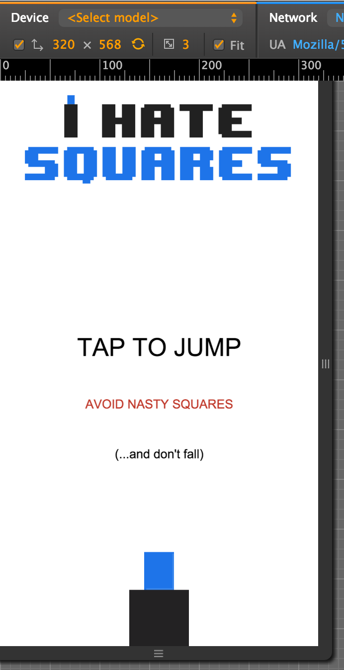
In the image above I’m loading some sprites into the title screen for the game, the blue rectangle (let’s focus on that) is created using an image with dimensions of 90 x 114. I’m also running the game through the emulator available in Chrome to emulate a device with a device pixel ratio of 3, this means that the device has three times the amount of pixels crammed in compared to its actual device width.
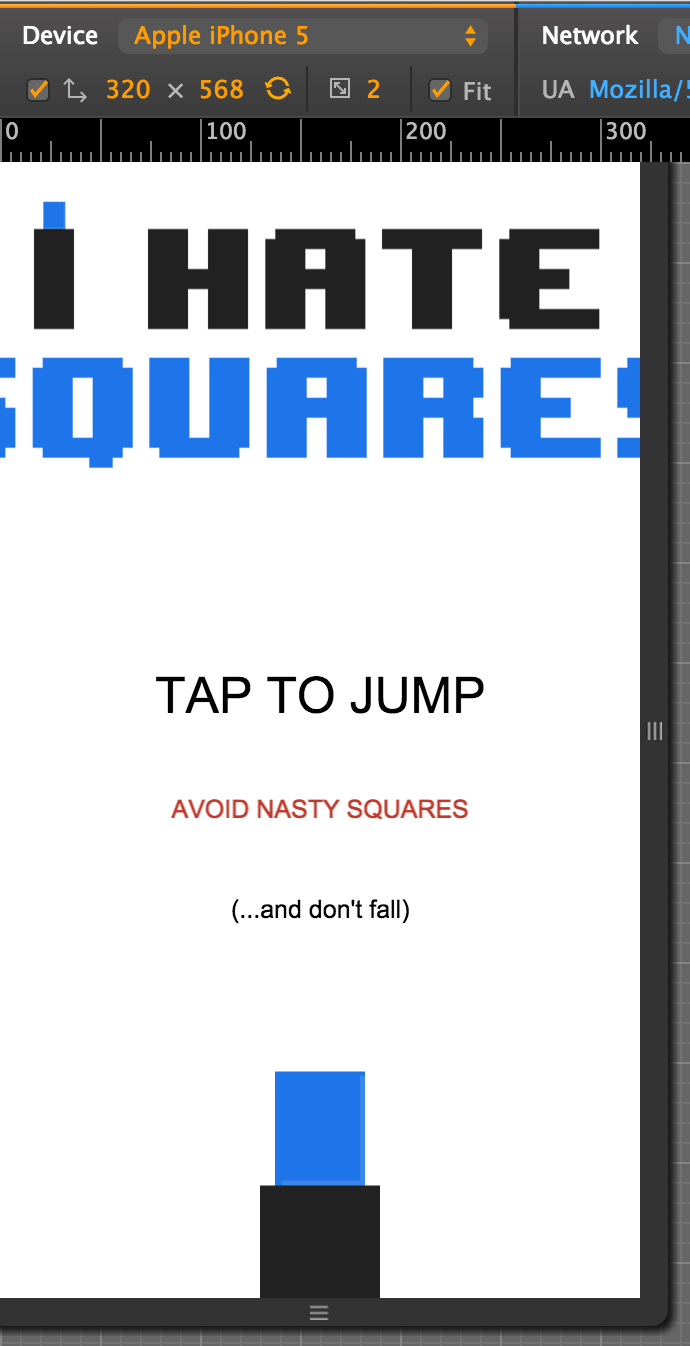
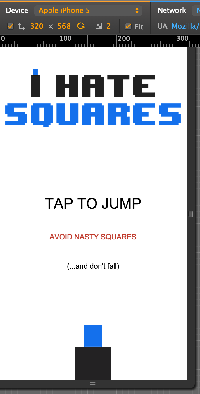
As you can see, the image looks quite normal and well proportioned. Now let’s try emulating a device with a device pixel ratio of 2:
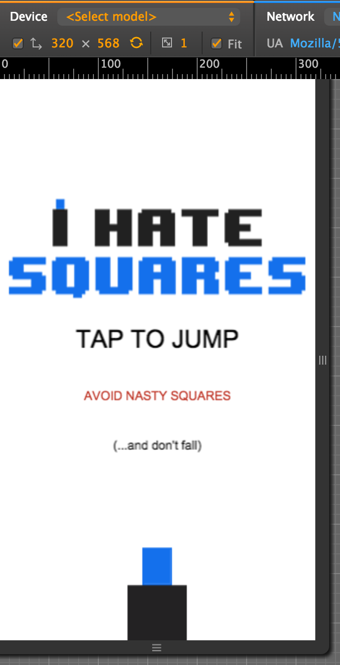
and now just 1 (i.e. no extra pixels are crammed in here, the resolution is the same as the actual device height and width):
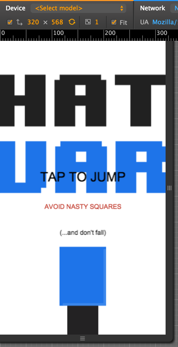
Ok so now it doesn’t look so good. As you can see in the image above, the dimensions of the device we are testing on are 320 x 568 (which is the same as an iPhone 5). At a device pixel ratio of 1, the blue rectangle that has a width of 90 pixels is going to take up almost a quarter of the screen. But when we increase the device pixel ratio to 3, in effect we have 960 (3 times the actual width of the device) pixels across the screen, which would mean the blue rectangle would take up less than 1/10th of the total width of the screen. That is what we want:
Another way to think about it is that if you create an image that is 90 pixels wide then it will only appear to be 30 pixels wide on a 3 DPR screen, and 60 pixels wide on a 2 DPR device.
Now we understand the problem, let’s talk about a solution.
How to deal with the device pixel ratio problem
There’s a couple of ways we could approach this in Phaser:
Option 1: Scale large images down
One option is to include images that are suitable for a device with the highest device pixel ratio that you are targeting, and then scale that image down for devices with a lower device pixel ratio. Phaser has a function built in to scale sprites on the fly:
mySprite.scale.setTo(0.5, 0.5);This would scale the sprite to half of its actual size. So if we included the blue rectangle as a 90 pixel wide image, we could scale it down using:
mySprite.scale.setTo(0.66, 0.66);on devices with a DPR of 2, and:
mySprite.scale.setTo(0.33, 0.33);on devices with a DPR of 1. The problem with this though is that we are causing Phaser to have to do more work to render the sprite on the screen, and if you’re scaling a lot of sprites then it will quickly become a problem. You have to be careful, especially when designing for mobile, that you’re not using too much memory or processing power. This may work in some circumstances, but in general I would recommend the following option.
Option 2: Load different sized graphics for different platforms
Another method is to create three different sized images and load them conditionally depending on the device pixel ratio of the device you are running on. We might originally have something like this as our preload function for example:
preload: function(){

        this.game.load.image('player', 'assets/player.png');
        this.game.load.image('enemy', 'assets/enemy.png');
        this.game.load.image('superenemy', 'assets/superenemy.png');
        this.game.load.image('logo', 'assets/logo.png');
        this.game.load.image('restart', 'assets/restart.png');

    },
which just loads in the same graphic no matter what device we are running on, but we could change it to this:
preload: function(){

        if(window.devicePixelRatio >= 3){
            this.game.load.image('player', 'assets/player@3x.png');
            this.game.load.image('enemy', 'assets/enemy@3x.png');
            this.game.load.image('superenemy', 'assets/superenemy@3x.png');
            this.game.load.image('logo', 'assets/logo@3x.png');
            this.game.load.image('restart', 'assets/restart@3x.png');
        }
        else if(window.devicePixelRatio >= 2){
            this.game.load.image('player', 'assets/player@2x.png');
            this.game.load.image('enemy', 'assets/enemy@2x.png');
            this.game.load.image('superenemy', 'assets/superenemy@2x.png');
            this.game.load.image('logo', 'assets/logo@2x.png');
            this.game.load.image('restart', 'assets/restart@2x.png');
        }
        else {
            this.game.load.image('player', 'assets/player.png');
            this.game.load.image('enemy', 'assets/enemy.png');
            this.game.load.image('superenemy', 'assets/superenemy.png');
            this.game.load.image('logo', 'assets/logo.png');
            this.game.load.image('restart', 'assets/restart.png');
        }

    },
Now different sized assets will be loaded to cater for the different pixel ratios. In the example above player@3x.png is three times larger than player.png. If we take a look at the game on a device with a DPR of 3 now:
2:
and 1:
Much better. Of course, the downside of this approach is that we need to include graphics in our game that won’t even end up being used.
The device pixel ratio of Retina (and other) screens can be a really tricky thing to get your head around, but this is a pretty simple solution that should work in a majority of cases.