

I got an email recently from someone who was interested in using Phaser and PhoneGap to build mobile games, but was confused by how to scale their game to fit all the different device sizes.
As an aside, please do email me if there’s something you’d like to see me write about. As long as it fits within the theme of stuff I usually write about then there’s a good chance I’ll get a blog post up about it before too long.
I think scaling is a pretty big topic for HTML5 mobile games, and there’s no one size fits all solution. I’m yet to make more complex games with Phaser but I have a scaling strategy that seems to work pretty well for me. The games I mainly produce are simple, time waster type games like Flappy Bird and Stick Hero. Without too many elements on the screen at any point in time, it’s quite easy to scale using the method I’ll describe below.
Setting the Games Size
When we create a game in Phaser we have to tell it how big we want our game world to be, which is typically done like this:
game = new Phaser.Game(600, 400, Phaser.CANVAS, 'gameArea');The immediate problem you might notice here is that we are manually supplying 600 x 400 as the dimensions for the game – this obviously is not going to work well if we want our game to scale to fit an iPhone 4, iPhone 5, iPad and the tons of different Android devices.
The obvious solution would be to grab the width and height of the device dynamically and set it to that. We can do that quite easily using window.innerWidth and window.innerHeight, so you might assume something like this would work well:
game = new Phaser.Game(
  window.innerWidth,
  window.innerHeight,
  Phaser.CANVAS,
  'gameArea'
);
But! This won’t work either. The problem is that some devices have a higher Device Pixel Ratio (DPR). An iPhone 5 for example has a DPR of 2, which essentially means they’ve crammed twice as many pixels in the same space to get a higher resolution. The problem is that if you use the code above, the dimensions reported will be incorrect.
This is a great reference for iOS devices. If you take a look at the iPhone 5 entry you will see that it has a logical resolution of 320 x 568 – this is what innerWidth and innerHeight will return. The actual width and height we want is 640 x 1136, and we can get this by multiplying the logical resolution by the DPR. As I mentioned, the DPR of the iPhone 5 is 2 so we can multiple both of these by 2 to get the value we need.
So, putting this all together the code we need to scale the game size to correctly fit all screen sizes will be:
game = new Phaser.Game(
  window.innerWidth * window.devicePixelRatio,
  window.innerHeight * window.devicePixelRatio,
  Phaser.CANVAS,
  'gameArea'
);
NOTE: In the code above I’m using Phaser.CANVAS instead of Phaser.AUTO as your game will not render correctly when using PhoneGap unless you explicitly specify Canvas (in my experience at least).
Scaling Game Assets
The other issue we run into when scaling is with the size of graphical assets (i.e player sprites, objects and so on). If you create some object at 300 x 300 pixels and it looks great on a device with a DPR of 1 (i.e your desktop computer or an iPhone 4) it will probably look teeny tiny on devices with a higher DPR.
Take the iPhone 5 for example again, although the object is 300 x 300 pixels it will only look like it’s 150 x 150 pixels. We need the asset to be twice as big for iPhone 5’s, so how do we handle this?
What you can do is create the object to suit the highest DPR you are supporting, which will likely be 3. This means that your 300 x 300 object should actually be 900 x 900. Then we scale it down in game to suit the device that it is actually on. On a device with a DPR of 3 we do nothing, with a DPR of 2 we will scale it down to 2/3rds of it’s original size and for a device with a DPR of 1 we will scale it down to 1/3rd of its original size.
To do this, first you need to figure out what this scaleRatio is. Create a new globally stored variable with the following code:
scaleRatio = window.devicePixelRatio / 3;and now whenever you add a new asset to the game, call the following method to scale it appropriately:
myAsset.scale.setTo(scaleRatio, scaleRatio);Now your asset will scale appropriately no matter what device your game is loaded on.
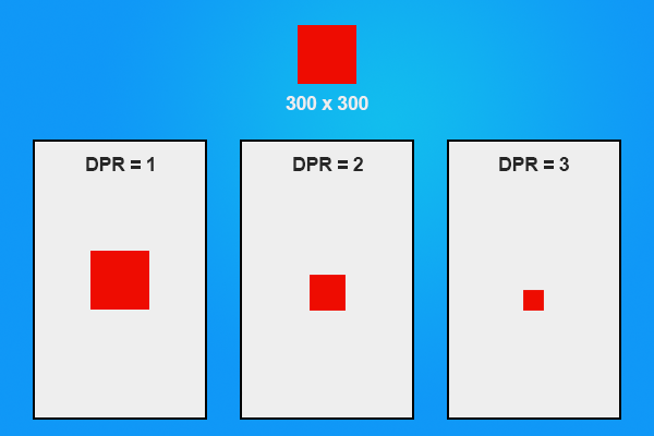
The effect of DPR across different devices
More Advanced Scaling
Phaser actually has some methods in built for dealing with scaling which I haven’t really made use of. I won’t be covering how they work in this blog post, but you should at least be aware of their existence.
Other things to watch our for
Since you don’t know how big your game size will actually be, it makes it hard to position things in the game world. Instead of giving exact coordinates for things, you will have to position them relatively.
For example, if I knew the height of my world was 800 pixels, and I wanted to place something 50 pixels from the bottom I could just give it a y coordinate of 750. Since I don’t know the height though, I should position it by giving it a y coordinate of:
game.world.height - 50;This will work for any device height. Similarly, if I want to place something in the center of the game I could do it like this:
game.add.sprite(game.world.centerX, game.world.centerY, 'mySprite');As I mentioned before, scaling is a pretty big topic and this post has only just touched the surface of it. This is a very basic strategy for scaling and somewhat restricts your options when creating the game, but for a lot of use cases it will work and is easy to execute.