

Sencha Touch has a powerful and adaptable layout system, but it’s also quite simple to use (if not a bit confusing at first). This tutorial will focus on explaining a little bit about how the Sencha Touch layout system works and then we will walk through building a specific complex layout.
1. A Quick Introduction to Layouts in Sencha Touch
Sencha Touch uses web technologies, so one might assume that are layouts would be created with HTML and CSS, this is not the case though. A layout in Sencha Touch is defined by the components that are used and the layout configuration that is assigned to it.
You may be familiar with components in Sencha touch that can be used to nest other components inside of them like Container and Panel. These can be assigned any of the following layout types:
Depending on the layout you assign, the components you nest inside of the container – like lists, images, forms and even more containers – will behave differently. Using the vbox layout for example will cause components to be added underneath each other. You could specify a vbox layout with the following code in the configuration of the container:
layout: {
  type: 'vbox';
}
For a full explanation of what all the different layouts do, you should take a look at Using Layouts in Sencha Touch. Another important concept is flex. With layouts like vbox and hbox where multiple components occupy the same container, flex determines how much of the space each component should occupy. Take the following as an example:
{
     xtype: 'map',
     flex: 2
},
{
     xtype: 'list',
     flex: 1
}
Flex works as a ratio so with the above example the map would take up 2/3rds and the list would take up 1/3rd. If we were to change the flex to 5 and 2 then the map would take up 5/7ths and the list would take up 2/7ths. If we were thinking in a CSS mindset we might try to use percentage widths or heights to achieve this, but this is not what you want to do. CSS still has its place in Sencha Touch though, typically it will be used to make style changes not layout changes. If you’re confused about when to use CSS and when to do things through the Sencha Touch framework, I would recommend getting your app as close to what you want by defining it through the framework and then make the rest of the changes with CSS.
2. Building a Home Page Menu in Sencha Touch
Commonly navigation in applications is achieved through tabs or sliding menus. We can get a little more creative than that though, sometimes you might want to do something a little outside of the norm that involves creating a more complicated layout. In this example we will be creating a layout that looks like this:
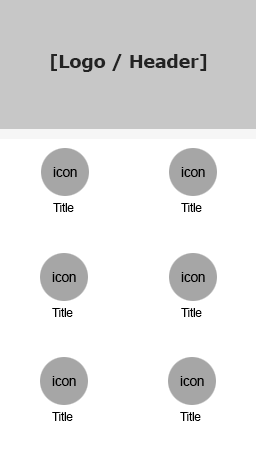
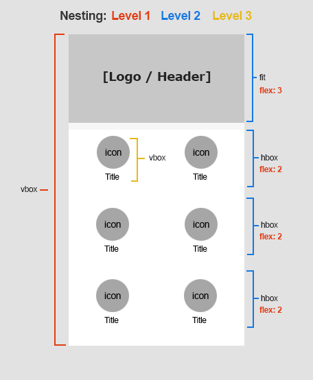
As I mentioned above there is a few different layout options in Sencha Touch, but when building complex layouts like this you will able to create just about anything you want with a combination of vertical box and horizontal box. Vertical box places components underneath each other, horizontal box places them side by side. You can then nest these inside of each other, a horizontal box inside of a vertical box which is inside of another horizontal box for example, to achieve all sorts of layouts. Once you get your head around, it will be easy to see how to break down any layout. This is how we would achieve the above layout:
Now let’s take a look at how we might code that.
- First set your container to a vbox layout, and add four containers as children:
Ext.define('MyApp.view.Main', {
  extend: 'Ext.Container',
  xtype: 'main',
  config: {
    layout: {
      type: 'vbox',
    },

    items: [
      {
        xtype: 'container',
        layout: {
          type: 'fit',
        },
        flex: 3,
      },
      {
        xtype: 'container',
        layout: {
          type: 'hbox',
        },
        flex: 2,
      },
      {
        xtype: 'container',
        layout: {
          type: 'hbox',
        },
        flex: 2,
      },
      {
        xtype: 'container',
        layout: {
          type: 'hbox',
        },
        flex: 2,
      },
    ],
  },
});
The first container will be our header / logo area, and the next three will contain our icons which we will use to allow our users to navigate to other views. We also want to split the bottom three containers into another two horizontal boxes (since we will have two side by side icons in each of the containers), so we are giving each of these a layout of hbox.
We are also making use of the flex configuration here. We have four containers, and the sum of the flex is 9 – this means then that our first container with a flex of 3 will take up a third of the space (3/9) and the rest of the containers will each take up 2/9ths of the space.
- Add two more containers to each of the hbox containers
Now we are going to split those horizontal boxes up into two separate containers. So for each of the last three containers, add the following items:
items: [
  {
    xtype: 'container',
    cls: 'icon-container',
    layout: {
      type: 'vbox',
      align: 'center',
    },
    items: [
      {
        xtype: 'image',
        mode: 'image',
        src: 'resources/images/icon.png',
      },
      {
        html: 'Title 1',
      },
    ],
  },
  {
    xtype: 'container',
    cls: 'icon-container',
    layout: {
      type: 'vbox',
      align: 'center',
    },
    items: [
      {
        xtype: 'image',
        mode: 'image',
        src: 'resources/images/icon.png',
      },
      {
        html: 'Title 2',
      },
    ],
  },
];
I’ve taken things even further here and have added another vbox layout inside the hbox layout. This will allow me to add an image, and then some HTML underneath that image. We could keep drilling down further and further but that’s as far as we need to take it for this example!
- Add some styling
You will notice in the last code block that I gave the vbox containers a class of icon-container, to finish things off we’re going to add the following styles to our app.scss file (don’t forget to compile with compass after the change has been made!)
.icon-container {
width: 50%;
font-size: 0.8em;
text-align: center;
padding-top: 1em;
}
And there you have it. Once you’ve finished you should have a layout that looks like the image above. As far as nesting containers within containers within containers, this tutorial takes it about as far as you will ever need to go. The great thing about Sencha’s layout system is that this layout will now easily scale to any screen size that we need.