

Animations are one of the little details that can make an average mobile app outstanding. You need to be careful with animations though, especially with HTML5 based mobile applications, as they can perform poorly if not done correctly and make your appear amateurish.
I’ve touched on this subject before when discussing how to make high performing PhoneGap applications, and just recently Mike Hartington, who is part of the Ionic team, wrote a quick blog post on how to animate elements in Ionic.
The most important take away from Mike’s post is to animate the translate3d property when moving elements in animations. By using this property rather than animating the left property for example, the devices GPU (Graphics Processor Unit) is invoked. This is called a hardware accelerated animation and is a lot smoother. You may find that animations that run fine on your desktop browser don’t work so well on mobile devices, so it’s usually important to use hardware acceleration (although relying on the GPU too much can also be disadvantageous, as it can lead to battery drain).
In Mike’s tutorial he creates an animation that will slide in list elements from the side whenever the list is loaded. He does this by defining an animation using @-webkit-keyframes in CSS. The post doesn’t go into detail about how to create these animations though, so in this tutorial I want to give a little more background and also run through a few examples.
By the end of this post we will have created something that looks like this:
What are “keyframes”?
You’ll see in Mike’s tutorial that he has declared his animation as:
@-webkit-keyframes slideIn {
  //..snip
}
If you’re reading this tutorial then there’s a good chance you won’t be familiar with this syntax. Basically, this allows you to specify what certain properties should be at a specific stage during an animation. So if we take a look at the full example:
@-webkit-keyframes slideInSmooth {
  0% {
    -webkit-transform: translate3d(-100%, 0, 0);
  }
  100% {
    -webkit-transform: translate3d(0, 0, 0);
  }
}
What we are saying here is that at the start of the animation (0%) the element should be displaced 100% to the left (the three parameters in translate3d represent the x, y, and z axis), so it will be just off screen. Then at the end of the animation (100%) the element should be back to its normal starting position.
We could also define a similar animation like this:
@-webkit-keyframes slideInSmooth {
  0% {
    -webkit-transform: translate3d(-100%, 0, 0);
  }

  50% {
    -webkit-transform: translate3d(50%, 0, 0);
  }

  100% {
    -webkit-transform: translate3d(0, 0, 0);
  }
}
Now the element would start off to the left, then go to the right and then finally get back to its normal position. You can define as many of these intermediate steps as you like, the only important thing is that you always have a 0% and 100% (alternatively, you can use from and to) otherwise the animation will be invalid.
As Mike highlighted in his post, the importance of using translate3d here rather than the left property to move the element is that by using translate3d the devices GPU will be used for performing the animation.
Now that we have that animation defined, we can use it by specifying it in the CSS for the element we want to animate as the -webkit-animation like Mike has:
.slide-in {
  -webkit-animation: slideInSmooth ease-in 1;
  animation: slideInSmooth ease-in 1;
  -webkit-animation-fill-mode: forwards;
  animation-fill-mode: forwards;
  -webkit-animation-duration: 750ms;
  animation-duration: 750ms;
}
You can see that slideInSmooth has been supplied as the animation and a few other things are also being defined here like how long the animation should take to complete. The different properties like -webkit-animation and animation do the same thing, it’s just that different browser vendors recognise different properties so we need to include both.
Creating Animations in Ionic
Let’s take a look at a few more animations we could create in our Ionic applications. Of course, these animations won’t be specific Ionic, it’s just normal CSS, but I will be creating them on the standard Ionic UI elements.
These aren’t necessarily going to be overly useful, creative or pretty, I just want to demonstrate the concept. I’ll be using the tabs starter project that Ionic provides to play with these animations since it has a few nice UI elements built in already. If you would like to follow along you should also create a new project based on the tabs template.
Run the following command to generate a new Ionic application based on the tabs template
ionic start ionic-animations tabsRun the following commands to set up SASS
cd ionic-animationsionic setup sassRun your Ionic application through the browser by running the following command:
ionic serveIonic List Slide in Animation
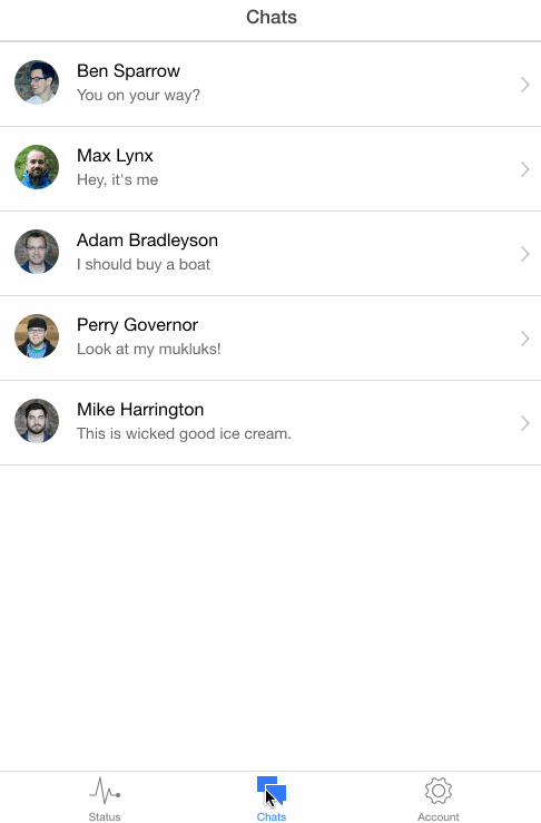
As our first animation, let’s take the example I gave above and see how it looks on the list in the Chats tab.
Add the following code to scss/ionic.app.scss
@-webkit-keyframes slideInBothWays {
  0% {
    -webkit-transform: translate3d(-100%, 0, 0);
  }

  50% {
    -webkit-transform: translate3d(50%, 0, 0);
  }

  100% {
    -webkit-transform: translate3d(0, 0, 0);
  }
}

.slide-in-both-ways {
  -webkit-animation: slideInBothWays ease-in 1;
  animation: slideInBothWays ease-in 1;
  -webkit-animation-fill-mode: forwards;
  animation-fill-mode: forwards;
  -webkit-animation-duration: 750ms;
  animation-duration: 750ms;
}
Modify the following in tabs-chat.html:
<ion-content class="slide-in-both-ways"></ion-content>Result
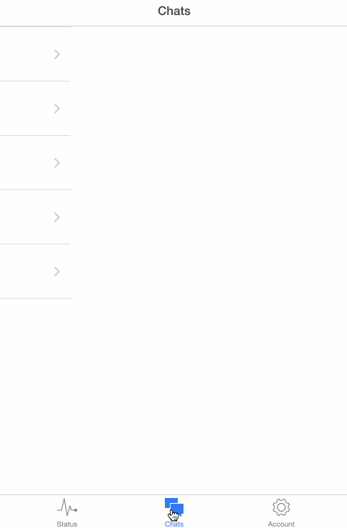
Not bad considering I just made it up on the spot, it has a nice kind of bounce effect to it but it’s not exactly the best animation in the world – I don’t think I’d ever use it in a real app. Let’s see if we can come up with some nicer ones.
Animate List Data
For this animation we’re going to use the same chat list again (make sure to take off the last animation otherwise this will look super funky). This time rather than animating in the whole list, let’s just animate the content: the pictures, name and text.
We want the picture and name to slide in from the left, and then we want their message to fade in.
Add the following to scss/ionic.app.scss
@-webkit-keyframes animateInPrimary {
  0% {
    -webkit-transform: translate3d(-100%, 0, 0);
  }

  100% {
    -webkit-transform: translate3d(0, 0, 0);
  }
}

@-webkit-keyframes animateInSecondary {
  0% {
    opacity: 0;
  }

  50% {
    opacity: 0;
  }

  100% {
    opacity: 1;
  }
}

.animate-in-primary {
  -webkit-animation: animateInPrimary;
  animation: animateInPrimary;
  -webkit-animation-duration: 750ms;
  animation-duraton: 750ms;
}

.animate-in-secondary {
  -webkit-animation: animateInSecondary ease-in 1;
  animation: animateInSecondary ease-in 1;
  -webkit-animation-duration: 750ms;
  animation-duraton: 750ms;
}
The primary animation should be familiar, but in the secondary animation we are fading in the opacity property. I wanted it to start fading in halfway through the animation but as I mentioned before, you must always supply a 0% state so I have done that here.
Result
Much better, this looks like something you might actually want to use in an application.
Bouncing Animation
Given that this is a chat application, we might want to notify the user when there is a new message available. A fun way to do this might be to make the persons picture bounce up and down if they have said something, so let’s try to create that.
Add the following to scss/ionic.app.scss
@-webkit-keyframes bounce {
  0% {
    -webkit-transform: translate3d(0, 0, 0);
  }

  25% {
    -webkit-transform: translate3d(0, -30%, 0);
  }

  50% {
    -webkit-transform: translate3d(0, 0, 0);
  }

  75% {
    -webkit-transform: translate3d(0, -30%, 0);
  }

  100% {
    -webkit-transform: translate3d(0, 0, 0);
  }
}

.bounce-animation {
  -webkit-animation: bounce ease-in 1;
  animation: bounce ease-in 1;
  -webkit-animation-duration: 1000ms;
  animation-duration: 1000ms;
}
Modify the following in tabs-chat.html
<img
  ng-class="chat.name=='Mike Harrington' ? 'bounce-animation' : 'animate-in-primary'"
  ng-src="{{chat.face}}"
/>
There shouldn’t be anything too surprising here, we’ve just added a few more steps in the keyframe so that it will bounce twice. In the template, I’ve just added an ng-class so that the bounce class is only applied to Mike.
Result
Pretty cool, now we know Mike has something to say about ice cream.
Expand Animation
I struggled to come up with a name for this one. We’re going to create an animation that will make each list item expand to its full height.
Add the following to scss/ionic.app.scss
@-webkit-keyframes listGrow {
  0% {
    -webkit-transform: scale3d(1, 0, 1);
  }

  100% {
    -webkit-transform: scale3d(1, 1, 0);
  }
}

.list-grow-animation {
  -webkit-animation: listGrow ease-in 1;
  animation: listGrow ease-in 1;
  -webkit-animation-duration: 400ms;
  animation-duration: 400ms;
}
NOTE: I’ve used the scale3d property here instead of just scaleY as this will invoke the GPU for a hardware accelerated animation as we discussed before.
Modify the following in tabs-chat.html
<ion-item
  class="item-remove-animate item-avatar item-icon-right list-grow-animation"
  ng-repeat="chat in chats"
  type="item-text-wrap"
  href="#/tab/chats/{{chat.id}}"
></ion-item>
Result
Again, not too bad. It’s a nice simple animation that could work well in a real world application.
Summary
At the risk of getting too crazy I’m going to leave it there for now, perhaps in future I’ll make a big post of different animations but hopefully that should give you some insight into how to start creating your own animations. If you’ve got a good handle on CSS it shouldn’t be too difficult to jump into animations.
If you’ve never created an animation in Ionic before, I encourage you to head over to play.ionic.io and make your own wacky animation for the button that is there by default.