Earlier this week I recorded a video where I walked through building an expandable component on screen. This was a generic component that could be given a specific height, and its state could be toggled between being expanded and collapsed.
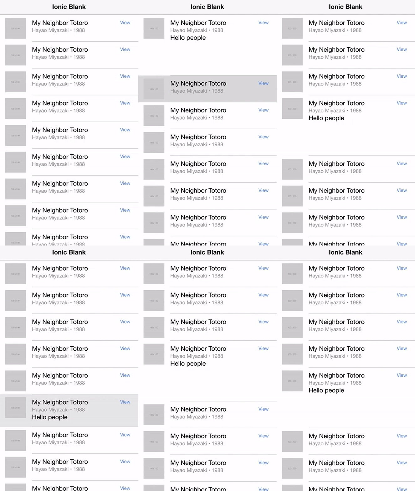
Due to a dwindling battery, I didn’t get to take the component quite as far as I wanted in the video, so I’m writing this blog post to finish things off a bit, and also use the component to create an accordion style list in Ionic. Here’s what we will have by the end of this tutorial:

NOTE: The updated version of the article looks a little different to the GIF above.
I will walk through building it from start to finish, so no need to watch the video if you don’t want to.
NOTE: We will be building an accordion list using a generic expandable component, I don’t think it would be correct to refer to this as an accordion component. It would be a small step to modify this to be a dedicated accordion component, though.
Before We Get Started
Last updated for Ionic 4.3.0
This is a somewhat advanced tutorial and will assume that you already have a reasonably strong understanding of Ionic and Angular. If you require more introductory level content on Ionic I would recommend checking out my book or the Ionic tutorials on my website.
NOTE: I have added a new article on building a high performance accordion component with Ionic that you can view here: High Performance Animated Accordion List in Ionic
1. Generate the Component
We will be creating a custom component called Expandable, so we will generate that first:
ionic g component components/ExpandableFor the sake of demonstration, we will just be setting the component up in a single module. However, if you want to share the component throughout your application I would recommend watching the following video for the appropriate setup: Using Custom Components on Multiple Pages in Ionic.
For our simple implementation, we will just add it to our home pages module.
Modify src/app/home/home.module.ts to include a declaration for the new component:
import { NgModule } from '@angular/core';
import { CommonModule } from '@angular/common';
import { IonicModule } from '@ionic/angular';
import { FormsModule } from '@angular/forms';
import { RouterModule } from '@angular/router';

import { HomePage } from './home.page';
import { ExpandableComponent } from '../components/expandable/expandable.component';

@NgModule({
  imports: [
    CommonModule,
    FormsModule,
    IonicModule,
    RouterModule.forChild([
      {
        path: '',
        component: HomePage,
      },
    ]),
  ],
  declarations: [HomePage, ExpandableComponent],
})
export class HomePageModule {}
2. Building the Expandable Component
What we are aiming to build is a component that will look like this:
<app-expandable expandHeight="150px" [expanded]="item.expanded">
  some content here
</app-expandable>
We could insert this wherever we wanted to display a collapsible/expandable component. We can pass in our desired height with the expandHeight option, and we can toggle the expanded state with the expanded input.
IMPORTANT: You should always provide an approximate or exact height of the expandable content to expandHeight. Although it works best with fixed height content, this component will allow for content of varying heights. You should set the expandHeight to the approximate height of the largest content you want to allow. For example, setting expandHeight to 500px will allow you to display dynamic content of any height up to 500px. You can not just set this to a very large number, otherwise the height transition animation will not apply correctly. The animation will occur over the full expandHeight value you supply, so if your actual content is much shorter than the expandHeight value you supply, there will be a delay before the animation starts (as it is animating the portion of the expandable area that is not visible). TLDR: Set the expandHeight as close as possible to the actual height of your expandable content.
With that in mind, let’s build out the component itself.
Modify src/components/expandable/expandable.component.html to reflect the following:
<div #expandWrapper class="expand-wrapper" [class.collapsed]="!expanded">
  <ng-content></ng-content>
</div>
The template for the component is reasonably simple. We are using content projection with <ng-content> to project whatever we add inside of the <app-expandable> tags into the component’s template. This means that we can display some content here inside of our component.
We also have a wrapper <div> that has a template variable of expandWrapper so that we can access it later, and the collapsed class is being applied conditionally based on the value of expanded. This is how we will toggle the collapsed styling on and off.
Modify src/components/expandable/expandable.component.scss to reflect the following:
.expand-wrapper {
  transition: max-height 0.4s ease-in-out;
  overflow: hidden;
  height: auto;
}

.collapsed {
  max-height: 0 !important;
}
In the template, we were toggling the collapsed class on and off, and this is where we define that class. When the collapsed class is applied it will force the height of the wrapper to be 0 so it should disappear, and we also add a transition property so that the component will shrink or grow smoothly rather than just snapping in and out of existence.
Modify src/components/expandable/expandable.component.ts to reflect the following:
import { Component, AfterViewInit, Input, ViewChild,  ElementRef, Renderer2 } from "@angular/core";

@Component({
  selector: "app-expandable",
  templateUrl: "./expandable.component.html",
  styleUrls: ["./expandable.component.scss"]
})
export class ExpandableComponent implements AfterViewInit {
  @ViewChild("expandWrapper", { read: ElementRef }) expandWrapper: ElementRef;
  @Input("expanded") expanded: boolean = false;
  @Input("expandHeight") expandHeight: string = "150px";

  constructor(public renderer: Renderer2) {}

  ngAfterViewInit() {
    this.renderer.setStyle(this.expandWrapper.nativeElement, "max-height", this.expandHeight);
  }
}
Now we have the class for the component. We set up the two inputs that we wanted (setting a default of 150px for expandHeight), and we also grab a reference to the expandWrapper using the template variable we added earlier. We then use that reference to set the height of the component in the ngAfterViewInit function.
3. Use the Component to Create an Accordion List
The component is complete now, so all we need to do is use it. As I mentioned, we are going to use it to create an accordion list by adding it into a list. It’s mostly just a case of dropping it in there, however, we also need to add a bit of logic to close all other expanded components in the list when a new component is expanded (so that only one is open at a time).
Modify src/app/home/home.page.html to reflect the following:
<ion-header>
  <ion-toolbar>
    <ion-title> Ionic Blank </ion-title>
  </ion-toolbar>
</ion-header>

<ion-content>
  <ion-card (click)="expandItem(item)" *ngFor="let item of items">
    <ion-card-header>
      <ion-card-title>My Neighbor Totoro</ion-card-title>
    </ion-card-header>

    <ion-card-content>
      <app-expandable expandHeight="100px" [expanded]="item.expanded">
        <p>Hello there.</p>
        <p>Hello there.</p>
        <p>Hello there.</p>
        <p>Hello there.</p>
        <p>Hello there.</p>
        <p>Hello there.</p>
      </app-expandable>
    </ion-card-content>
  </ion-card>
</ion-content>
We’ve just added a stock standard list to the template here, except that we’ve added an <app-expandable> component inside of it. We bind the expanded input to the value of each particular items expanded property (which will allow us to toggle them individually), and we also have a click handler that triggers expandItem which will allow us to toggle the items expanded state.
Modify src/app/home/home.page.ts to reflect the following:
import { Component } from "@angular/core";

@Component({
  selector: "app-home",
  templateUrl: "home.page.html",
  styleUrls: ["home.page.scss"]
})
export class HomePage {
  public items: any = [];

  constructor() {
    this.items = [
      { expanded: false },
      { expanded: false },
      { expanded: false },
      { expanded: false },
      { expanded: false },
      { expanded: false },
      { expanded: false },
      { expanded: false },
      { expanded: false }
    ];
  }

  expandItem(item): void {
    if (item.expanded) {
      item.expanded = false;
    } else {
      this.items.map(listItem => {
        if (item == listItem) {
          listItem.expanded = !listItem.expanded;
        } else {
          listItem.expanded = false;
        }
        return listItem;
      });
    }
  }
}
We’ve set up an array of item objects here that only have a single expanded property. Of course, you would usually have other properties defined here as well like the title, body, and so on.
Our expandItem function maps each element in the array – when it gets to the item that has been clicked, it will toggle its state, and it will set any other expanded items back to the collapsed state.
If you load the application up in your browser now and click around a bit, you should have something that looks like this:

NOTE: The updated version of the article looks a little different to the GIF above.
Summary
The way in which this component is designed is quite generic and modular, so even though we are using it to create an accordion style list in this case, it could also be used in a variety of different circumstances as well. This is why it’s often better to create custom components for this type of functionality, rather than trying to build functionality directly into your pages.

