
In this tutorial, we are going to look into how we can use SASS (which is built into Ionic/Angular applications by default) to create a cool gradient effect on our Ionic lists. It will look something like this:
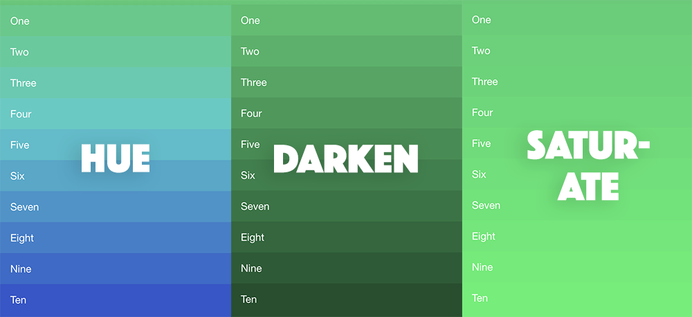
The basic idea is that we choose a base colour, and then that colour will be transitioned dynamically across each list item. This effect can be applied to more than just lists too, you could use it in pretty much any situation where you have a parent element with multiple child elements.
It is straight-forward enough to create a linear gradient effect with CSS using something like this:
background: linear-gradient(#e66465, #9198e5);But you may notice in the images above that we aren’t just applying a linear gradient. Instead of smoothly changing from one colour to another, each item in the list is actually a solid colour, and each item in the list slowly steps its way towards the end colour.
Each of the images above is actually showing something different too - all of them start with the same base colour but have different modifiers applied. Unlike a gradient where we transition evenly from one colour to another, we are actually modifying the base colour to achieve different effects, from left-to-right we are:
- Modifying the hue. The hue represents the actual “colour” and we are slowly changing this.
- Modifying the brightness. By modifying the brightness we are changing how much white or black is mixed into the colour.
- Modifying the saturation. Saturation represents the “intensity” of a colour, less saturation means more gray is mixed in with the colour.
What we will be discussing in this tutorial are mostly just generic SASS concepts - it is not specific to Ionic or Angular. However, the fact that Ionic uses CSS4 variables does slightly complicate things for us, and we need to do something specific with SASS to account for that.
Before We Get Started
Last updated for Ionic 4.0.0
This tutorial assumes you already have a basic level of understanding of Ionic. If you require more introductory level content on Ionic I would recommend checking out my book or the Ionic tutorials on my website.
I will not be covering what SASS is in this tutorial. If you are not already familiar with SASS then you might find it useful to read about the basics of SASS. If you aren’t interested in learning more about SASS, then it is still possible to complete this tutorial without an appreciation for what SASS is or how it works.
1. Create the Template
We need something to work with so we are just going to create a simple list with Ionic. Your list can look different if you like, and as I mentioned you can even use this effect on something other than a list.
If you would like to follow along with the list I am creating, add the list below to your home.page.html file:
<ion-content class="darken">
  <ion-list lines="none">
    <ion-item>One</ion-item>
    <ion-item>Two</ion-item>
    <ion-item>Three</ion-item>
    <ion-item>Four</ion-item>
    <ion-item>Five</ion-item>
    <ion-item>Six</ion-item>
    <ion-item>Seven</ion-item>
    <ion-item>Eight</ion-item>
    <ion-item>Nine</ion-item>
    <ion-item>Ten</ion-item>
  </ion-list>
</ion-content>
Notice that we have given <ion-content> a class of darken. This is what we will be using to toggle between the various effects we will be implementing. We are going to start with implementing a “darken” effect that will modify the brightness of the base colour.
2. Using a SASS For-Loop
Since Ionic 4, we now use CSS4 variables like --ion-color-primary instead of SASS variables like $primary. Although SASS offers a lot more than just variables, a lot of Ionic developers may only have ever used this feature. This means that a lot of people now probably don’t even use SASS at all in their Ionic 4 projects since we can just use CSS4 variables instead. However, Ionic projects still do use SASS (which is why the style file names end with .scss and not .css) and we can utilise the full power that SASS provides if we want to.
One particular thing we can do with SASS is create selectors/styles dynamically by using a for loop. To give you a simple example, instead of creating classes manually like this:
.item-1 {
  width: 50px;
}

.item-2 {
  width: 100px;
}

.item-3 {
  width: 150px;
}
We could instead create these dynamically like this with SASS:
$start: 1;
$end: 3;

@for $i from $start through $end {
  .item-#{$i} {
    width: 50px * $i;
  }
}
As you could imagine, this can save a lot of time as your selectors become more complex. This is a contrived example so the value might not be obvious here, but you will soon see how much easier a @for loop will make our lives when creating our gradient list.
3. Dynamically Modifying Brightness
With a basic understanding of how a for loop works in SASS, let’s create our own for loop that will apply our “darken” effect for us.
Add the following code to src/app/home/home.page.scss:
$steps: 10;
$gradient-color: #2ecc71;
$amount: 3;

@for $i from 0 through $steps {
  .darken ion-item:nth-child(#{$i}) {
    --ion-background-color: #{darken($gradient-color, $i * $amount)};
  }
}
There is quite a bit here so let’s unpack it all. First, we declare three variables. The $steps variable will determine how many items we want to apply this effect on. Since SASS is a pre-processor (meaning it is compiled before our application is run) we can’t supply a dynamic number of items, so we need to know upfront how many items are in our list (or at least, how many items we want to apply the effect on). We will be implementing some additional styles in a moment so that the effect will still display nicely on lists where we don’t know how many items there will be.
The $gradient-color variable is our base colour that we want to start from and the $amount variable is used to determine how much we want to change the colour each time, the higher the amount is the more obvious the effect will be.
Next, we have our for loop. We loop through from 0 to the number of $steps we defined. Each time this loop runs it will create additional classes that look like this:
.darken ion-item:nth-child(0) {
  --ion-background-color: ; /* calculated colour value goes here */
}

.darken ion-item:nth-child(1) {
  --ion-background-color: ; /* calculated colour value goes here */
}

.darken ion-item:nth-child(2) {
  --ion-background-color: ; /* calculated colour value goes here */
}
In this case, classes would be created all the way up to 10. If you are unfamiliar with the nth-child pseudo-selector, it will only apply the styles to the child element in the position supplied to nth-child. So, nth-child(0) will only apply to the first child, nth-child(1) will only apply to the second child and so on.
The darken method is supplied by SASS, and it will calculate the colour for us - we just supply it with our base colour and how much we want to modify it by. By supplying our $i iterator, we can increase the amount each time we go through the loop. Since we are assigning this value to a CSS4 variable, it is important that we evaluate the result of darken by surrounding it in #{}.
This achieves the majority of our effect, but we have two problems:
- The background colour for
<ion-content>won’t match the list items - If we have more than 10 list items they won’t be styled properly.
Let’s add some additional styles to deal with that.
Add the following styles to src/app/home/home.page.scss:
.darken {
  --ion-background-color: linear-gradient(
    #{$gradient-color},
    #{darken($gradient-color, $steps * $amount)} 50%
  );
}

.darken ion-item {
  --ion-background-color: #{darken($gradient-color, $steps * $amount)};
}
The first selector will target the <ion-content> component, and we are using a bit of a trick here so that the background colour above the list will be the colour of the first item, and the background color below the list will be the colour of the last item. We are using a linear-gradient to create a gradient that will transition from the first colour to the last colour (so that the top if one colour, and the bottom is another), but we start the second colour at exactly 50% so that the colour will change immediately rather than smoothly transitioning. If you were to remove this list and just look at the background, you would see that the top half of the content area would be one flat colour, and the second half of the content area would be another flat colour. This makes it blend in more nicely with the list.
The second selector just provides a default colour for items in our list. If an item does not have a dynamic class created for it (e.g. you use a $steps variable of 10 but you have 15 items in your list) it will just have a background colour of whatever the last dynamic colour in the list was. This means that once your base colour has finished transitioning to whatever the final colour is, any additional items will just use that colour as well.
4. Dynamically Modify Hue and Saturation
As well as darken, SASS also provides other methods to modify colour. We want to implement 2 more options to control both the hue and saturation of our list items. We will use the same basic idea, we will just supply a different class selector so that we can control which effect we want to use.
Here is my final home.page.scss file:
ion-item {
  color: #fff;
}

$steps: 10;
$gradient-color: #2ecc71;
$amount: 3;

.darken {
  --ion-background-color: linear-gradient(
    #{$gradient-color},
    #{darken($gradient-color, $steps * $amount)} 50%
  );
}

.darken ion-item {
  --ion-background-color: #{darken($gradient-color, $steps * $amount)};
}

@for $i from 0 through $steps {
  .darken ion-item:nth-child(#{$i}) {
    --ion-background-color: #{darken($gradient-color, $i * $amount)};
  }
}

.saturate {
  --ion-background-color: linear-gradient(
    #{$gradient-color},
    #{saturate($gradient-color, $steps * $amount)} 50%
  );
}

.saturate ion-item {
  --ion-background-color: #{saturate($gradient-color, $steps * $amount)};
}

@for $i from 0 through $steps {
  .saturate ion-item:nth-child(#{$i}) {
    --ion-background-color: #{saturate($gradient-color, $i * $amount)};
  }
}

.hue {
  --ion-background-color: linear-gradient(
    #{$gradient-color},
    #{adjust-hue($gradient-color, $steps * 8)} 50%
  );
}

.hue ion-item {
  --ion-background-color: #{adjust-hue($gradient-color, $steps * 8)};
}

@for $i from 0 through $steps {
  .hue ion-item:nth-child(#{$i}) {
    --ion-background-color: #{adjust-hue($gradient-color, $i * 8)};
  }
}
Then to toggle between the effects, you can just modify this:
<ion-content class="darken"></ion-content>to this:
<ion-content class="hue"></ion-content>or this:
<ion-content class="saturate"></ion-content>There are also additional methods you can use to modify colours with SASS including:
- alpha
- rgb
- blend
- shade
- contrast
You can find a list of all available color adjusters here.
Summary
We now have an easily configurable visual effect that we can apply to our lists, without needing to manually define 10 or 20 different classes as well as manually picking appropriate colours to achieve the effect.
The “downside” to SASS is that since it is a preprocessor we can’t apply this effect dynamically to a list with any number of items, but we can still create a nice looking effect even if the list has a dynamic number of items.