
Near the start of 2016, Facebook released “Reactions” which gave users a way to express themselves more deeply than just with a single “Like”. Rather than adding it a bunch of new buttons for the reactions, Facebook stayed with a single “Like” button that would then display more options when the button was held down:
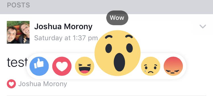
If the user just taps the “Like” button it will trigger a like, but if the user holds down the “Like” button it will launch the reactions pop up. This keeps the interface simple, but still provides easy access to the new reactions. It is an interesting design, and it is actually quite easy to implement in Ionic as well.
In this tutorial, we are going to create a simplified version of the reactions button that looks like this:
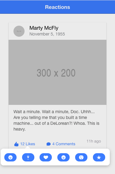
This is a bare-bones implementation with not much effort put into styling it well, but if there is enough interest, I may do a follow-up blog post with a more complete implementation.
Before We Get Started
Last updated for Ionic 3.6.1
Before you go through this tutorial, you should have at least a basic understanding of Ionic concepts. You must also already have Ionic set up on your machine.
If you’re not familiar with Ionic already, I’d recommend reading my Ionic Beginners Guide or watching my beginners series first to get up and running and understand the basic concepts. If you want a much more detailed guide for learning Ionic, then take a look at Building Mobile Apps with Ionic.
1. Create a Template
We’re going to need some content to play around with, so if you don’t already have something with a “Like” button or an equivalent, you should add the following to your application.
Add the following code to one of your templates:
<ion-header>
  <ion-navbar color="primary">
    <ion-title> Reactions </ion-title>
  </ion-navbar>
</ion-header>

<ion-content padding>
  <ion-card>
    <ion-item>
      <ion-avatar item-start>
        <img src="http://placehold.it/75" />
      </ion-avatar>
      <h2>Marty McFly</h2>
      <p>November 5, 1955</p>
    </ion-item>

    <img src="http://placehold.it/300x200" />

    <ion-card-content>
      <p>
        Wait a minute. Wait a minute, Doc. Uhhh... Are you telling me that you
        built a time machine... out of a DeLorean?! Whoa. This is heavy.
      </p>
    </ion-card-content>

    <ion-row>
      <ion-col>
        <button ion-button icon-left clear small>
          <ion-icon name="thumbs-up"></ion-icon>
          <div>12 Likes</div>
        </button>
      </ion-col>
      <ion-col>
        <button ion-button icon-left clear small>
          <ion-icon name="text"></ion-icon>
          <div>4 Comments</div>
        </button>
      </ion-col>
      <ion-col center text-center>
        <ion-note> 11h ago </ion-note>
      </ion-col>
    </ion-row>
  </ion-card>
</ion-content>
This is just using a <ion-card> example from the documentation.
2. Create a Reactions Page
In order to achieve the reactions popup, we are going to use Ionic’s Popover directive, which will allow us to display a modal window next to an element.
We can pass a component to Popover and it will display that component as a modal. The Popover component is documented as requiring a page, but an Ionic page is just a normal Angular component, so you don’t technically have to generate a “page” if you don’t want to – that is what we will be doing, though.
Generate a new page to use for the Reactions
ionic g page ReactionsAll we are going to do on this page is add a few buttons, but we will also need to do some styling to remove a lot of the normal page styling which is going to make the popover look weird.
Modify src/pages/reactions/reactions.html to reflect the following:
<ion-content>
  <ion-grid>
    <ion-row>
      <ion-col col-2>
        <button (click)="share()" ion-button small round icon-only>
          <ion-icon name="happy"></ion-icon>
        </button>
      </ion-col>
      <ion-col col-2>
        <button (click)="share()" ion-button small round icon-only>
          <ion-icon name="wine"></ion-icon>
        </button>
      </ion-col>
      <ion-col col-2>
        <button (click)="share()" ion-button small round icon-only>
          <ion-icon name="heart"></ion-icon>
        </button>
      </ion-col>
      <ion-col col-2>
        <button (click)="share()" ion-button small round icon-only>
          <ion-icon name="sad"></ion-icon>
        </button>
      </ion-col>
      <ion-col col-2>
        <button (click)="share()" ion-button small round icon-only>
          <ion-icon name="outlet"></ion-icon>
        </button>
      </ion-col>
      <ion-col col-2>
        <button (click)="share()" ion-button small round icon-only>
          <ion-icon name="star"></ion-icon>
        </button>
      </ion-col>
    </ion-row>
  </ion-grid>
</ion-content>
This adds 6 buttons to a grid, and each of those buttons triggers a share function. This function won’t actually do anything, we will just use it to trigger the closing of the popover (but you could use it to do something else, of course).
Modify src/pages/reactions/reactions.ts to reflect the following:
import { Component } from '@angular/core';
import { IonicPage, NavController, NavParams, ViewController } from 'ionic-angular';

@IonicPage()
@Component({
  selector: 'page-reactions',
  templateUrl: 'reactions.html',
})
export class ReactionsPage {

    constructor(private navCtrl: NavController, private navParams: NavParams, private viewCtrl: ViewController) {

    }

    ionViewDidLoad() {
        console.log('ionViewDidLoad ReactionsPage');
    }

    share(){
        this.viewCtrl.dismiss();
    }

}
This just sets up the ViewController so that we can dismiss the popover when the share function is called. Now we just need to add a couple of styles.
Modify src/pages/reactions/reactions.scss to reflect the following:
page-reactions {
  ion-content {
    padding: 0;
  }

  button {
    width: 40px;
  }
}
This will make our reactions page display nicely, but we are also going to make some additional style changes so that the popover that is displayed looks more like the Facebook reactions bar.
Add the following variables to the src/theme/variables.scss file:
// App iOS Variables
// --------------------------------------------------
// iOS only Sass variables can go here

$popover-ios-width: 95%;

// App Material Design Variables
// --------------------------------------------------
// Material Design only Sass variables can go here

$popover-md-width: 95%;
This will modify the popover so that it takes up 95% of the width of the page. Finally, we are going to add a global style to give the popover a bit more of a shadow.
Add the following styles to src/app/app.scss:
.popover-wrapper .popover-content {
  box-shadow: 0px 3px 15px 0px rgba(0, 0, 0, 0.25);
}
3. Trigger the Popover
We have our reactions popover set up nicely – now we just need to trigger it. We are going to add two handlers to our “Like” button to handle cases where the user just taps, and cases where the user holds down on the like button.
Modify the like button to reflect the following:
<button
  (click)="like()"
  (press)="showReactions($event)"
  ion-button
  icon-left
  clear
  small
></button>
We are creating an event binding for the press event, which will only trigger if the user taps and holds down on the screen. It’s important that we pass the $event through to the showReactions function because, in order for the popover to know where on the screen it needs to be displayed, it needs access to the pointer event that triggered it.
Now we just need to create the functions to handle these events.
Modify your page to include the following two functions:
import { Component } from '@angular/core';
import { NavController, PopoverController } from 'ionic-angular';
import { ReactionsPage } from '../../pages/reactions/reactions';

@Component({
  selector: 'page-home',
  templateUrl: 'home.html'
})
export class HomePage {

    constructor(public navCtrl: NavController, private popoverCtrl: PopoverController) {
        // THIS IS JUST FOR TESTING
        window.addEventListener("contextmenu", (e) => { e.preventDefault(); });
    }

    showReactions(ev){

        let reactions = this.popoverCtrl.create(ReactionsPage);

        reactions.present({
            ev: ev
        });

    }

    like(){
        console.log("like");
    }

}
When we call the present method on the popover, notice that we are sending the event we passed in along with it. I’ve also added some code to the constructor that will prevent the context menu from launching. This is not required for production, but if you are using the Chrome device simulator, the context menu is triggered by clicking and holding on the screen. Since this is the same way that our reactions popover is triggered, it makes it annoying to test.
Summary
This was a reasonably simple tutorial, but it is quite a cool little technique. As I mentioned, if there is enough interest I may do a more advanced implementation that more closely mimics Facebook’s implementation.