

You know what’s way cooler than horizontal progress bars? Circle progress bars! Well, for some contexts at least. Circles are a little bit more difficult to work with in CSS that squares/rectangles where we can just define a simple width/height for the shape, but with some effort we can create something that looks like this:
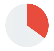
There are different ways to go about implementing a circle component like this, but I am going to walk through a rather simple method for achieving the effect with conic gradients. The basic idea is that we can use the conic-gradient that CSS provides to create a radial gradient that looks something like this:
If we then overlay another circle shape ontop of the gradient, we can achieve the circular progress bar effect quite easily:
The best part of this approach is how lightweight the solution is, with the key aspect being this CSS property:
background: conic-gradient(green 34%, 0, grey 66%);This will create a gradient similar to the example that you can see above with a circular bar 34% of the way around the full circle. To make this into a more dynamic component, we will need to implement a way to configure both the colour values and the percentages for that CSS property.
NOTE: The conic-gradient value is not currently fully supported by all browsers. It is supported on Chrome/Safari (both desktop and iOS/Android), but Internet Explorer/Firefox and others do not support conic-gradient yet. If you do require support for these browsers, and want to use this component, there is a polyfill available.
Before We Get Started
We are going to create this component as a standalone web component using StencilJS. Although we will be focusing specifically on StencilJS, you could still follow this tutorial to apply the same concept elsewhere. For example, you could build this directly into an Ionic/StencilJS application (rather than creating a standalone component), or as an Angular component, or use the same concepts in your React application. We are just working with standard web stuff here.
This tutorial was written with Ionic developers in mind, but there also isn’t anything specific to Ionic or mobile applications here. If you are following along with StencilJS, I will assume that you already have a basic understanding of creating custom web components with StencilJS
1. Create the Component
We will be creating a component called my-circle-progress but you can rename this to whatever you prefer. Just make sure that you create a my-circle-progress.css and my-circle-progress.tsx file inside of the components folder in your StencilJS project.
The basic outline of the component will look like this:
import { Component, Prop, h } from '@stencil/core';

@Component({
  tag: 'my-circle-progress',
  styleUrl: 'my-circle-progress.css',
  shadow: true,
})
export class MyCircleProgress {
  @Prop() progressAmount: string = '0';
  @Prop() progressColor: string = '#2ecc71';

  render() {
    return (
      <div>
        <div>
          <span>75%</span>
        </div>
      </div>
    );
  }
}
We will use two props that can be used to pass in values to this component. The progressAmount will be used to determine how much of the circle should be filled (and it will default to 0 if no value is supplied), and the progressColor will be used to determine the colour of the progress wheel (which defaults to a nice green colour).
Our template has a <div> for the element that will hold our conic-gradient background, and another <div> for the overlay that will sit on top of the gradient and contain the percentage number. We are going to define the styles directly on the elements - the CSS is quite short and it makes the tutorial easier to follow - but if you prefer, you could add classes to these divs and add your styles to the my-circle-progress.css file instead.
2. Implement the Conic Gradient
First, let’s take a look at how we can create the gradient required for our circle.
Modify the template to reflect the following:
  render() {
    return (
      <div
        style={{
          width: `100%`,
          height: `100%`,
          display: `flex`,
          alignItems: `center`,
          justifyContent: `center`,
          background: `conic-gradient(${this.progressColor} ${this.progressAmount}%, 0, #ecf0f1 ${(
            100 - parseInt(this.progressAmount)
          ).toString()}%)`,
          borderRadius: `50%`
        }}
      >
        <div>
          <span>
            {this.progressAmount}
          </span>
        </div>
      </div>
    );
  }
Creating a circle in CSS is simple enough - we just use a border-radius of 50%. The tricky part here is setting up the gradient. As we discussed earlier, we can add a conic-gradient like this:
background: conic-gradient(green 34%, 0, grey 66%);Which would fill our circle with 34% green and 66% grey in a clock-wise manner. We need to make this dynamic. Ideally, we want to be able to pass in a number (e.g. 67) and then have the circle fill up with our main colour 67% of the way. All we need to do to achieve this is supply the desired number as the first percent value, and then 100 - (the number) as the second percentage value. We do this by passing in our progressAmount prop that we defined on the component.
We also pass in the progressColor prop to dynamically set the colour. We use a default grey for the background of #ecf0f1 but you could make this dynamic too if you wanted to (by using another prop, setting up a CSS variable, or turning off Shadow DOM on the component).
We have also added some other styles aside from the borderRadius and background. We want the circle to fill up all the available space, and we will also need the overlay (the <div> inside of the one we are currently working on) to be centered both vertically and horizontally - so, we use a flex layout with alignItems and justifyContent to achieve this.
At this point, our circles should look like a pie chart:
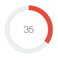
3. Add the Overlay
To make our circles look less like a pie chart and more like a progress wheel, we need to add another circle overlay on top. This will give the appearance of cutting out the middle section of the circle, and will create the effect of a bar rotating around a circle.
Modify the template to reflect the following:
  render() {
    return (
      <div
        style={{
          width: `100%`,
          height: `100%`,
          display: `flex`,
          alignItems: `center`,
          justifyContent: `center`,
          background: `conic-gradient(${this.progressColor} ${this.progressAmount}%, 0, #ecf0f1 ${(
            100 - parseInt(this.progressAmount)
          ).toString()}%)`,
          borderRadius: `50%`
        }}
      >
        <div
          style={{
            display: `flex`,
            alignItems: `center`,
            justifyContent: `center`,
            backgroundColor: `#fff`,
            height: `80%`,
            width: `80%`,
            borderRadius: `50%`,
            boxShadow: `0px 0px 7px 0px rgba(0, 0, 0, 0.1)`
          }}
        >
          <span
            style={{
              fontFamily: `"Helvetica Neue", Helvetica, Arial, Verdana, sans-serif`,
              fontSize: `2em`,
              fontWeight: `lighter`
            }}
          >
            {this.progressAmount}
          </span>
        </div>
      </div>
    );
  }
This overlay is a more simple circle. To make sure that we can still see the gradient behind the circle, we give this circle a width/height of 80% - this will leave the edges of the gradient behind it visible. We also add a box-shadow but this is not required, it just creates a nice little effect to give the component some depth.
Once again, we use a flex layout because we will also need to center the number that will be displayed on top of the circle, and we also add a bit of styling to our text.
4. Use the Component
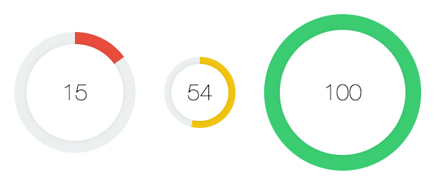
The component is completed now! If you have been building this with StencilJS you can add the component to your index.html file to see a preview of what it looks like:
<body>
  <div style="display: flex; align-items: center; flex-direction: column">
    <div style="width: 170px; height: 170px; margin: 20px;">
      <my-circle-progress
        progress-color="#e74c3c"
        progress-amount="15"
      ></my-circle-progress>
    </div>
    <div style="width: 100px; height: 100px; margin: 20px;">
      <my-circle-progress
        progress-color="#f1c40f"
        progress-amount="54"
      ></my-circle-progress>
    </div>

    <div style="width: 220px; height: 220px; margin: 20px;">
      <my-circle-progress
        progress-color="#2ecc71"
        progress-amount="100"
      ></my-circle-progress>
    </div>
  </div>
</body>
You can have a play around and use whatever colours/progress amounts you like.
Summary
We now have a resuable component that can be easily used anywhere - if you built this with StencilJS you will also be able to use it anywhere that supports web components. You will just need to publish the component in some manner.
If you enjoyed this tutorial, let me know in the comments or on Twitter. If there is interest in this component I’d like to take it a bit further, perhaps by extending it to function as an animated timer or event an input mechanism.