

In this tutorial, we are going to walk through how to build a simple tap to reveal component in Ionic 2. The concept is quite straightforward, we will build a component that has two possible content area: a before, and an after. The before content will be displayed initially, and the after content will be displayed once the user taps the component.
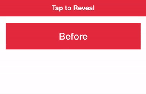
Here’s what it will look like when we are done:
NOTE: This tutorial uses similar concepts to this tutorial. It discusses the general concept of custom components and how they work in quite a bit of detail. Since I have already covered these concepts, this tutorial will mostly just be a basic step-by-step guide. If you want more of a beginner friendly introduction to custom components in Ionic 2, I would recommend that you read the previous tutorial or watch this video.
Before We Get Started
Last updated for Ionic 3.3.0
Before you go through this tutorial, you should have at least a basic understanding of Ionic 2 concepts. You must also already have Ionic 2 installed on your machine.
If you’re not familiar with Ionic 2 already, I’d recommend reading my Ionic 2 Beginners Guide first to get up and running and understand the basic concepts. If you want a much more detailed guide for learning Ionic 2, then take a look at Building Mobile Apps with Ionic 2.
1. Generate a New Ionic 2 Application
We will start off by generating a new Ionic 2 application with the following command:
ionic start ionic2-tap-reveal blankOnce that has finished generating, you should make it your working directory by running the following command:
cd ionic2-tap-revealWe will also need to generate the TapReveal component we will be implementing. We will generate that with the Ionic CLI now.
Run the following command to generate the TapReveal component:
ionic g component TapRevealIn order to be able to use this component throughout the application, we will need to add it to our app.module.ts file.
Modify src/app/app.module.ts to reflect the following:
import { BrowserModule } from '@angular/platform-browser';
import { NgModule, ErrorHandler } from '@angular/core';
import { IonicApp, IonicModule, IonicErrorHandler } from 'ionic-angular';
import { SplashScreen } from '@ionic-native/splash-screen';
import { StatusBar } from '@ionic-native/status-bar';

import { MyApp } from './app.component';
import { HomePage } from '../pages/home/home';
import { TapRevealComponent } from '../components/tap-reveal/tap-reveal';

@NgModule({
  declarations: [MyApp, HomePage, TapRevealComponent],
  imports: [BrowserModule, IonicModule.forRoot(MyApp)],
  bootstrap: [IonicApp],
  entryComponents: [MyApp, HomePage],
  providers: [
    StatusBar,
    SplashScreen,
    { provide: ErrorHandler, useClass: IonicErrorHandler },
  ],
})
export class AppModule {}
Now we’re ready to jump into the implementation.
2. Implement the Tap Reveal Component
As I mentioned, the implementation for this component is quite simple, so we are just going to paste the code for each file and talk through it briefly.
Modify src/components/tap-reveal/tap-reveal.html to reflect the following:
<div class="tap-reveal-container" (click)="toggle()" [class.tap-reveal-after]="toggled">

    <div class="before">
        <ng-content class="before" select=".tap-reveal-before"></ng-content>
    </div>

    <div class="after">
        <ng-content select=".tap-reveal-after"></ng-content>
    </div>

</div>
The most important part of the template for this component is the use of <ng-content>. This allows us to “project” content from wherever we are using this component. You will see when we make use of this component later or we define the content that we want injected where the <ng-content> tags are.
We have a conditional class of tap-reveal-after applied, and we have a toggle function that will toggle the toggled member variable between true and false. When the component has been tapped, the tap-reveal-after class will apply, and it will be removed again if it is tapped a second time. This is what will allow us to modify the visibility of the different content areas, as you will see in a moment.
Modify src/components/tap-reveal/tap-reveal.scss to reflect the following:
tap-reveal {
  .tap-reveal-container {
    position: relative;
  }

  .before {
    position: absolute;
    top: 0;
    left: 0;
    opacity: 1;
    transition: opacity 1000ms;
  }

  .after {
    position: absolute;
    top: 0;
    left: 0;
    opacity: 0;
    transition: opacity 1000ms;
  }

  .tap-reveal-after {
    .before {
      opacity: 0;
    }

    .after {
      opacity: 1;
    }
  }
}
As you can see above, the before class is set to be visible in the beginning and the after class is set to be invisible (by setting its opacity to 0). However, once the tap-reveal-after class is applied, it will use the rules towards the bottom instead to switch the visibility of the two. Since the rule nested inside of tap-reveal-after is more specific, it will be applied instead of the un-nested rules. We also add a transition property on opacity to animate the change in opacity.
The other important thing here is the use of position. We need the two content areas to overlap each other such that one content area sits directly on top of the other. To do this, we give the parent container a relative position, and then we give each of its children an absolute position. This allows us to position the element absolutely relative to the parent container, rather than the document itself. The result is that we position both elements in the absolute top left of the container.
Modify src/components/tap-reveal/tap-reveal.ts to reflect the following:
import { Component } from '@angular/core';

@Component({
  selector: 'tap-reveal',
  templateUrl: 'tap-reveal.html',
})
export class TapRevealComponent {
  toggled: boolean = false;

  constructor() {}

  toggle() {
    this.toggled = !this.toggled;
  }
}
The logic for this component is very simple, all we have to do is define that single toggle function and set up the toggled member variable.
3. Use the TapReveal Component
We’ve finished implementing the tap to reveal component now, all we have to do is use it. We are just going add it to our Home Page.
Modify src/pages/home/home.html to reflect the following:
<ion-header>
  <ion-navbar color="danger">
    <ion-title> Tap to Reveal </ion-title>
  </ion-navbar>
</ion-header>

<ion-content padding>
  <tap-reveal>
    <div class="tap-reveal-before"><h2>Before</h2></div>

    <div class="tap-reveal-after"><h2>After</h2></div>
  </tap-reveal>
</ion-content>
You can see now we make use of content projection with the <ng-content> tag. By giving elements here a class that matches the select attribute that <ng-content> used in the component’s template, we are able to project content we add here into the component.
Modify src/pages/home/home.scss to reflect the following:
.ios,
.md {
  page-home {
    .tap-reveal-container {
      width: 100%;
    }

    .before,
    .after {
      width: 100%;
      background-color: map-get($colors, danger);
      color: #fff;
      padding: 20px;
      text-align: center;

      h2 {
        margin: 0px;
      }
    }
  }
}
Now we have just applied some styles to the component itself to make it look a little nicer and more obvious. The important thing to note is that the styles here are not required for the functionality of the component, it is purely presentational – we kept all the styling that the component needs to function in the .scss file for the component itself.
If you serve the application now, it should look something like this:
Summary
This is a fun and simple little component, but it makes use of the component architecture available in Ionic 2 applications so you would be able to reuse the component just about anywhere now (even in a generic Angular application).