

A tabbed navigation interface is very commonly used in mobile applications and, as with most things user interface related, the Ionic web components make implementing this kind of interface relatively easy. We can make use of the <ion-tabs>, <ion-tab>, <ion-tab-bar>, and <ion-tab-button> components to create an interface with multiple tabs that display different components that we can easily switch between:
In this tutorial, we are going to look at two different approaches to implementing tab navigation in an Ionic & StencilJS application. The first will be a basic implementation that allows for switching between components using tabbed navigation, but each individual tab will be limited to displaying just a single component.
The second approprach will provide each tab with its own navigation system, allowing for additional pages/components to be pushed within an individual tab. This would allow you to create a master/detail navigation pattern (or pretty much anything else) within an individual tab.
Before we Get Started
This tutorial will assume that you already have a grasp on the basics of building Ionic applications with StencilJS. If you need to learn more of the basics first, you might want to check out my other StencilJS tutorials.
1. Getting Ready
We will be using, more or less, the same project structure for both of our example. If you want to follow along with the examples, I would recommend setting up a new Ionic/StencilJS project with the following components:
app-rootapp-tabsapp-homeapp-profileapp-detail
With both approaches, the general structure is mostly the same. We have our app-root component which will contain our routing information as usual. The app-tabs component will set up the tabs interface and the app-home, app-profile, and app-detail components will be used inside of the tabs interface.
For the basic example, we will just be using app-home and app-profile inside of the tabs interface and providing the ability to switch between those. In the advanced example, we will add the ability to “push” the additional app-detail page inside of the tab that contains app-profile.
2. Basic Tabs
This first example is going to demonstrate a basic implementation of tabbed navigation that will allow you to switch between multiple components in a tab view, but you will not be able to navigate within individual tabs.
Modify src/components/app-tabs/app-tabs.tsx to reflect the following:
import { Component } from '@stencil/core';

@Component({
  tag: 'app-tabs',
  styleUrl: 'app-tabs.css',
})
export class AppTabs {
  render() {
    return [
      <ion-tabs>
        <ion-tab tab="tab-home" component="app-home" />
        <ion-tab tab="tab-profile" component="app-profile" />

        <ion-tab-bar slot="bottom">
          <ion-tab-button tab="tab-home">
            <ion-icon name="map" />
            <ion-label>Home</ion-label>
          </ion-tab-button>
          <ion-tab-button tab="tab-profile">
            <ion-icon name="information-circle" />
            <ion-label>Profile</ion-label>
          </ion-tab-button>
        </ion-tab-bar>
      </ion-tabs>,
    ];
  }
}
This sets up the general structure for our tabs. We define everything inside of the <ion-tabs> components, including each individual tab which is created with <ion-tab> and then the <ion-tab-bar> which provides the buttons for switching between the various tabs. Notice that we give a name to each <ion-tab> using the tab property, and then we supply that name to the <ion-tab-button> so that it knows which tab to activate when clicked.
We also assign the component that the tab should display by using the component property, and just providing the tag of the component that we want to use. Now we just need to set up the routing.
Modify src/components/app-root/app-root.tsx to reflect the following:
import { Component } from '@stencil/core';

@Component({
  tag: 'app-root',
  styleUrl: 'app-root.css',
})
export class AppRoot {
  render() {
    return (
      <ion-app>
        <ion-router useHash={false}>
          <ion-route component="app-tabs">
            <ion-route url="/" component="tab-home" />
            <ion-route url="/profile" component="tab-profile" />
          </ion-route>
        </ion-router>
        <ion-nav />
      </ion-app>
    );
  }
}
We create a route for our app-tabs component similarly to how we would create a normal route, except that there is no url attached directly to it. Instead, we provide additional routes inside of the route for app-tabs that connects particular URLs to our tabs. Notice that the component we supply to the routes is the tab name we gave them in app-tabs not the actual component itself - we want the router to active the tab that contains the component, not the component itself.
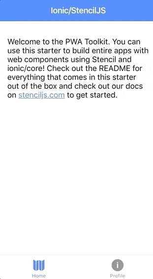
That’s all we need to do for a basic tabs set up. If you load the application now it should load up the default / route, which will display the tab-home tab in our tabbed navigation. You should then be able to switch back and forth between the two tabs.
3. Advanced Tabs
This next implementation will give each tab its own <ion-nav> component, which will allow it to provide full navigation capabilities within individual tabs. This means that each tab can maintain its own navigation, and you could navigate between multiple pages/components within an individual tab.
There are only a few minor modifications required in order to get this working. Let’s take a look.
Modify src/components/app-tabs/app-tabs.tsx to reflect the following:
import { Component } from '@stencil/core';

@Component({
  tag: 'app-tabs',
  styleUrl: 'app-tabs.css',
})
export class AppTabs {
  render() {
    return [
      <ion-tabs>
        <ion-tab tab="tab-home">
          <ion-nav />
        </ion-tab>

        <ion-tab tab="tab-profile">
          <ion-nav />
        </ion-tab>

        <ion-tab-bar slot="bottom">
          <ion-tab-button tab="tab-home">
            <ion-icon name="map" />
            <ion-label>Home</ion-label>
          </ion-tab-button>
          <ion-tab-button tab="tab-profile">
            <ion-icon name="information-circle" />
            <ion-label>Profile</ion-label>
          </ion-tab-button>
        </ion-tab-bar>
      </ion-tabs>,
    ];
  }
}
This is more or less the same as the basic example, except that instead of assigning a component directly to the <ion-tab> we add an <ion-nav> component inside of the tab. Now let’s up the routing.
Modify src/components/app-root/app-root.tsx to reflect the following:
import { Component } from '@stencil/core';

@Component({
  tag: 'app-root',
  styleUrl: 'app-root.css',
})
export class AppRoot {
  render() {
    return (
      <ion-app>
        <ion-router useHash={false}>
          <ion-route component="app-tabs">
            <ion-route url="/" component="tab-home">
              <ion-route component="app-home" />
            </ion-route>

            <ion-route url="/profile" component="tab-profile">
              <ion-route component="app-profile" />
              <ion-route url="/detail" component="app-detail" />
            </ion-route>
          </ion-route>
        </ion-router>
        <ion-nav />
      </ion-app>
    );
  }
}
Again, pretty similar, except that now we have one additional layer or nesting for our routes. Inside of the route for each individual tab, we supply further routes to determine what to display in that tab. Let’s take a closer look at the tab-profile tab which is the interesting one here:
<ion-route url="/profile" component="tab-profile">
  <ion-route component="app-profile" />
  <ion-route url="/detail" component="app-detail" />
</ion-route>
The first additional <ion-route> that we set up just provides the default component for that tab - e.g. the one that will be activated when the user goes to /profile. In this case, that means that app-profile will be displayed. Then we add an additional route with a different url. This means that when the user goes to /profile/detail the app-detail component will be activated inside of the tab-profile tab.
This completes our advanced tabbed navigation implementation, but I will just quickly show you an example of using this. The easiest way to navigate about the application is to use simple buttons with href and routerDirection, and if we added a button like this on our app-profile component:
<ion-button href="/profile/detail" routerDirection="forward"
  >Push Detail Page</ion-button
>
We would be able to push our app-detail page into the tab-profile tab, and then (as long as we add a back button) navigate back to the default app-profile component within that tab. However, you might also want to navigate programmatically. This is easy to do as well, as ultimately everything can just be controlled by changing the URL. We could, for example, modify our app-profile component to look like this:
import { Component } from "@stencil/core";

@Component({
  tag: "app-profile",
  styleUrl: "app-profile.css"
})
export class AppProfile {
  private navCtrl: HTMLIonRouterElement;

  componentDidLoad() {
    this.navCtrl = document.querySelector("ion-router");
  }

  someCleverLogic(){
      // do something clever
      this.navCtrl.push("/profile/detail");
  }

  render() {
    return [
      <ion-header>
        <ion-toolbar color="primary">
          <ion-title>Profile</ion-title>
        </ion-toolbar>
      </ion-header>,

      <ion-content padding>
        <ion-button href="/profile/detail" routerDirection="forward">
          Push Detail Page (href)
        </ion-button>
        <ion-button onClick={() => this.someCleverLogic()}>
          Push Detail Page (programmatically)
        </ion-button>
      </ion-content>
    ];
  }
}
Both of these approaches to navigation will achieve the same result - we will be in the tab-profile tab with the app-profile page activated initially, and then the app-detail page will be pushed into view in that same tab.
Summary
Both of these tab implementations are rather similar, and also rather straight-forward to implement when you consider what we are achieving with such a small amount of code. We can gain the full navigation power of using individual <ion-nav> components inside each tab with relatively few changes to the overall structure.