

The Ionic team have stated that their goal with Ionic was to provide a core set of components out of the box and to allow developers and the community to build out additional components. Things like buttons, toolbars, and lists are all pretty essential. Things like Tinder cards and maps are popular but are not really things that would fit into a core set of features.
Swipeable Tabs are one of those features that are not included in the core set of components but are quite popular. I’ve seen many requests for this functionality since Ionic 2 has come out. Ibby Hadeed, who has contributed a lot to the Ionic framework (especially with Ionic Native), took on the challenge and recently released a great component that allows for swipeable tabs:
I wanted to write this post to highlight the awesome work he has done with this, but I also wanted to dive into the component he has built. This is a reasonably complex component and I think it’s a great learning opportunity to peek beneath the hood and see how these things actually work. Hopefully, it makes it seem less intimidating to go out there are create your own custom components.
Before We Get Started
Last updated for Ionic 2.3.0
Before you go through this tutorial, you should have at least a basic understanding of Ionic 2 concepts. You must also already have Ionic 2 installed on your machine.
If you’re not familiar with Ionic 2 already, I’d recommend reading my Ionic 2 Beginners Guide first to get up and running and understand the basic concepts. If you want a much more detailed guide for learning Ionic 2, then take a look at Building Mobile Apps with Ionic 2.
Using the Swipeable Tabs Component
Let’s first go through a simple example of using the swipeable tabs, and then we will take a look at what is going on behind the scenes.
1. Generate a New Ionic 2 Application
We are just going to use a normal tabs application for this example, and then modify it to use the swipeable tabs. To do that, you should run the following command:
ionic start ionic-swipeable-tabs tabs --v2Once that has finished generating, you should make it your working directory:
cd ionic-swipeable-tabs2. Setting up Swipeable Tabs
To set up swipeable tabs in a project, you will need to follow the instructions listed here. The component has been bundled up into an npm package, so to set it up you will first need to install the npm package:
npm install ionic2-super-tabs --saveand then you just need to add the SuperTabsModule from the package that was just installed to your imports in the app.module.ts file:
import { NgModule, ErrorHandler } from '@angular/core';
import { IonicApp, IonicModule, IonicErrorHandler } from 'ionic-angular';
import { MyApp } from './app.component';
import { AboutPage } from '../pages/about/about';
import { ContactPage } from '../pages/contact/contact';
import { HomePage } from '../pages/home/home';
import { TabsPage } from '../pages/tabs/tabs';
import { SuperTabsModule } from 'ionic2-super-tabs';
import { StatusBar } from '@ionic-native/status-bar';
import { SplashScreen } from '@ionic-native/splash-screen';

@NgModule({
  declarations: [MyApp, AboutPage, ContactPage, HomePage, TabsPage],
  imports: [IonicModule.forRoot(MyApp), SuperTabsModule],
  bootstrap: [IonicApp],
  entryComponents: [MyApp, AboutPage, ContactPage, HomePage, TabsPage],
  providers: [
    StatusBar,
    SplashScreen,
    { provide: ErrorHandler, useClass: IonicErrorHandler },
  ],
})
export class AppModule {}
You may not have added functionality before that requires you to add a module to the imports array, most people would be more familiar with just importing a component and adding it to the declarations array. The reason for this is easier to understand if you have a basic idea of what the point of a @NgModule is, which I explain in this video. In short, you can use a module to bundle together a bunch of components that you want to make available throughout your application. We add the IonicModule so that we can use all of Ionic’s components throughout the application (without having to import each component everywhere we want to use them), and similarly, by adding the SuperTabsModule we can easily set up the two components required for the swipeable tabs.
3. Using Swipeable Tabs
Now that we have the set up complete, all we have to do is add some swipeable tabs to the application.
Modify src/pages/tabs/tabs.html to reflect the following:
<super-tabs height="100%">
  <super-tab [tabRoot]="tab1Root" title="Home"></super-tab>
  <super-tab [tabRoot]="tab2Root" title="About"></super-tab>
  <super-tab [tabRoot]="tab3Root" title="Contact"></super-tab>
</super-tabs>
Since we already have tab1Root, tab2Root, and tab3Root defined in tabs.ts since we are using the tabs template which automatically generates those for us, this is all we need to do. You simple supply the pages you want to use for each tab using the tabRoot property, and you’re good to go!
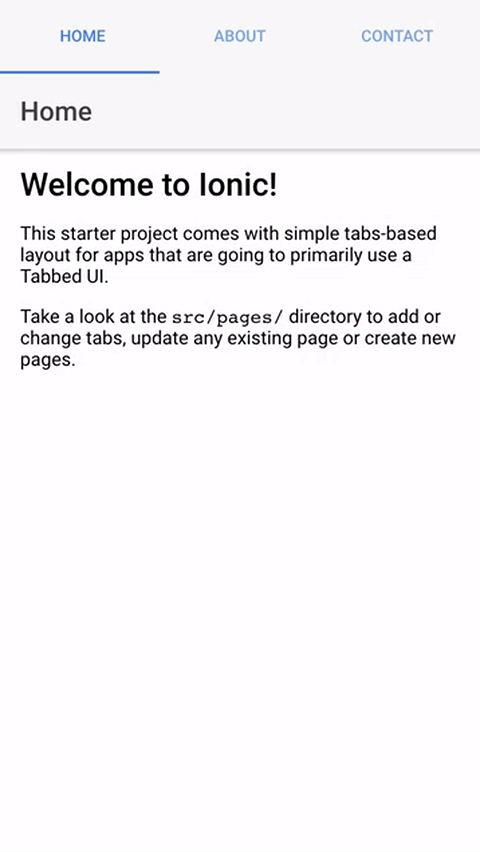
You should now have something that looks like this:
There are more configuration options available for this component, so I would highly recommend that you have a look through the documentation as well.
How the Swipeable Tabs Component Works
Ibby has done an amazing job with making this super easy to use and to install. On the surface, it all looks pretty straightforward, but behind the scenes, there is a little bit more going on. So, let’s do a broad overview of how this actually works.
First of all, this isn’t just one component, it’s two components – SuperTab and SuperTabs – both of which are bundled into a single @NgModule called SuperTabsModule:
src/super-tabs.module.ts
import { NgModule } from '@angular/core';
import { IonicModule } from 'ionic-angular';
import { SuperTabComponent } from './components/super-tab/super-tab';
import { SuperTabsComponent } from './components/super-tabs/super-tabs';

@NgModule({
  declarations: [SuperTabComponent, SuperTabsComponent],
  imports: [IonicModule],
  exports: [SuperTabComponent, SuperTabsComponent],
})
export class SuperTabsModule {}
Just like the standard Ionic tabs component, there is a component which handles the functionality of the tabs as a whole, and there is also a component for each individual tab.
The majority of the heavy lifting happens in the SuperTabsComponent so let’s take a closer look at that. Having a look at the template for a component is a good way to see what is going on at a glance:
@Component({ selector: 'super-tabs', template: `
<ion-toolbar [color]="toolbarColor" #toolbar mode="md">
  <ion-segment [color]="tabsColor" [(ngModel)]="selectedTabIndex" mode="md">
    <ion-segment-button
      *ngFor="let tab of tabs; let i = index"
      [value]="i"
      (ionSelect)="onTabSelect(i)"
    >
      <ion-icon *ngIf="tab.icon" [name]="tab.icon"></ion-icon>
      {{tab.title}}
    </ion-segment-button>
  </ion-segment>
  <div
    class="slide"
    #slide
    [style.left]="slidePosition"
    [class.ease]="shouldSlideEase"
    [style.width]="slideWidth"
  ></div>
</ion-toolbar>
<ion-slides
  [style.height]="slidesHeight + 'px'"
  (ionSlideDrag)="onDrag($event)"
  (ionSlideWillChange)="onSlideWillChange()"
  (ionSlideDidChange)="onSlideDidChange()"
  [initialSlide]="selectedTabIndex"
>
  <ion-slide *ngFor="let tab of tabs">
    <ion-nav [root]="tab.tabRoot" [rootParams]="tab.navParams"></ion-nav>
  </ion-slide>
</ion-slides>
` })
When using the <super-tabs> element, this is the template that is being used. Let’s simplify the template a bit to only look at the important bits:
<ion-toolbar>
  <ion-segment>
    <ion-segment-button> </ion-segment-button>
  </ion-segment>
</ion-toolbar>
<ion-slides>
  <ion-slide *ngFor="let tab of tabs">
    <ion-nav [root]="tab.tabRoot" [rootParams]="tab.navParams"></ion-nav>
  </ion-slide>
</ion-slides>
This entire component is made through combining the functionality of existing components in Ionic. A toolbar and segment is being used to list the tabs, and then the tabs themselves are just slides. Each slide then has its own ion-nav so that it can maintain its own navigation history.
The <ion-slide> uses an *ngFor which is looping over a tabs member variable. If you take a look further down the super-tabs.ts file you will see:
tabs: SuperTabComponent[] = [];so tabs is an array of SuperTabComponents (which is the other component used in the module). If you take a look at the ngAfterViewInit function you will see the following:
this.superTabs.forEach((tab) => {
  tab.navParams = tab.navParams || {};
  tab.navParams.rootNavCtrl = this.rootNavCtrl;
  this.tabs.push(tab);
});
The superTabs here is defined as follows:
@ContentChildren(SuperTabComponent) superTabs: QueryList<SuperTabComponent>;It grabs every instance of a SuperTabComponent that is added inside of the SuperTabsComponent using @ContentChildren and then adds those to the tabs array. Then that tabs array is used to generate a slide for each of the tabs in the array. @ConentChildren allows you to grab components that are projected into another component – if you are unfamiliar with this, it might be worth taking a look at this video.
There is more to this component, like listening for drag events and triggering slide changes and so on, but hopefully this illustrates the basic idea of how this functionality was created.
Summary
Ibby has done a fantastic job with this functionality, and I certainly don’t want to downplay that, but I did want to highlight that if you dig into how these components work (community created ones and the Ionic components themselves) it’s not too far-fetched to create your own. In a lot of cases, you can build off of existing functionality that is close to what you want to do, so you’re not starting completely from scratch.