

I’ve said it many times before, but one of my favourite things about Ionic 2 is that it has sleek UI elements available out of the box, and those UI elements automatically conform to the conventions of the platform that the application is running on.
However, no matter how good the default UI is if you want to add you or your organisation’s branding and personality you are going to need to add a custom touch to the theme. Even with just a few basic changes, you can quite quickly create a theme that will match your brand, and I’ve already written a few tutorials on how you might do this:
- A Guide to Styling an Ionic 2 Application
- Tips & Tricks for Styling Ionic 2 Applications
- Hacking CSS in Ionic 2
Sometimes you may want to take things a little further, though, by creating a more complex and visually pleasing layout. I’m a big believer in ”Form follows function”, and that a good user experience trumps trendy design or fancy animations, but the two are most certainly not mutually exclusive.
In this tutorial, we are going to walk through an example of building a stylish news feed layout in Ionic 2. The two standout UI elements will be a parallax header, and a frosted glass effect on the navigation bar. When it is done it will look like this:
NOTE: The frosted glass effect will make use of the backdrop-filter CSS property, which has limited support. This means that the effect will only be visible on Safari and iOS, it will not work on Chrome and Android. Instead, Android devices will just have a semi-transparent effect on the navigation bar instead.
Before We Get Started
Last updated for Ionic 3.3.0
Before you go through this tutorial, you should have at least a basic understanding of Ionic 2 concepts. You must also already have Ionic 2 set up on your machine.
If you’re not familiar with Ionic 2 already, I’d recommend reading my Ionic 2 Beginners Guide first to get up and running and understand the basic concepts. If you want a much more detailed guide for learning Ionic 2, then take a look at Building Mobile Apps with Ionic 2.
1. Generate a New Ionic 2 Application
To get us started, we are going to generate a simple blank Ionic 2 application.
Run the following command to generate a new Ionic 2 application:
ionic start ionic2-card-layout blank --v2Run the following command once the application has finished generating:
cd ionic2-card-layout2. Create the Basic Layout
Before we get into adding in the necessary styling to create the design we are attempting to create, we are first going to set up the basic structure of the application.
We are going to create a card list, based on the example from the documentation, with cards that contain an avatar, name, date, image, description, likes, comments, and a timestamp. Basically, a pretty standard social media style card. We will also add a Segment component to the top of the list.
Modify src/pages/home/home.html to reflect the following:
<ion-header no-border>
  <ion-navbar color="secondary">
    <ion-buttons left>
      <button ion-button icon-only color="light">
        <ion-icon name="arrow-back"></ion-icon>
      </button>
    </ion-buttons>
  </ion-navbar>
</ion-header>

<ion-content fullscreen>
  <ion-segment [(ngModel)]="category">
    <ion-segment-button value="gear"> Gear </ion-segment-button>
    <ion-segment-button value="clothing"> Clothing </ion-segment-button>
    <ion-segment-button value="nutrition"> Nutrition </ion-segment-button>
  </ion-segment>

  <ion-card *ngFor="let card of cards">
    <ion-item>
      <ion-avatar item-left>
        <img src="https://avatars.io/facebook/joshua.morony" />
      </ion-avatar>
      <h2>Josh Morony</h2>
      <p>November 5, 1955</p>
    </ion-item>

    <img src="http://placehold.it/500x200" />

    <ion-card-content>
      Lorem Ipsum is simply dummy text of the printing and typesetting industry.
      Lorem Ipsum has been the industry's standard dummy text ever since the
      1500s.
    </ion-card-content>

    <ion-row>
      <ion-col>
        <button ion-button icon-left clear small>
          <ion-icon name="thumbs-up"></ion-icon>
          <div>12 Likes</div>
        </button>
      </ion-col>
      <ion-col>
        <button ion-button icon-left clear small>
          <ion-icon name="text"></ion-icon>
          <div>4 Comments</div>
        </button>
      </ion-col>
      <ion-col center text-center>
        <ion-note> 11h ago </ion-note>
      </ion-col>
    </ion-row>
  </ion-card>
</ion-content>
Currently, there isn’t a whole lot going on. The code above is, more or less, copied directly from the documentation for the components. There are a couple of things worth noting, though.
We have set up two-way data binding using [(ngModel)] on the Segment component so that we can set the default option to be selected. In order for this to work, we will need to create a member variable in our TypeScript file called category (which we will do shortly).
We are also creating multiple cards using *ngFor, which will use the cards array we will define in our TypeScript file. These cards aren’t using any dynamic data right now, so we are just using *ngFor to create a bunch of cards in our list that we can play with.
Finally, we have a couple of CSS Utility Attributes set up that you may not have seen before. We set no-border on the <ion-header> which, not surprisingly, removes the border styling from the header. We are also using the fullscreen attribute on <ion-content>, which will cause the content area to occupy the full height of the screen and will force content to render underneath the navigation bar in the header. This is important because we will be creating a semi-transparent frosted glass effect, so we want to see the content blurred behind that “glass”.
There are also many other CSS Utility Attributes like these that you can use in your Ionic 2 applications. I would recommend getting familiar with them if you aren’t already.
3. Add Styling and the Frosted Glass Effect
Now that we’ve got the basic layout set up, we are going to move on to setting up that frosted glass effect on the navigation bar. It’s actually really simple to create, but remember that it will only work on iOS. Chrome does not have support for the backdrop-filter property that we will be making use of yet.
Modify src/pages/home/home.scss to reflect the following:
.ios,
.md {
  page-home {
    ion-header {
      backdrop-filter: blur(8px);
    }

    ion-navbar {
      opacity: 0.4;
      box-shadow: 0px 1px 13px 1px rgba(0, 0, 0, 0.77);
    }
  }
}
All we are doing here is setting a blur of 8px on the <ion-header> and we also reduce the opacity of the navigation bar so that we can more easily see our content behind it. The slight box-shadow also helps the navigation bar stand out a little more.
4. Set up the TypeScript File
Since we are setting up two-way data binding, and looping over an array of cards that we have not defined yet, we will need to add a few things to the TypeScript file.
Modify src/pages/home/home.ts to reflect the following:
import { Component } from '@angular/core';
import { NavController } from 'ionic-angular';

@Component({
  selector: 'page-home',
  templateUrl: 'home.html'
})
export class HomePage {

    cards: any;
    category: string = 'gear';

    constructor(public navCtrl: NavController) {

        this.cards = new Array(10);

    }

}
Here we have defined the category member variable for the Segment component, and we also set the cards array up. We just initialise it to be a new array with 10 elements – we don’t need to define any data in the arrays, we just want the cards to repeat themselves, so this is a quick way to do that rather than manually creating an array with 10 elements.
5. Add the CSS Rules
Now we are going to add the rest of the CSS rules that we need, and also set up some SASS variables. First, we are going to set up the SASS variables by modifying the $colors map, and setting a background colour.
Modify src/theme/variables.scss to include the following:
// Shared Variables
// --------------------------------------------------
// To customize the look and feel of this app, you can override
// the Sass variables found in Ionic's source scss files.
// To view all the possible Ionic variables, see:
// http://ionicframework.com/docs/v2/theming/overriding-ionic-variables/

$background-color: #3c353c;

// Named Color Variables
// --------------------------------------------------
// Named colors makes it easy to reuse colors on various components.
// It's highly recommended to change the default colors
// to match your app's branding. Ionic uses a Sass map of
// colors so you can add, rename and remove colors as needed.
// The "primary" color is the only required color in the map.

$colors: (
  primary: #bdc3c7,
  secondary: #7f8c8d,
  danger: #f53d3d,
  light: #fff,
  dark: #3c353c
);
This sets up the colours we will be using, but if you would prefer you can replace these with your own colours. Next, we are going to set up the rest of our CSS rules. This is mostly just going to be a bit of basic styling and positioning, so let’s get it set up first and then talk through it.
Modify src/pages/home/home.scss to reflect the following:
.ios,
.md {
  page-home {
    .header-image {
      background-image: url(https://ununsplash.imgix.net/photo-1421091242698-34f6ad7fc088?fit=crop&fm=jpg&h=650&q=75&w=950);
      height: 40vh;
    }

    .main-content {
      background-color: map-get($colors, dark);
      box-shadow: 0px -1px 13px 1px rgba(0, 0, 0, 0.3);
    }

    .scroll-content {
      padding-top: 0 !important;
    }

    ion-header {
      backdrop-filter: blur(8px);
    }

    ion-navbar {
      opacity: 0.4;
      box-shadow: 0px 1px 13px 1px rgba(0, 0, 0, 0.77);
    }

    ion-segment {
      padding: 0px 12px;
      opacity: 0.7;
      position: relative;
      top: -50px;
    }

    ion-segment-button {
      border-color: map-get($colors, primary) !important;
      color: #fff !important;
    }

    ion-card {
      background-color: #fff;
      width: 100%;
      margin: 0;
      margin-bottom: 25px;
      position: relative;
      top: -30px;
    }

    ion-card:last-of-type {
      margin-bottom: 0 !important;
    }

    ion-item {
      background-color: #fff;
    }
  }
}
We still have the styles we set up for the frosted glass effect, but we have a lot of new additions as well. A lot of it is just pretty basic styling but we are doing some weird stuff, so let’s focus on that.
We use relative positioning on ion-segment so that our Segment component is pushed out of the main content area and up into where the parallax header image will be. You should remove relative positioning if you are not going to be using the parallax header.
We are setting the margin-bottom for most of the cards to 25px, but then we use the last-of-type pseudo selector to apply a specific rule to only the last card. For this card, we set the margin-bottom to “.
We make use of map-get($colors, name) for some colour properties so that we can use the colours we defined in the $colors map in the variables.scss file.
Finally, we have two classes, .main-content and .header-image, which will be used for the parallax header in the next step. If you are not including the parallax header then you can get rid of these styles.
6. Add the Parallax Header (Optional)
This step is not required, but if we want to completely recreate the example I showed at the beginning, we will need to add in a parallax header.
I’ve previously created a tutorial on how to create a high-performance parallax header in Ionic 2, and we will be making use of that here. I will not be recreating this directive in this tutorial so you will need to complete the parallax tutorial first. If you like, you can implement the directive directly into this application as you follow the tutorial.
Once you have completed that tutorial, you should make sure that you copy the directive into this application so that it is located at:
src/components/parallax-headerand you will also need to update your app.module.ts file to include the directive.
Modify src/app/app.module.ts to reflect the following:
import { BrowserModule } from '@angular/platform-browser';
import { NgModule, ErrorHandler } from '@angular/core';
import { IonicApp, IonicModule, IonicErrorHandler } from 'ionic-angular';
import { SplashScreen } from '@ionic-native/splash-screen';
import { StatusBar } from '@ionic-native/status-bar';

import { MyApp } from './app.component';
import { HomePage } from '../pages/home/home';
import { ParallaxHeader } from '../components/parallax-header/parallax-header';

@NgModule({
  declarations: [MyApp, HomePage, ParallaxHeader],
  imports: [BrowserModule, IonicModule.forRoot(MyApp)],
  bootstrap: [IonicApp],
  entryComponents: [MyApp, HomePage],
  providers: [
    StatusBar,
    SplashScreen,
    { provide: ErrorHandler, useClass: IonicErrorHandler },
  ],
})
export class AppModule {}
Next, we will need to make some changes to the template to make the parallax header work.
Modify src/pages/home/home.html to reflect the following:
<ion-header no-border>
  <ion-navbar color="secondary">
    <ion-buttons left>
      <button ion-button icon-only color="light">
        <ion-icon name="arrow-back"></ion-icon>
      </button>
    </ion-buttons>
  </ion-navbar>
</ion-header>

<ion-content fullscreen parallax-header>
  <div class="header-image"></div>

  <div class="main-content">
    <ion-segment [(ngModel)]="category">
      <ion-segment-button value="gear"> Gear </ion-segment-button>
      <ion-segment-button value="clothing"> Clothing </ion-segment-button>
      <ion-segment-button value="nutrition"> Nutrition </ion-segment-button>
    </ion-segment>

    <ion-card *ngFor="let card of cards">
      <ion-item>
        <ion-avatar item-left>
          <img src="https://avatars.io/facebook/joshua.morony" />
        </ion-avatar>
        <h2>Josh Morony</h2>
        <p>November 5, 1955</p>
      </ion-item>

      <img src="http://placehold.it/500x200" />

      <ion-card-content>
        Lorem Ipsum is simply dummy text of the printing and typesetting
        industry. Lorem Ipsum has been the industry's standard dummy text ever
        since the 1500s.
      </ion-card-content>

      <ion-row>
        <ion-col>
          <button ion-button icon-left clear small>
            <ion-icon name="thumbs-up"></ion-icon>
            <div>12 Likes</div>
          </button>
        </ion-col>
        <ion-col>
          <button ion-button icon-left clear small>
            <ion-icon name="text"></ion-icon>
            <div>4 Comments</div>
          </button>
        </ion-col>
        <ion-col center text-center>
          <ion-note> 11h ago </ion-note>
        </ion-col>
      </ion-row>
    </ion-card>
  </div>
</ion-content>
We have made two significant changes here. First, we have added the parallax-header attribute to <ion-content> which will attach the behaviour of the custom parallax directive to the content area.
The parallax header directive also requires the content to be structured in a certain way, so we add two new divs with the header-image and main-content classes. All of the content for this page should now live inside of the main-content div.
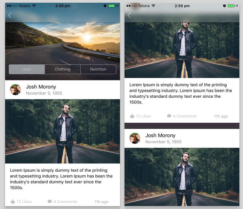
With that done, you should now have the layout completed, and it should look something like this:
Summary
I think this tutorial highlights how quick and easy it can be to create great looking layouts in Ionic 2, since a lot of what we do relies on plain old CSS and Ionic has already done a lot of the heavy lifting for us. Even though one of the properties we are relying on isn’t supported in Chrome, the lowered opacity of the navigation bar still gives somewhat of a “glass” effect even if we don’t have the nice blur filter.