

Creating your own custom components for Ionic 2 applications is a lot easier than it might seem initially. You do it all the time already because each page you add to your application is a custom component. Take the HomePage component that the Ionic CLI generates by default as an example, that looks something like this:
import { Component } from '@angular/core';
import { NavController } from 'ionic-angular';
@Component({
  selector: 'page-home',
  templateUrl: 'home.html',
})
export class HomePage {}
Technically, this sets up a component that we could use by adding the selector page-home to our templates like this:
<page-home></page-home>This would inject the component wherever we place that tag, which means that contents of the home.html file would be displayed wherever we place that tag and it could also make use of the logic in the home.ts file. Of course, we do not actually do this for pages in Ionic 2. We never actually manually render out pages in our Ionic 2 applications like this (even though they are just components like any other component), instead, we use Ionic’s built in navigation methods. My point is that if you know how to build a basic page in Ionic 2, you already have most of the knowledge to build your own custom components.
In this tutorial, we are going to build a custom progress bar component that we can use in an Ionic 2 application. This progress bar will have an input property that can be set to control the progress bar. It will look something like this:
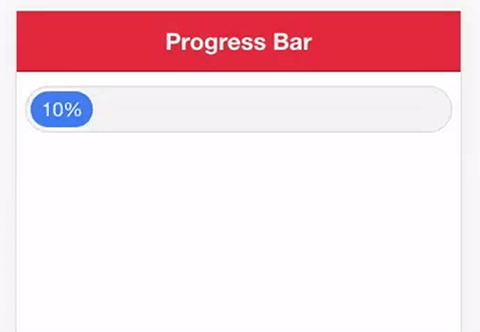
Once it has been completed, we will be able to use this component anyway where we want in the application, as many times as we want, or even in completely different applications, just by using the following syntax:
<progress-bar [progress]="loadProgress"></progress-bar>This is why creating a custom component can be preferable to building the functionality directly into your pages. It makes the code for your pages a lot cleaner and allows for much easier reuse (rather than having to copy and paste a bunch of code all the time).
Before We Get Started
Last updated for Ionic 3.9.2
Before you go through this tutorial, you should have at least a basic understanding of Ionic 2 concepts. You must also already have Ionic 2 set up on your machine.
If you’re not familiar with Ionic 2 already, I’d recommend reading my Ionic 2 Beginners Guide first to get up and running and understand the basic concepts. If you want a much more detailed guide for learning Ionic 2, then take a look at Building Mobile Apps with Ionic 2.
Understand Input and Output in Custom Components
As I mentioned in the introduction, if you already have the basics of Ionic 2 down then you already have most the knowledge that you need for building your own custom components. Property binding, event binding, two-way data binding, interpolation, using Ionic’s components, styling – all of these concepts and more are all exactly the same as when you work with them on normal pages in Ionic 2.
One concept you may not come across before attempting to create your own custom components is Input and Output. A component needs a way for data to flow in and flow out. Data can flow into the component (from its parent component) through its @Input, and data can flow out of the component (up to its parent component) through its @Output. We can use property binding to provide a component with input, and we can make the component fire an event to create output.
Setting up @Input and @Output in a component might look like this:
import { Component, Input, Output, EventEmitter } from '@angular/core';
import { NavController } from 'ionic-angular';

@Component({
  selector: 'my-component',
  templateUrl: 'my-component.html',
})
export class MyComponent {
  @Input('propertyName') myValue;
  @Output() someEvent = new EventEmitter();

  constructor() {}
}
If we want to pass in some data to this component now, we can use the someProperty input to do that, like this:
<my-component [propertyName]="someValue"></my-component>Once we do that, whatever someValue is will be available anywhere inside of our custom component as this.myValue since we set that up using @Input. If we want to trigger an event from within the component then we can just emit some data using the EventEmitter we set up using @Output like this:
this.someEvent.emit({ data: someData });which would then allow us to listen for that even like this:
<my-component
  [propertyName]="someValue"
  (someEvent)="doSomething()"
></my-component>
For the progress bar component, we will just be using @Input as we have no need to send any data back to the parent component. We just want to be able to supply our progress bar component with a value that it should use to display a certain percentage of progress.
Now that we have that bit of theory out of the way, let’s jump into creating the loading bar component.
1. Generate a New Ionic 2 Application
To start off with, we are going to generate a new Ionic 2 application using the blank template.
Run the following command to generate a new Ionic 2 project:
ionic start ionic2-progress-component blank --v2Once the project has generated, make it your working directory:
cd ionic2-progress-componentWe are also going to use the Ionic CLI to generate a template for our component.
Run the following command to generate the progress bar component:
ionic g component ProgressBarThis will generate the component for us, but we are also going to have to import and declare it in our app.module.ts file.
Modify src/app/app.module.ts to reflect the following:
import { BrowserModule } from '@angular/platform-browser';
import { NgModule, ErrorHandler } from '@angular/core';
import { IonicApp, IonicModule, IonicErrorHandler } from 'ionic-angular';
import { SplashScreen } from '@ionic-native/splash-screen';
import { StatusBar } from '@ionic-native/status-bar';

import { MyApp } from './app.component';
import { HomePage } from '../pages/home/home';
import { ProgressBarComponent } from '../components/progress-bar/progress-bar';

@NgModule({
  declarations: [MyApp, HomePage, ProgressBarComponent],
  imports: [BrowserModule, IonicModule.forRoot(MyApp)],
  bootstrap: [IonicApp],
  entryComponents: [MyApp, HomePage],
  providers: [
    StatusBar,
    SplashScreen,
    { provide: ErrorHandler, useClass: IonicErrorHandler },
  ],
})
export class AppModule {}
Note that you only need to include the custom component in the declarations array, you don’t need to add it to the entryComponents as well.
2. Create the Component
We’re going to jump straight into the fun bit now and step through creating the progress bar component. Let’s start off by implementing the progress-bar.ts file.
Modify src/components/progress-bar/progress-bar.ts to reflect the following:
import { Component, Input } from '@angular/core';

@Component({
  selector: 'progress-bar',
  templateUrl: 'progress-bar.html',
})
export class ProgressBarComponent {
  @Input('progress') progress;

  constructor() {}
}
You’ll notice that this looks pretty similar to the example code I showed you earlier. All we are doing here is setting up an @Input called progress that we will use to control how full the progress bar should be. This is actually all we need to do for this file, the rest of the logic will be handled in the template.
Modify src/components/progress-bar/progress-bar.html to reflect the following:
<div class="progress-outer">
  <div class="progress-inner" [style.width]="progress + '%'">{{progress}}%</div>
</div>
This is also a pretty simple file. We create a container <div> so that we can apply the appropriate styling to this component later. The interesting part is the inner <div>, we use property binding to bind our progress input to the width property for the element (along with a percentage symbol). So if we give this component an input of 50, it will set the width of that inner <div> to 50%. Then we just render out that value as text inside of the <div>.
That will control how full the progress bar should be, and all we have left to do is add a bit of styling.
Modify src/components/progress-bar/progress-bar.scss to reflect the following:
progress-bar {
  .progress-outer {
    width: 96%;
    margin: 10px 2%;
    padding: 3px;
    text-align: center;
    background-color: #f4f4f4;
    border: 1px solid #dcdcdc;
    color: #fff;
    border-radius: 20px;
  }

  .progress-inner {
    min-width: 15%;
    white-space: nowrap;
    overflow: hidden;
    padding: 5px;
    border-radius: 20px;
    background-color: map-get($colors, primary);
  }
}
All this really does is style the component so that it looks like a loading bar.
3. Use the Component
Our component is finished now, so all we need to do is use it. To do that, you can just use the following syntax in any of your templates:
<progress-bar [progress]="loadProgress"></progress-bar>This example would bind the progress property to a member variable called loadProgress that would be set up in the TypeScript file. You can even change this loadProgress variable dynamically (as a download is progressing, for example) to create an animated effect like this:
Summary
We now have a component that we can easily just drop into any template, in any application, and control it easily. Once you get the hang of creating custom components and identifying when they might be necessary, they can do a lot to make your application much more organised and reusable.