

A little while ago I created a tutorial that discussed how to theme an Ionic 2 application. It covered most of the basics like making use of attributes like primary and secondary, overriding SASS variables, and creating your own custom styles.
In this tutorial we are going to cover one specific component, which is the cornerstone for building complex layouts in Ionic 2: The Grid (queue Tron music).
Sometimes when creating simple layouts we can just add the components we need to the template, and everything sits nicely where it should. A simple list layout like this for example:
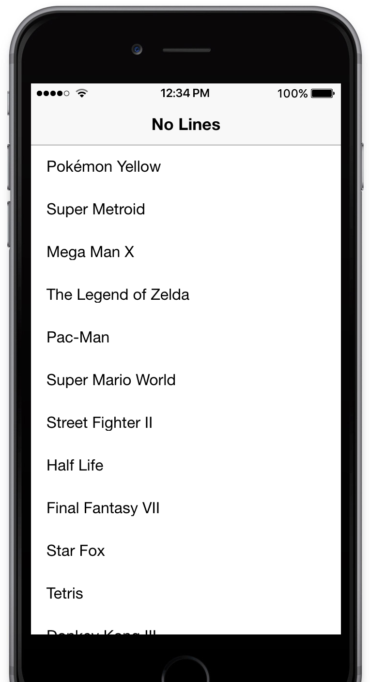
doesn’t require any special styling. You just add an <ion-list> to the content area and the job is done. But if we wanted to create a more complex layout, like Twitter’s profile page:
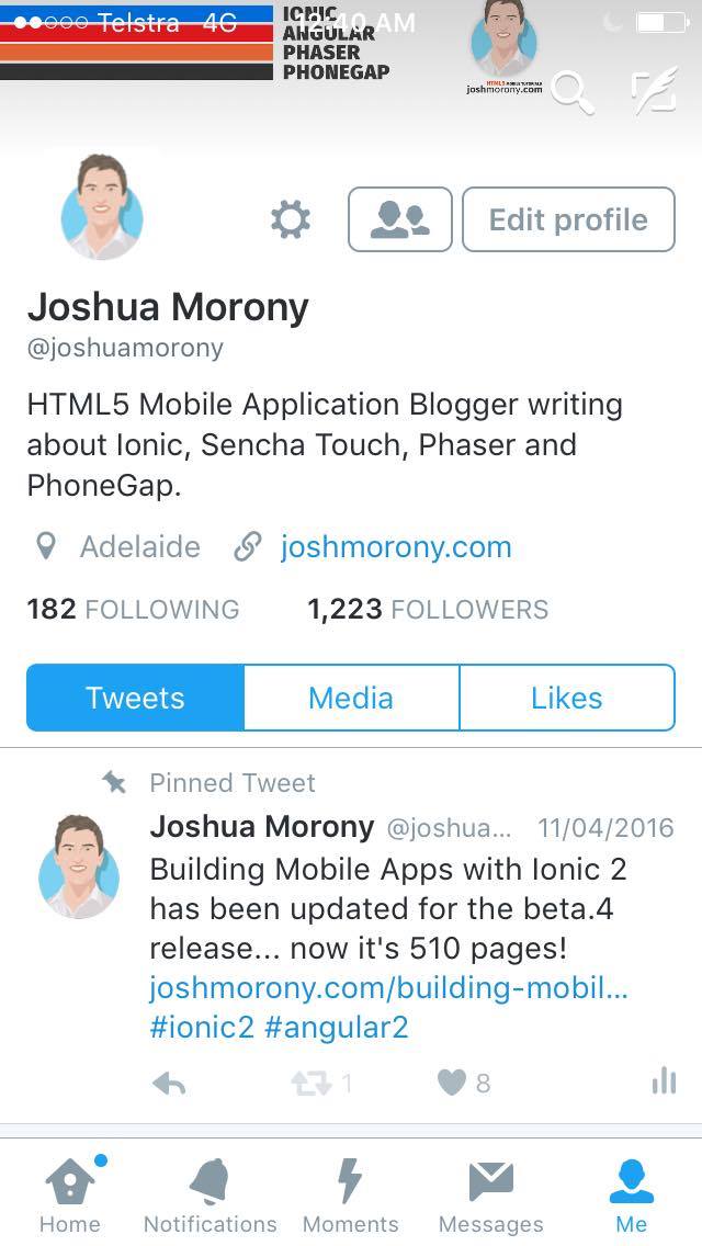
then we’re going to need to do a little more work – fortunately the grid makes it pretty easy. It might be a little tricky to grasp at first, but once you understand how to make a couple simple layouts with the grid, you’ll be able to create just about anything.
Before we Get Started
Last updated for Ionic 3.3.0
Before you go through this tutorial, you should have at least a basic understanding of Ionic 2 concepts. You must also already have Ionic 2 set up on your machine.
If you’re not familiar with Ionic 2 already, I’d recommend reading my Ionic 2 Beginners Guide first to get up and running and understand the basic concepts. If you want a much more detailed guide for learning Ionic 2, then take a look at Building Mobile Apps with Ionic 2.
Grid Basics
If you’ve used a CSS framework like Foundation or Bootstrap before then you will probably be familiar with using a grid layout by dividing your page into rows and columns. Rows display underneath each other vertically, and columns split up rows horizontally. The grid system in Ionic 2 works the same way.
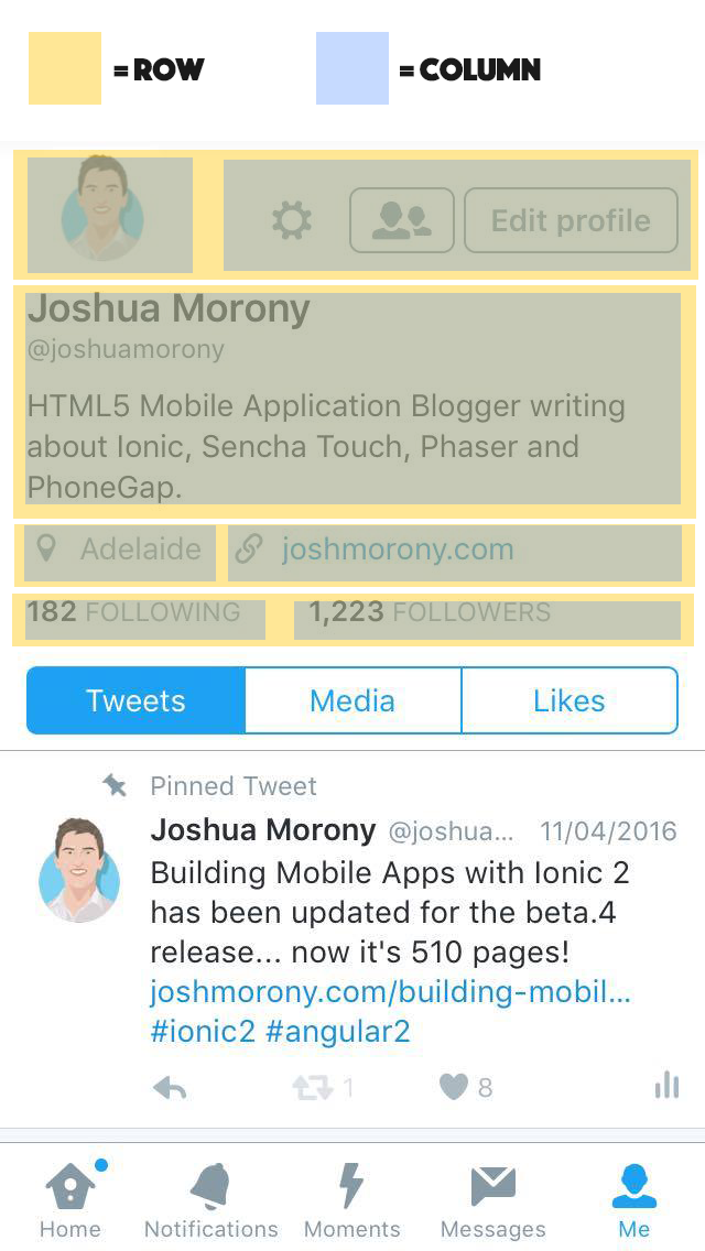
Here’s an example of how the Twitter page I just showed you would be split up into rows and columns:
You can nest rows and columns as much as you need to create your layout. If you have a row you could split that up into three columns. Then in the second column you could add another two rows inside of that. Inside of one of those rows you could again split that up into 4 more columns. This would look something like this:
<ion-row>
  <ion-col> </ion-col>

  <ion-col>
    <ion-row>
      <ion-col></ion-col>
      <ion-col></ion-col>
      <ion-col></ion-col>
      <ion-col></ion-col>
    </ion-row>
    <ion-row>
      <ion-col></ion-col>
      <ion-col></ion-col>
      <ion-col></ion-col>
      <ion-col></ion-col>
    </ion-row>
  </ion-col>

  <ion-col> </ion-col>
</ion-row>
That level of complexity is pretty absurd though, I just did it to illustrate a point. You’re unlikely to ever need more than one level of nesting.
By default, each column that is inside of a row will occupy an equal amount of space. If I have two columns inside a row then both of those columns will take up half of the row each. This isn’t always what we want though, and in the case of the Twitter example above, we would want the users display picture to take up less space than the buttons to the right.
To handle these situations we can specify a col to any of our columns like this:
<ion-row>
    <ion-col col-3</ion-col>
    <ion-col col-9></ion-col>
</ion-row>
Now the first column will take up 3 of the first columns, and the second column will take up the remaining 9 of the width. You can use any combination of the following that adds up to 12:
- col-1
- col-2
- col-3
- col-4
- col-5
- col-6
- col-7
- col-8
- col-9
- col-10
- col-11
- col-12
Creating Complex Layouts using the Grid
Now that we’ve covered the basics, let’s go over a real example of implementing a complex layout with the grid. We will use the Twitter profile page I showed above as an example, which we have already divided up into rows and columns:
We have 4 rows. The first, third and fourth rows are divided up into two columns, and the second row just has a single full width column. Here’s how the code might look for this:
<ion-row class="header">
  <ion-col col-3>
    <img src="http://placehold.it/100x100" />
  </ion-col>
  <ion-col col-9 class="button-container">
    <button class="icons" style="border: none;">
      <ion-icon name="cog"></ion-icon>
    </button>
    <button class="icons">
      <ion-icon name="people"></ion-icon>
    </button>
    <button class="icons">Edit Profile</button>
  </ion-col>
</ion-row>

<ion-row>
  <ion-col col-12>
    <h4 class="name">John Smith</h4>
    <p class="twittername">@johnsmith</p>
    <p>
      Lorem ipsum dolor sit amet, consectetur adipiscing elit. Aliquam quis
      ultrices quam, at interdum ante.
    </p>
  </ion-col>
</ion-row>

<ion-row>
  <ion-col col-3> <ion-icon name="pin"></ion-icon> Adelaide </ion-col>
  <ion-col col-9> <ion-icon name="link"></ion-icon> johnsmith.com </ion-col>
</ion-row>

<ion-row>
  <ion-col col-4> <strong>300</strong> FOLLOWING </ion-col>
  <ion-col col-8> <strong>300</strong> FOLLOWERS </ion-col>
</ion-row>
All that we have done is replicate the row and column structure using <ion-row> and <ion-col> in the template, and for the columns that do not take up the full width we have supplied the col-* attribute.
There’s a little extra CSS we’ll want to more closely reflect the Twitter layout as well:
and the CSS:
.icons {
background-color: #fff;
border: 1px solid #7f8c8d;
color: #7f8c8d;
margin: 0;
font-size: 0.9em;
}
.name {
margin: 0;
}
.handle {
margin: 0;
}
.status {
white-space: normal;
color: #000;
margin-top: 5px;
}
.item {
align-items: baseline;
}
.button-container {
align-self: flex-end;
text-align: right;
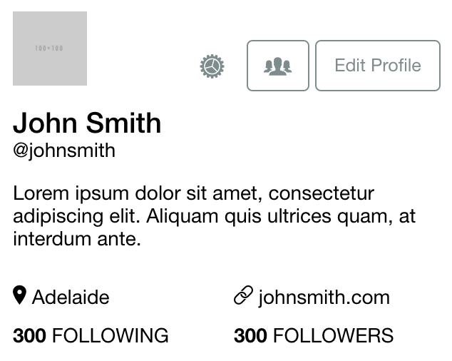
}The result will be something like this in Ionic 2:
Notice that in the CSS we are using a weird attribute to align the button container to the bottom of its parent:
align-self: flex-end;This is a flex property. The grid system uses Flexbox, which I have written about before. I’m not going to dive into Flexbox in this tutorial because it is a pretty big topic, but essentially you can use flex to position elements on the screen. It is much more powerful than traditional methods of positioning, especially when working with fluid screen sizes. For a little bit more background, read my previous tutorial for Ionic 1.
Using Flexbox with the Grid
I said I wasn’t going to get into Flex in this tutorial, but there is one thing in particular I want to quickly cover. When creating a layout in Ionic 2 with the grid system, Flex can come in really handy. Let’s say I want to create a page that is split into three equal sections vertically like this:
Seems easy enough, you would think you could just do something like this:
<ion-content class="home">
  <ion-grid>
    <ion-row style="background-color: #e74c3c;">
      <ion-col>Alizarin!</ion-col>
    </ion-row>

    <ion-row style="background-color: #f1c40f;">
      <ion-col>Sunflower!</ion-col>
    </ion-row>

    <ion-row style="background-color: #9b59b6;">
      <ion-col>Amethyst!</ion-col>
    </ion-row>
  </ion-grid>
</ion-content>
but the result would be this:
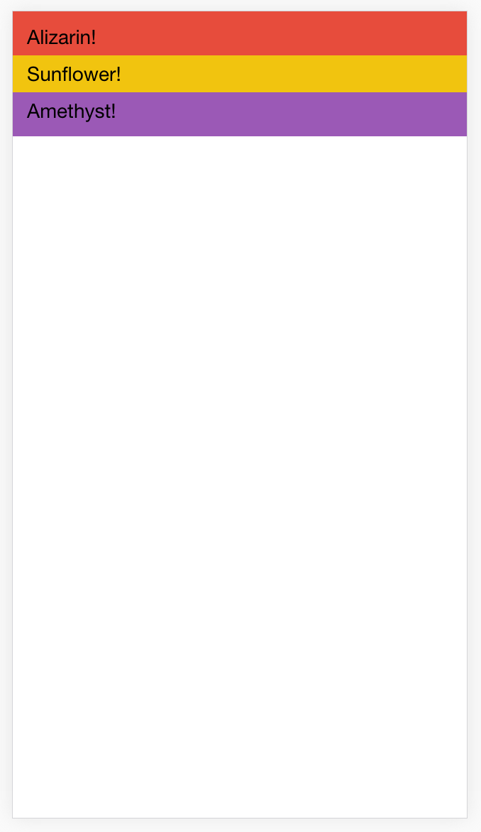
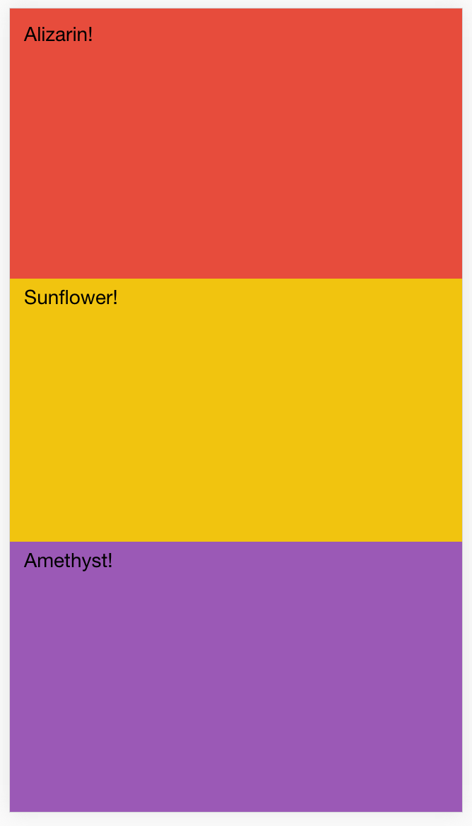
Not exactly what we want. We want each of those three rows to fill all of the available space, so we have to set their parent to use display: flex; and we have to give each of the children a flex: 1 property. The flex property defines how much of the available space the element should take up. By giving them all a flex of 1 they will all take up an equal amount of space. If you were to give one a flex of 2 instead, then that one would take up half the space, and the remaining 2 will take up 1/4th of the available space each (2 + 1 + 1 = 4).
So if we add the following CSS to this template:
.home {
  scroll-content {
    display: flex;
    flex-direction: column;
  }

  ion-grid {
    padding: 0;
    height: 100%;
  }

  ion-row {
    flex: 1;
  }
}
We will now get the following result:
which is exactly what we wanted.
Summary
Once you understand how to split up a layout into rows and columns, you should pretty easily be able to create the basic structure of just about any layout you can think of in Ionic 2 using the grid system. Combine that with the powerful options Flexbox offers to finish things off and you will be making beautiful applications in no time.